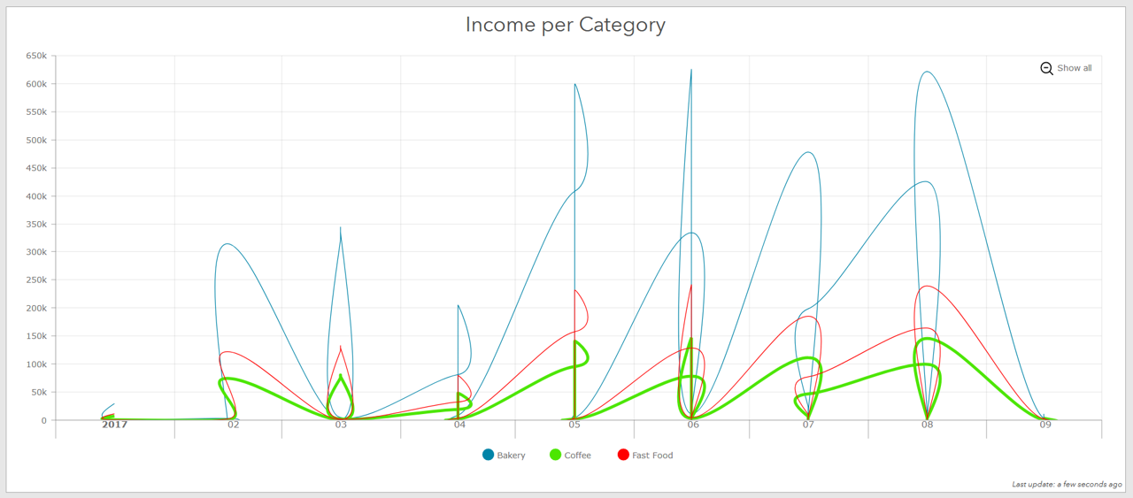
The line graphs do not look how they are supposed to, or as compared to WebApp Builder - Infographics.Both graphs below have the exact same data source.
Operations Dashboard:
WebApp Builder - Infographics:
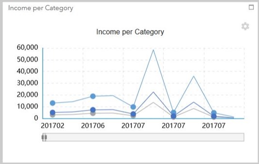
Please fix the visualizations to accurately represent the data? Is there a work around?