- Home
- :
- All Communities
- :
- Products
- :
- ArcGIS Dashboards
- :
- ArcGIS Dashboards Ideas
- :
- Allow multiple data sources for widgets in Operati...
- Subscribe to RSS Feed
- Mark as New
- Mark as Read
- Bookmark
- Follow this Idea
- Printer Friendly Page
Allow multiple data sources for widgets in Operations Dashboard
- Mark as New
- Bookmark
- Subscribe
- Mute
- Subscribe to RSS Feed
- Permalink
Currently you are only allowed to use one map/feature service per widget in Operations Dashboard. This severely limits your ability to create useful comparison charts. I am trying to create a simple bar chart showing the count of crimes between 2 weeks of data. The only way to do this is create 2 chart widgets. I can do this in Excel in a matter of seconds. This is what I am trying to create...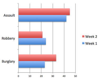
For instance, I want to use Gauge widget for repairs management. I need to see how many objects have been repaired in comparison with all objects that need to be repaired.
At the moment I can only see the number of all objects that need to be repaired or the number of objects that have been already repaired separately.
many instances where this would be useful... please vote!
There's another idea about that: Add multiple data sources in a dashboard tool
But if you have your data in one layer, you can split your bar charts by another attribute. Yet this doesn't help if you want to compare two separate data sources (e.g. 2 feature layers) in the same chart.
Waiting for this! 
Hi! Does anyone know if there has been any response or follow-up to this idea?
I have another request.
I have a dataset classified by land categories presented in a webmap and a serial chart (graph). I've linked them to respond when selection changes. (e.g. highlight features in the map, or select a bar in the graph, the other element responds accordingly). I would like to split the dataset up and present each category into a separate filtered layer. However, the graph appears to only be able to link to one map layer.
@ArthurPoon It looks like you’ve included a secondary ideas to this request, and this doesn’t really adhere to our Submission Guidelines. Is there any change you could separate your idea into a separate submissions?
@KevinArmstrong1 We can/will think of ways to accommodate more than one data set per dashboard element for a future release. Via data modeling/manipulation, you should be able to achieve the chart illustrated using a dashboard's serial chart element, and the ability to manually create multiple-series when the chart is configured to derive its categories from 'Features'. This workaround, however, will not work for all elements, and this is why we need to think about the idea in more detail.

I'd like to see this functionality in the list widget. It would be great to have one list view with multiple data sources vs 10 different lists. Our example is pulling different surveys into a daily work dashboard. I have 11 different infographics all set to today's work. We would like to see a list view of this in one list vs creating 11 different lists in tabs. There just isn't enough real estate on the screen to quickly see a view of what's going on.
ArcGIS Dashboards now support Arcade in two ways: data expressions and advanced formatting. Used individually or together, these new additions open up many new possibilities. An example of how to use more than one data source for an element was recently shown at the Esri Developer's Summit.
There are a few related requests in this post, and I think they can be handled by what was mentioned above. If not, please consider submitting a new request.
You must be a registered user to add a comment. If you've already registered, sign in. Otherwise, register and sign in.