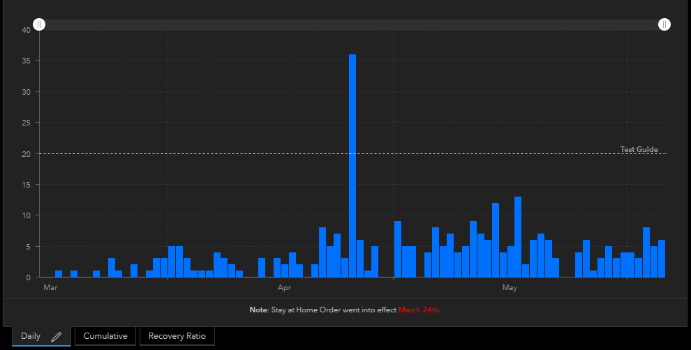
Currently there is only the ability to add a guide on the y-axis. Like this:
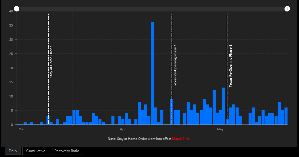
However, amid COVID-19 we need the ability to add a guide on the X-axis. Our use case is that City Management/Council would like to be able to visualize the change in cases over time with certain dates as a reference. For example:
- County's Stay at Home Order - March 24th.
- Texas Re-Opening Phase 1 - May 1st
- Texas Re-Opening Phase 2 - May 18th
Something like this would be ideal: