Turn on suggestions
Auto-suggest helps you quickly narrow down your search results by suggesting possible matches as you type.
Cancel
- Home
- :
- All Communities
- :
- Products
- :
- ArcGIS Dashboards
- :
- ArcGIS Dashboards Ideas
- :
- Ability to Add Guide on X-Axis
Options
- Subscribe to RSS Feed
- Mark as New
- Mark as Read
- Bookmark
- Follow this Idea
- Printer Friendly Page
- Mark as New
- Bookmark
- Subscribe
- Mute
- Subscribe to RSS Feed
- Permalink
Currently there is only the ability to add a guide on the y-axis. Like this:
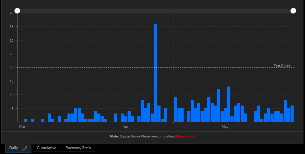
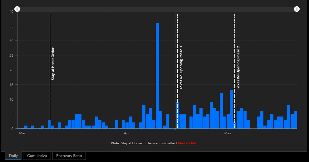
However, amid COVID-19 we need the ability to add a guide on the X-axis. Our use case is that City Management/Council would like to be able to visualize the change in cases over time with certain dates as a reference. For example:
- County's Stay at Home Order - March 24th.
- Texas Re-Opening Phase 1 - May 1st
- Texas Re-Opening Phase 2 - May 18th
Something like this would be ideal:
2 Comments
You must be a registered user to add a comment. If you've already registered, sign in. Otherwise, register and sign in.