- Home
- :
- All Communities
- :
- Products
- :
- ArcGIS CityEngine
- :
- ArcGIS CityEngine Questions
- :
- Re: How to Create Dashboards in CE 2015.2
- Subscribe to RSS Feed
- Mark Topic as New
- Mark Topic as Read
- Float this Topic for Current User
- Bookmark
- Subscribe
- Mute
- Printer Friendly Page
How to Create Dashboards in CE 2015.2
- Mark as New
- Bookmark
- Subscribe
- Mute
- Subscribe to RSS Feed
- Permalink
Hi,
I am testing this great new feature in the latest Cityengine release which allows us to create nice dashboards using Reports.
But I don't understand how to select multiple attributes/reports to compare different modes.
in the configuration panel I can only select one Report:
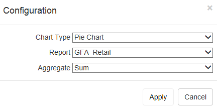
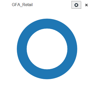
And I get:
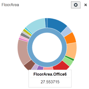
And of course I'd like something like:
In the documentation its says:
If you select a report with sub-classes, only the Pie and Column charts will display all the sub-class values. Key Number will just display the main class. For example, TotalEnergyByClass is divided into the following sub-classes:
- TotalEnergyByClass.C
- TotalEnergyByClass.D
- TotalEnergyByClass.E
- TotalEnergyByClass.F
- TotalEnergyByClass.G
When you generate the report the Dashboard displays all the sub-classes values.
Could someone explain how to create classes and sub_classes in a Report ?
Thanks.
- Mark as New
- Bookmark
- Subscribe
- Mute
- Subscribe to RSS Feed
- Permalink
To create column charts and pie charts with multiple columns/slices, generate a report with sub-reports using a period (.) to separate the report and sub-report names. For example, if you'd like to create a chart that reports GFA for different types of buildings (e.g., retail, residential, office, hospital, etc.), then, generate reports in CGA with the following names: GFA.Retail, GFA.Residential, GFA.Office, GFA.Hospital, etc.
report("GFA.Retail", geometry.area)
report("GFA.Residential", geometry.area)
Or, if you have the building type in a variable, you can create strings for the report name:
buildingType = "Office"
reportName = "GFA." + buildingType
report(reportName, geometry.area)
More about creating sub-reports can be found in Tutorial 11 in the "Greenspace and BuildUp Area Reports" section: Tutorial 11: Reporting—CityEngine Tutorials | ArcGIS for Desktop
Then, create the dashboard by selecting "GFA" as the "Report".
- Mark as New
- Bookmark
- Subscribe
- Mute
- Subscribe to RSS Feed
- Permalink
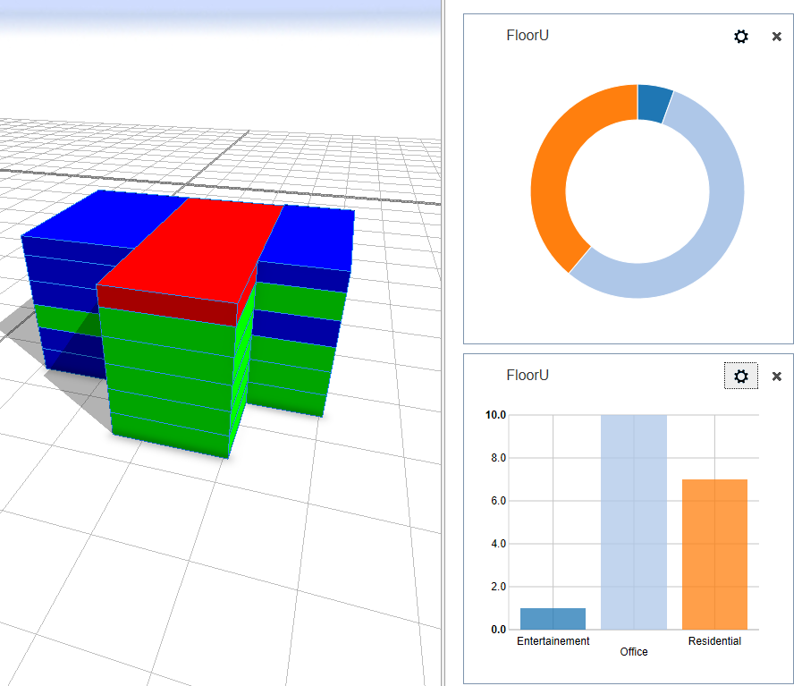
Ok, I got it! It makes reports much more visually attractive.
Thanks for you reply Cheryl.
It would be great to update the CE documentation with a simple example.
Here's the code I used for my test, it might helpful to someone else...
attr height = 20
attr floorheight = 3.5
Footprint -->
extrude(height)
split(y){floorheight:FloorUse}*
FloorUse -->
50%: Residential
30%: Office
else: Entertainment
Residential -->
report("FloorU.Residential",1)
color(0,0,1)
Office -->
report("FloorU.Office",1)
color(0,1,0)
Entertainment -->
report("FloorU.Entertainment",1)
color(1,0,0)