- Home
- :
- All Communities
- :
- Developers
- :
- ArcGIS API for Python
- :
- ArcGIS API for Python Questions
- :
- Using GraduatedSymbolsRenderer with SpatialDataFra...
- Subscribe to RSS Feed
- Mark Topic as New
- Mark Topic as Read
- Float this Topic for Current User
- Bookmark
- Subscribe
- Mute
- Printer Friendly Page
Using GraduatedSymbolsRenderer with SpatialDataFrame in Jupyter
- Mark as New
- Bookmark
- Subscribe
- Mute
- Subscribe to RSS Feed
- Permalink
I was inspired by Rohit Singh and his team's presentations at Esri UC 2018. So I started learning Jupyter. I am using electric consumption data to explore correlations with consumption and maintenance of electric facilities. I tried to use a graduated renderer with a field called MaxConsumption to class the size of the points. But the results just show simple points. My full code is hosted on GitHub in a Jupyter Notebook. I'm still working on that so it will likely change as this post ages. Currently this line below is not producing the results am looking for.
If anyone can provide an example or point to a sample using GraduatedSymbolsRenderer with ArcGIS Python API I would appreciate it.
consumptionLyr = gis.content.import_data(sdf)
m.add_layer(consumptionLyr,options={"renderer":"GraduatedSymbolsRenderer","classificationField":"MAXCONSUMPtION"})Solved! Go to Solution.
Accepted Solutions
- Mark as New
- Bookmark
- Subscribe
- Mute
- Subscribe to RSS Feed
- Permalink
Darris Friend try
map1.add_layer(freeway_feature_layer, {"renderer":"ClassedSizeRenderer", "field_name": "MAXCONSUMPtION"})Checkout the topic on "Smart Mapping" for examples Smart Mapping | ArcGIS for Developers
- Mark as New
- Bookmark
- Subscribe
- Mute
- Subscribe to RSS Feed
- Permalink
Darris Friend try
map1.add_layer(freeway_feature_layer, {"renderer":"ClassedSizeRenderer", "field_name": "MAXCONSUMPtION"})Checkout the topic on "Smart Mapping" for examples Smart Mapping | ArcGIS for Developers
- Mark as New
- Bookmark
- Subscribe
- Mute
- Subscribe to RSS Feed
- Permalink
Thank you. That produced the result I was looking for. In fact two of Electrical Engineers just left my office. We are taking this concept and pushing it up to the transformers. They want a map showing existing KVA and recommended KVA based on customer count and consumption history downstream of each transformer. We will map the transformers that are undersized and target locations using data from our outage management system where transformers are the root cause of an outage.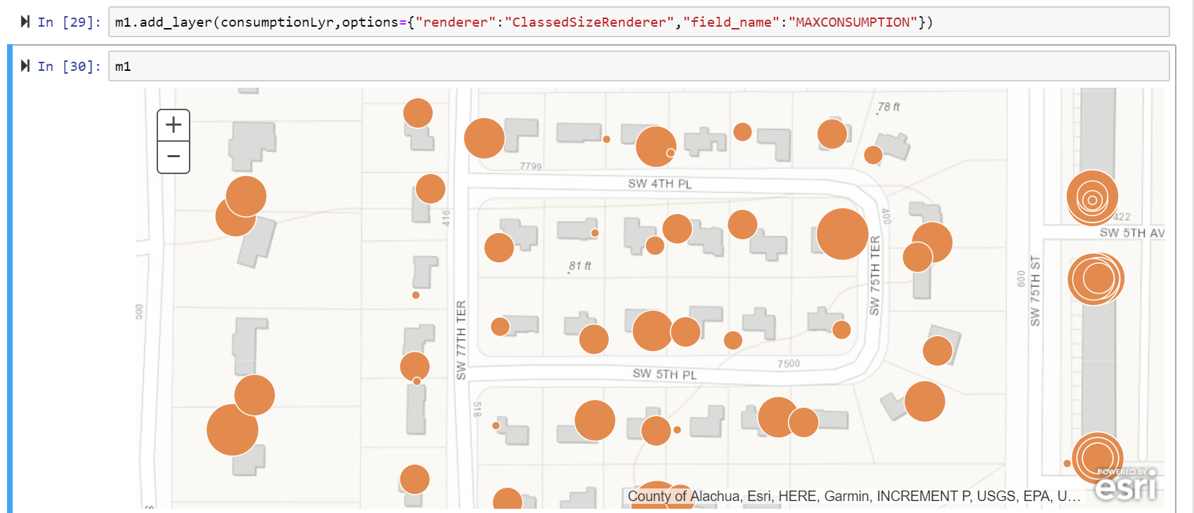
- Mark as New
- Bookmark
- Subscribe
- Mute
- Subscribe to RSS Feed
- Permalink
Sounds pretty interesting. Thanks for sharing, the dev team gets very excited whenever we hear real world usage of our products like this. When you get a chance, check out visualization on "SpatialDataFrame" object visualizing data with the spatial dataframe | ArcGIS for Developers. You can slice and dice your data even more, throw it on a map to view spatial patterns, or plot them to see non-spatial characteristics.
Also, remember, anything you draw on your map widget can be saved as a web map.. useful if the field crew wants to quickly check something using their mobile devices.