- Home
- :
- All Communities
- :
- Developers
- :
- JavaScript Maps SDK
- :
- JavaScript Maps SDK Questions
- :
- Re: Incomplete legend when print
- Subscribe to RSS Feed
- Mark Topic as New
- Mark Topic as Read
- Float this Topic for Current User
- Bookmark
- Subscribe
- Mute
- Printer Friendly Page
Incomplete legend when print
- Mark as New
- Bookmark
- Subscribe
- Mute
- Subscribe to RSS Feed
- Permalink
- Report Inappropriate Content
Hi guys! I have a problem with the captions when I print the map. Some caption items do not appear in the pdf (and others) and I was unable to find a pattern. This caption is generated through a ClassBreakRenderer. I'm forgetting something?
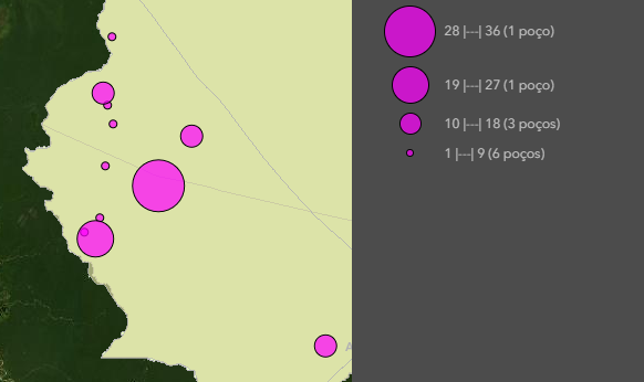
Caption generated with ClassBreakRenderer
Caption when printing
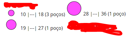
In the above case, the first banner does not appear when printing.
- Mark as New
- Bookmark
- Subscribe
- Mute
- Subscribe to RSS Feed
- Permalink
- Report Inappropriate Content
it looks like a bug to me. The good news is that the bug appeared to be fixed in 10.8 and above

- Mark as New
- Bookmark
- Subscribe
- Mute
- Subscribe to RSS Feed
- Permalink
- Report Inappropriate Content
In fact, both maps have orange and red symbols, what happens is that on the map where the output is correct, the red dots are above the orange dots.
On the map where the output is incorrect, some red dots are being omitted and, for this reason, oranges appear, you know?
It seems that there are still problems with the legends when printing the map in some features. For example, I include the Print Widget in a sample code (multivariable visualization) and the caption exported is also completely different from what appears on the map (using the default print service).
Code: https://codepen.io/thafny/pen/LYGgrQa
Map Legend:

Output Legend:

Is there any forecast for fixing these bugs?
- Mark as New
- Bookmark
- Subscribe
- Mute
- Subscribe to RSS Feed
- Permalink
- Report Inappropriate Content
'multivariable visualization' issue seems like a bug. let me dig it. it
about the previous issue:
- does the output I shared last time look good (except the orange legend patch on the layout)?
- do you have two layers with the same features in your map?
- Mark as New
- Bookmark
- Subscribe
- Mute
- Subscribe to RSS Feed
- Permalink
- Report Inappropriate Content
1. Yes, the captions for versions 10.5, 10.8 and the default print service are correct.
2. Yes, just that. The red dot layer is a copy of the orange dot layer, but with another renderer.
- « Previous
- Next »
- « Previous
- Next »