- Home
- :
- All Communities
- :
- Developers
- :
- JavaScript Maps SDK
- :
- JavaScript Maps SDK Ideas
- :
- ArcGIS Javascript 4 Cluster renderer
- Subscribe to RSS Feed
- Mark as New
- Mark as Read
- Bookmark
- Follow this Idea
- Printer Friendly Page
ArcGIS Javascript 4 Cluster renderer
- Mark as New
- Bookmark
- Subscribe
- Mute
- Subscribe to RSS Feed
- Permalink
I'd like to be able to render my clusters in a way distinct from individual points.
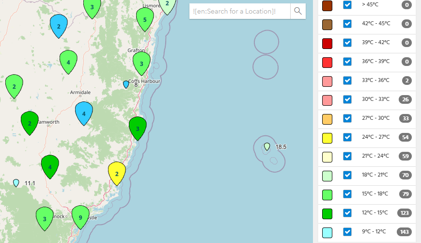
I'm using the unique values renderer on my GeoJSON layer to show temperature with individual locations as pins. I'd like to show the clusters as larger circles with the numbers within to make then distinct from the numbers representing temperature beside the individual points.
The FeatureReductionCluster doesn't implement a renderer property, so there is no individual control over this.
In addition, colouring the cluster with the most common colour isn't necessarily very useful. I'd like to do something similar to a plugin I used in Leaftlet to create a pie chart for the clusters:

This has the additional benefit that the text representing the cluster count is always black text on a white background, so is more accessible. Whereas, on hot days, my ArcGIS clusters would show black text on a red background.
i think this one is available in ArcGIS SDK version 4.16, but i'm not sure we need to test it.
i have the same issue and i'm using 4.14 version and it's not redered different from the render geoJsonLayer itself.
We won't be able to implement the pie chart symbol for clusters in the near term. The JS API CIMSymbol implementation first needs to add support for chart symbols before we can add support for that.
Regarding the distinct symbol, there is an undocumented/unsupported/experimental property on FeatureReductionCluster called "symbol". You can set a symbol on that property to make the cluster symbol distinct from all individual points. Give that a try and let me know if that satisfies most of your use cases.
Also post if you want or need more control over rendering than just the symbol, like sizing the cluster using another stat other than feature count...field sum...field average...etc.
I think being able to color the cluster symbol by the number of features would be very helpful - I find the eye gets drawn a little more to the colors than the size, esp. with a lot of clusters on the page. Being able to call out large clusters with a visual variable other than size would be great.
If we publicly release "symbol" now, then we won't be able to release other rendering capabilities later. It will be limiting to other scenarios. If controlling other rendering aspects of clusters is important, like color, then we need to have a proper API for exposing all rendering properties, including a symbol.
@KristianEkenes - what version of the API is the "symbol" property unofficially supported in? I'm using 4.18, and am having no luck. Without this I'm can't use FeatureReductionCluster for my application. It has 95% of the of functionality I need, but is missing a critical 5%.
Yep. It wasn't added until 4.19.
This was implemented in v4.25. See the release notes here: https://developers.arcgis.com/javascript/latest/release-notes/#custom-cluster-styles
Here are examples that demonstrate this:
https://developers.arcgis.com/javascript/latest/sample-code/featurereduction-cluster-renderer-sum/
https://developers.arcgis.com/javascript/latest/sample-code/featurereduction-cluster-pie-charts/
You must be a registered user to add a comment. If you've already registered, sign in. Otherwise, register and sign in.