- Home
- :
- All Communities
- :
- ArcGIS Topics
- :
- Applications Prototype Lab
- :
- Applications Prototype Lab Blog
- :
- Distributive Flow Maps for Pro
Distributive Flow Maps for Pro
- Subscribe to RSS Feed
- Mark as New
- Mark as Read
- Bookmark
- Subscribe
- Printer Friendly Page
A new version of the Distributive Flow Lines (DFL) tool is now available. (Dec 15 , 2022) updating compatibility to ArcGIS Pro 3.0. A couple of enhancements were made and some code cleanup. The tool now uses the new Distance Accumulation tool. If you want to use the tool in ArcMap, the previous version of the DFL and the previous blog are still available. The previous blog also contains a little background on distributive flow maps and some details about the internal workings of the tool. Here I will focus on how to use the new Pro tool and a couple details about the inputs and flow “direction”. The example in this blog shows the flow of federal education tax dollars from Washington D.C. to the lower 48 state capitals. If you would like to follow along, the tool and test data used to produce the maps in this blog are available at the first link above.
Note: To use the tool you need ArcGIS Pro and the Spatial Analyst extension. If you do not have access to a Spatial Analyst license, a 30-day no cost trial can be obtained through the Esri Marketplace. The tool will with a base license level of Basic. If you want to use the Create smoothed output option available in the tool then a Standard or Advanced base license will be required.
Usually, flow maps depict the flow of something from a single source to many destinations. They can also show stuff flowing from many destinations to a single source. The DFL tool can be used for both cases. Within the interface the point of convergence is named Source Feature. Behind the scenes the “something” always flows from the Destinations to the Source. This is because the tool uses ArcGIS hydrology GP tools and the flow lines are more akin to a stream network with the mouth of the largest stream terminating at the Source node. The Source Feature is just the location where the flow lines will terminate and does not need to have any specific fields describing the “something” flowing through the network.
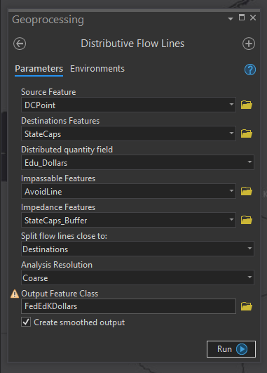
Figure 1: New Distributive Flow Lines Tool
The Destination Features in Figure 1 must have an integer field indicating the amount of “stuff” received from the Source. In Figure 1, the Source Feature, DC Point, is a point feature over Washington DC. StateCaps represents the lower 48 state capitals. Edu_Dollars is a field in the StateCaps feature class representing federal education tax dollars supplied to the states. Figure 2, below, is the output generated based on the inputs in Figure 1.
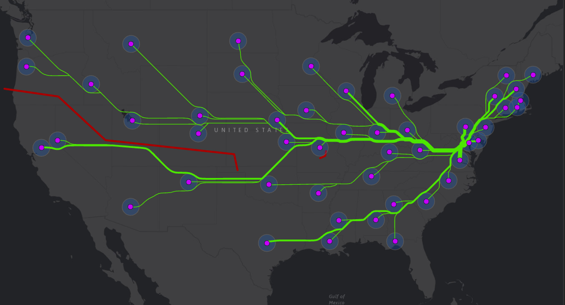
Figure 2: Output based on Figure1 input values. California and Nevada flow southward to avoid the red barrier.
Note: The tool output lines will automatically be added to the map with a Single Symbol style. To make the output have lines with increasing thickness it is necessary to change the symbology of the features using the Symbology pane. The output features will contain a field with the same name as the input Distributed quantity field from the Destination features. Use this field as the symbology Field. Additionally you will want to experiment with the Method, Classes, Minimum size, Maximum size and Template input parameters in the Symbology pane to achieve the effect you like.
In previous versions of the DFL, the optional inputs, Impassable Features and Impedance Features, also caused some confusion because they are similar but treated much differently by the tool. Both provide some control over where the flow lines will be placed. In Figure 2, the large red line in the western half of the US is the Impassable Features input. The blue buffers around the capitals are the Impedance Features input. Impassable features will not be crossed or touched by flow lines. They will be slightly buffered and the lines will appear to flow around them. The Impedance Features may be crossed by flow lines but in most cases the tool will also avoid these features unless there is no other less “expensive” path toward the Source Feature. Figure 3 represents the output where no Impassable Features are specified. Note the flow lines from California and Nevada change from southward to northward.
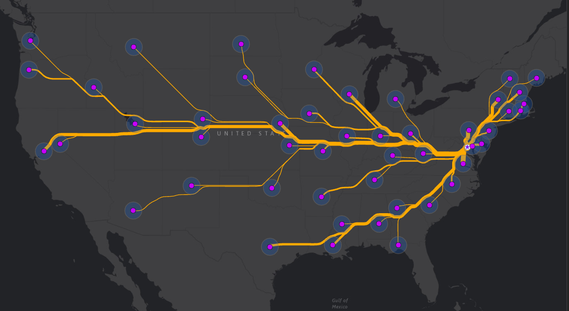
Figure 3: Impedance Features input specified but no Impassable Feature input. Now flowlines generally go around the intermediate state capitals.
Tip: It is not necessary to turn on, or even add the Impedance and Impassible features to the map. They are shown here for clarity. Depending on the application of the tool you may wish to show them because they are significant to the story you are trying to communicate, but often they are just used for aesthetic purposes to control the shape of the output and have nothing to do with the story being told.
In Figure 4 below, neither Impassable nor Impedance features were specified. As you can see, flow lines pass through the intermediate state capitals. This is sometimes desired, but in the case of federal tax dollars, the dollars do not flow through intermediate states, so this might be confusing. Providing an Impedance feature reduces this confusion. If the buffers around the state capitals were specified as Impassable Features, the flow lines could not flow away from the states and no solution would be possible.
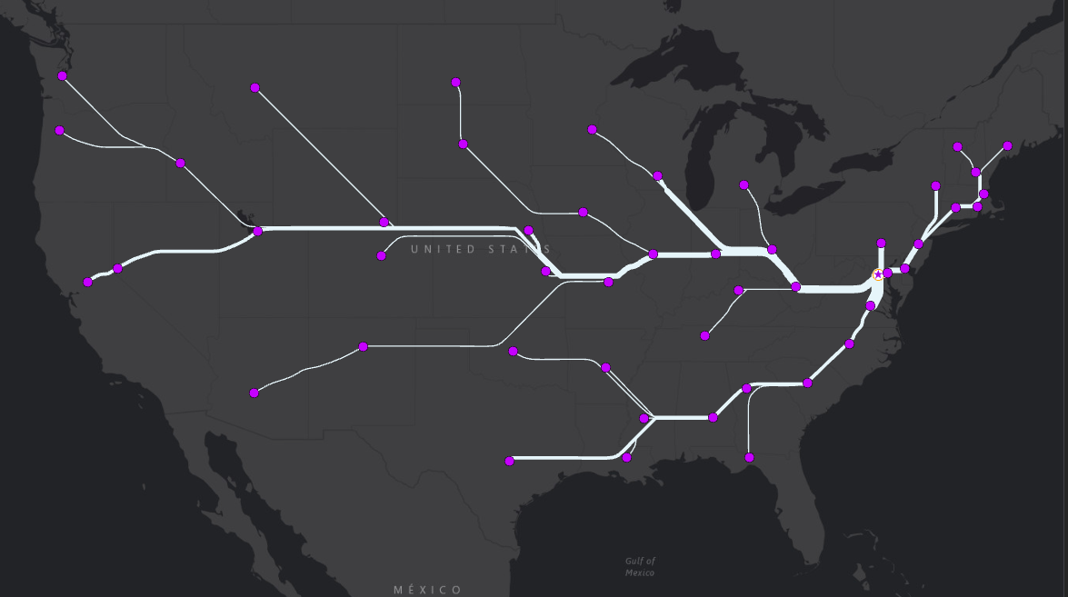
Figure 4: Output generated without specifying Impassable or Impedance Features. California and Nevada flow northward. Flow lines flow through intermediate state capitals
The output in Figure 5 below used the same inputs as Figure 4 except the “Split flow lines close to” parameter was changed from Destination to Source. The result is that California has a dedicated line all the way into Missouri, and several things change in the Northeast. This may be less aesthetically pleasing but does a better job of highlighting which individual states receive more tax dollars.
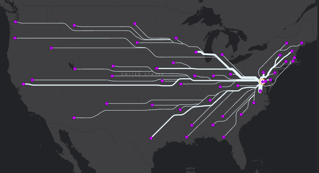
Figure 5: Split flow lines close to Destinations, Neither Impedance nor Impassable features specified.
Figure 6 is a closeup of what is going on in the Northeast. There are a few things worth pointing out. The first is the treatment of the Impedance Features, StateCaps_Buffer. Notice how the flow lines pass through the New York and Connecticut buffer features. This is happening because the direct route is less “expensive” than going around those buffers. Purple labels indicate where the values on the flow lines are coming from. The green flow line labels emphasize the additive nature when individual tributary flow lines converge as they get closer to the Source feature. Lastly, the Massachusetts flow line goes directly through Rhode Island. This is because it is located within the Rhode Island StateCaps_Buffer. This is a case where some manual editing may be needed to clarify that Massachusetts tax dollars are not flowing through Rhode Island.
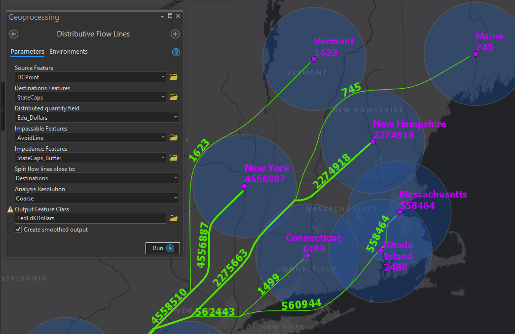
Figure 6: Note the flow line pass through the buffers around New York and Connecticut as well as Rhode Island. Also note the additive nature of the flow lines.
I hope you will find the tool useful in creating flow maps or other creative applications. I also look forward to reading your comments, suggestions and use cases. If you missed the link to the tool and sample data, here it is again. Distributive Flow Lines for Pro.
You must be a registered user to add a comment. If you've already registered, sign in. Otherwise, register and sign in.