- Home
- :
- All Communities
- :
- Industries
- :
- AEC
- :
- AEC Questions
- :
- Re: How can I symbolize by gradient with ranges of...
- Subscribe to RSS Feed
- Mark Topic as New
- Mark Topic as Read
- Float this Topic for Current User
- Bookmark
- Subscribe
- Mute
- Printer Friendly Page
How can I symbolize by gradient with ranges of dates as the attributes?
- Mark as New
- Bookmark
- Subscribe
- Mute
- Subscribe to RSS Feed
- Permalink
Hello,
I am trying to figure out if there is a way to symbolize using a gradient style with attribute data such as this:
1-5 years, 6-10 years, 11-15 years, etc.
Is there a way to do this?
I am making a road map that requires the display of road maintenance like when is the upcoming chip seal project (1-5 years), how about the next overlay project (6-10 years), and how many years has it been since the last overlay or chip seal. Anyone have any tips?
Thanks.
Solved! Go to Solution.
Accepted Solutions
- Mark as New
- Bookmark
- Subscribe
- Mute
- Subscribe to RSS Feed
- Permalink
Have you tried using unique values like the image below. This is using a text field similar to yours which I created quickly on my computer.

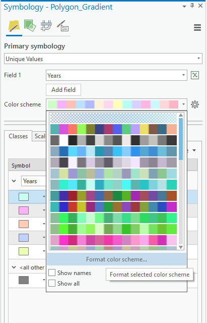
Go to color scheme and click format color scheme as seen below.

In this menu select Continuous colour scheme , there are a few other options to explore. See this option highlighted below.

You are then able to adjust either end of the color scheme to your desired look. I hope this helps answer your question.
Shane
- Mark as New
- Bookmark
- Subscribe
- Mute
- Subscribe to RSS Feed
- Permalink
Hi Kaitlyn Abrahamson,
If your using ArcGIS Pro , check out the Gradient fill on Fill symbol layers—ArcGIS Pro | Documentation or the Graduated Colours Symbolize feature layers—ArcGIS Pro | Documentation using a manual interval specified in the method. I hope this helps answer your question.
Shane
- Mark as New
- Bookmark
- Subscribe
- Mute
- Subscribe to RSS Feed
- Permalink
I'm not sure how you are getting the gradient fill to work on text data. My attributes are literally text fields with data like "1-5 years."
- Mark as New
- Bookmark
- Subscribe
- Mute
- Subscribe to RSS Feed
- Permalink
Have you tried using unique values like the image below. This is using a text field similar to yours which I created quickly on my computer.

Go to color scheme and click format color scheme as seen below.

In this menu select Continuous colour scheme , there are a few other options to explore. See this option highlighted below.

You are then able to adjust either end of the color scheme to your desired look. I hope this helps answer your question.
Shane
- Mark as New
- Bookmark
- Subscribe
- Mute
- Subscribe to RSS Feed
- Permalink
How did you go, did you ever get to the bottom of this?
Shane
If this answer was helpful please mark it as helpful. If this answer solved your question please mark it as the answer to help others who have the same question.
- Mark as New
- Bookmark
- Subscribe
- Mute
- Subscribe to RSS Feed
- Permalink
Hi Shane,
I ended up taking your advice and changing my data a little bit. I wanted to represent my data like a numerical value instead of the text values they are. It didn't quite look the way I wanted it to look, but it still looks close to the way I intended.
- Mark as New
- Bookmark
- Subscribe
- Mute
- Subscribe to RSS Feed
- Permalink
Always hard when you have a specific vision you would like to achieve. Let me know If I can help anymore.
Shane