- Home
- :
- All Communities
- :
- Products
- :
- ArcGIS Dashboards
- :
- ArcGIS Dashboards Ideas
- :
- Add Filter to Group Values on Charts to show only ...
- Subscribe to RSS Feed
- Mark as New
- Mark as Read
- Bookmark
- Follow this Idea
- Printer Friendly Page
Add Filter to Group Values on Charts to show only Top # Count
- Mark as New
- Bookmark
- Subscribe
- Mute
- Subscribe to RSS Feed
- Permalink
Add a filter on charts in the categories option when using the group values option to show X number of top count. E.g. Pie chart - show [5] groups based on field X with highest counts. This would make charts more usable for larger data sets where attributes vary more as currently the charts can not handle large amount of groups
Currently, in Operations Dashboard there is a widget for bar charts (Serial Chart).
Using Grouped Values to display a 'count' statistic yields a bar chart with a category for each distinct value in the given field. Given a table with hundreds of distinct/unique values, this results in a huge bar chart.
In my use case, a table contains search terms used. Approximately 10-20 have large numbers of searches, but then it drops off significantly. I want to just restrict the bar chart to show the "Top 10" or equivalent results. Note of course that I want to be able to define how many results/bars I want to display.
The link below is my original GeoNet post asking if it was possible:
https://community.esri.com/message/769612-how-to-get-the-top-n-results-in-a-chart
This functionality was available in the old operations dashboard so would be good to see it in the new version.
This thread also seems to highlight the same issue, but don't know if an idea got created
https://community.esri.com/message/769540-re-how-to-get-the-top-n-results-in-a-chart?commentID=76954...
Found the other idea here which is basically the same thing
https://community.esri.com/ideas/14960-operations-dashboard-bar-chart-for-top-n-results
This looks to be the same idea
https://community.esri.com/ideas/15346-add-filter-to-group-by-on-charts-to-show-only-top-count
Needing exactly that functionality. Hoping Esri has been looking at the last 2 years?
Displaying only the top (n) values would allow a graph to be more user friendly, and to focus on the most significant data groups.
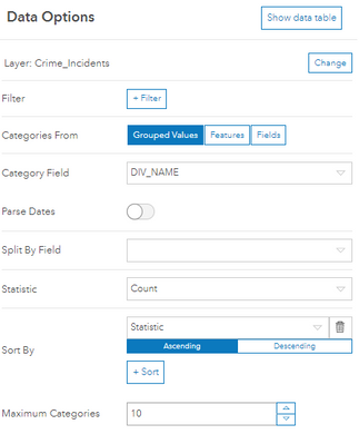
Many dashboard element config options include a setting for Maximum Categories. Used in combination with one or more Sort By fields, a Top (N) result can be simulated. Unfortunately (as one post in this thread has requested), this setting is not exposed for pie charts who get their categories from Grouped Values.
Serial chart:
You must be a registered user to add a comment. If you've already registered, sign in. Otherwise, register and sign in.
