- Home
- :
- All Communities
- :
- ArcGIS Topics
- :
- Applications Prototype Lab
- :
- Applications Prototype Lab Blog
- :
- Generating Distributive Flow Maps with ArcGIS
Generating Distributive Flow Maps with ArcGIS
- Subscribe to RSS Feed
- Mark as New
- Mark as Read
- Bookmark
- Subscribe
- Printer Friendly Page
Editor: Please refer to this blog posting for an updated distributive flow tool.
This blog post was written by Brad Simantel, a summer intern in the Applications Prototype Lab.
NOTE March, 2019: An even newer and easier to use version of the this tool is now available for ArcGIS Pro and an updated blog post about using the tool has also been posted.
Flow maps are used to show the movement of goods or people from one place to another. These maps use lines to symbolize the movement, often varied in width to represent the quantity of the flow, and fall into one of three categories: radial, network, and distributive. Radial flow maps are used to show relationships between one source and many destinations. If there are more than a handful of destinations and you still want to show the the quantity of flow, however, the lines overlap too much to discern individual values. Network flow maps are used to show the quantity of flow over some existing network — transportation and communication networks being the most common. Distributive flow maps are similar to radial flow maps, but rather than having individual lines from the source to each destination, lines are joined together, only forking once they get close to their destinations.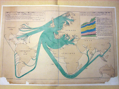 A distributive flow map made by Charles Joseph Minard showing coal exports from England in 1864.
Unfortunately, there are no built-in tools in ArcGIS to generate distributive flow maps — the only way to make one with the software currently is to draw and attribute it by hand. So I wrote my own.How it Works
First, the tool takes source and destination features and converts them to points, if they’re not already. It then generates a grid using the Create Fishnet tool, which will ultimately give the finished flow lines some structure, and converts that grid to points. Next, it creates three Euclidean distance rasters — one based on distance from the source, one based on the destinations, and one based on the grid centroids — and divides them into an equal number of slices, depending on the settings when you run the tool. These three rasters are then added together, creating a surface that can be used to determine least-cost paths from the source to the destinations. After that, it runs the Flow Accumulation tool to determine the quantity of goods or people upstream of any given pixel, and then converts the output to vector lines (which now have the quantity of upstream goods or people as an attribute).Results
Here’s the output of the tool when run using the data from Minard’s coal export map, seen above: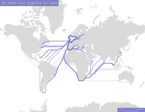
This is without any finessing - just the raw output of the tool. See below for information about how this raw output can be improved.
Here’s another example, showing migration from California in 2010:
Again, this is the raw output.Generating Flow Maps
If you’d like to generate some flow maps yourself, you can download my tool here. Once you’ve downloaded it, the first step before running the tool is making sure your data is suitable. You’ll need:
- A source feature class containing one single feature.
- A destination feature class containing all destinations and a Z-value attribute (any features with a Z-value of null or zero will be discarded). Basically anything you could use to make a choropleth or graduated symbol map you can use to make a flow map.
- Optionally, a feature class which you would like the lines to avoid. An impassable feature class, if you will.
- Lastly, you’ll need all your data to be projected, ideally in the same projection as your data frame.
If you don’t have any data of your own but want to follow along, you can download the Minard-based dataset seen above here.
To run the tool, open ArcMap and find the FlowMapGenerator Python toolbox you've just downloaded using the catalog window, then double-click it to run the FlowMapGenerator tool. You should see this: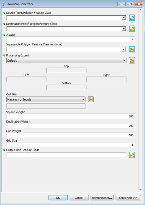
Let’s go through these fields one by one.
- Source Feature Class: This is the source of your flow, and must be a feature class containing only one feature. In the Minard example, that would be England.
- Destination Feature Class: These are the destinations of your flow. The features in this feature class also have to have a quantity attribute that will ultimately be inherited by the line leading to it.
- Z-Value: This is the quantity attribute I was referring to, and will be used to symbolize the magnitude of flow to a given destination.
- Impassable Feature Class: An optional feature class which allows you to influence how the flow lines are drawn. Whichever feature class you select will be treated as nearly impassable (the lines will cross the features in this feature class only when there are no other options). In the Minard example, I used a land feature class for this field.
- Processing Extent: For raster analysis you have to choose a processing extent. I recommend using the Same as Display option and setting your extent visually.
- Cell Size: This is also for raster analysis purposes. On a global scale, I’d recommend something in the ten to twenty kilometer range.
- Source Weight: This field lets you choose how much influence you’d like the distance from source to have over your flow lines. The bigger the number, the more likely your lines are to beeline for the source.
- Destination Weight: Same as Source Weight, but for destinations. If you want your lines to prefer going through or near your destinations, increase this number.
- Grid Weight: Again, the same. If you want your lines to clump together for longer before fanning out, use a higher number here.
- Grid Size: This field determines the size of the grid. If you use a larger grid, your lines are more likely to clump together (rather than fanning out and all heading in the same direction). The grid will be your cell size multiplied by this number.
- Output Feature Class: Choose the name and location of your output polyline feature class.
Finessing and Symbolization
Once you’ve run the tool, you’ll be left with a fairly inorganic-looking flow map. If you like that look, congratulations! You're done! If you want to smooth out some of those rough edges, though, we can run the Smooth Line tool. For the Minard map below, I ran it with a tolerance of 1,000 kilometers. Smoothing isn't enough, though — there are still too many straight lines. Unfortunately, the only way to fix that is by hand. At least you didn’t have to draw and attribute everything manually, though! Here’s my final result after a little bit of finessing: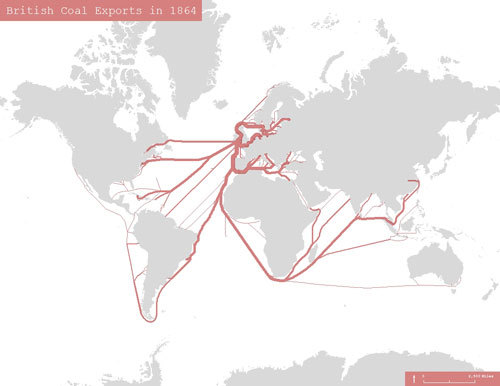
This is symbolized using graduated symbols with ten classes ranging in width from 0.5 pts to 7 pts. I’d prefer to use proportional symbols so you could see the the actual values, but then the source overwhelms the map.
Assuming you've been following along, congratulations! You just saved yourself hours of manually drawing and attributing lines. If you have any questions, leave a comment below.Downloads
Tool: http://www.arcgis.com/home/item.html?id=3bb350838ee044979d1f583b116cb8c1Data: http://www.arcgis.com/home/item.html?id=9d48ce9b6837492e982e980402d3ed11UPDATE (11/27/2012):
After downloading and unzipping the sample you should see the following in the ArcMap catalog window.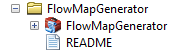
Expanding python toolbox will reveal one script tool as shown below: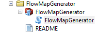
By default, python toolboxes do not display the "pyt" file extension. To display this and other known extensions in ArcCatalog (or the catalog window in ArcMap) check the following: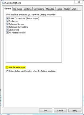
This dialog is accessible in ArcCatalog by clicking Customize > ArcCatalog Options. Unchecking the highlighted option will show the following: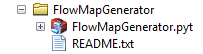
Please direct comments to Bob Gerlt.
You must be a registered user to add a comment. If you've already registered, sign in. Otherwise, register and sign in.