- Home
- :
- All Communities
- :
- Products
- :
- ArcGIS Pro
- :
- ArcGIS Pro Blog
- :
- This Week’s Picks – ArcGIS Pro #3
This Week’s Picks – ArcGIS Pro #3
- Subscribe to RSS Feed
- Mark as New
- Mark as Read
- Bookmark
- Subscribe
- Printer Friendly Page
Welcome to the third act of “This Week’s Picks” - ArcGIS Pro, Product Advocacy’s unofficial recurring GeoNet blog. If you haven’t seen the first two posts, the aim of this series is to highlight some of my favorite ArcGIS Pro content.
This week we’re going to look at some quick mapping tips and tricks for anyone looking to make compelling maps in ArcGIS Pro. For some, every day is Dia de Cartografo (cartography day) but these resources can be used in many mapping scenarios whether you are a daily mapmaker or find yourself creating maps only occasionally. Now on to the picks!
One Minute Map Hacks Series
I love John Nelson’s “One Minute Map Hacks” series. These short (1 min or less) clips cover a lot of area, too numerous to discuss individually but suffice it to say there is something in the series for everyone designing maps whether you’re a map nerd or not! Want to tweak a projection? Check. Give your map a tattered paper effect or create a vignette? Check and check. Oh, derive hillshade that doesn’t wash out your map? He’s got you covered there too.
John has posted two map hack blogs with 5 hacks each. The first, covering 1-5 can be seen here while the second, covering 6-10 can be seen here. If you want to see the full playlist that can be found here. This contains additional map hacks not covered in the aforementioned blogs.
Symbolizing 2D data in 3D with preset layers
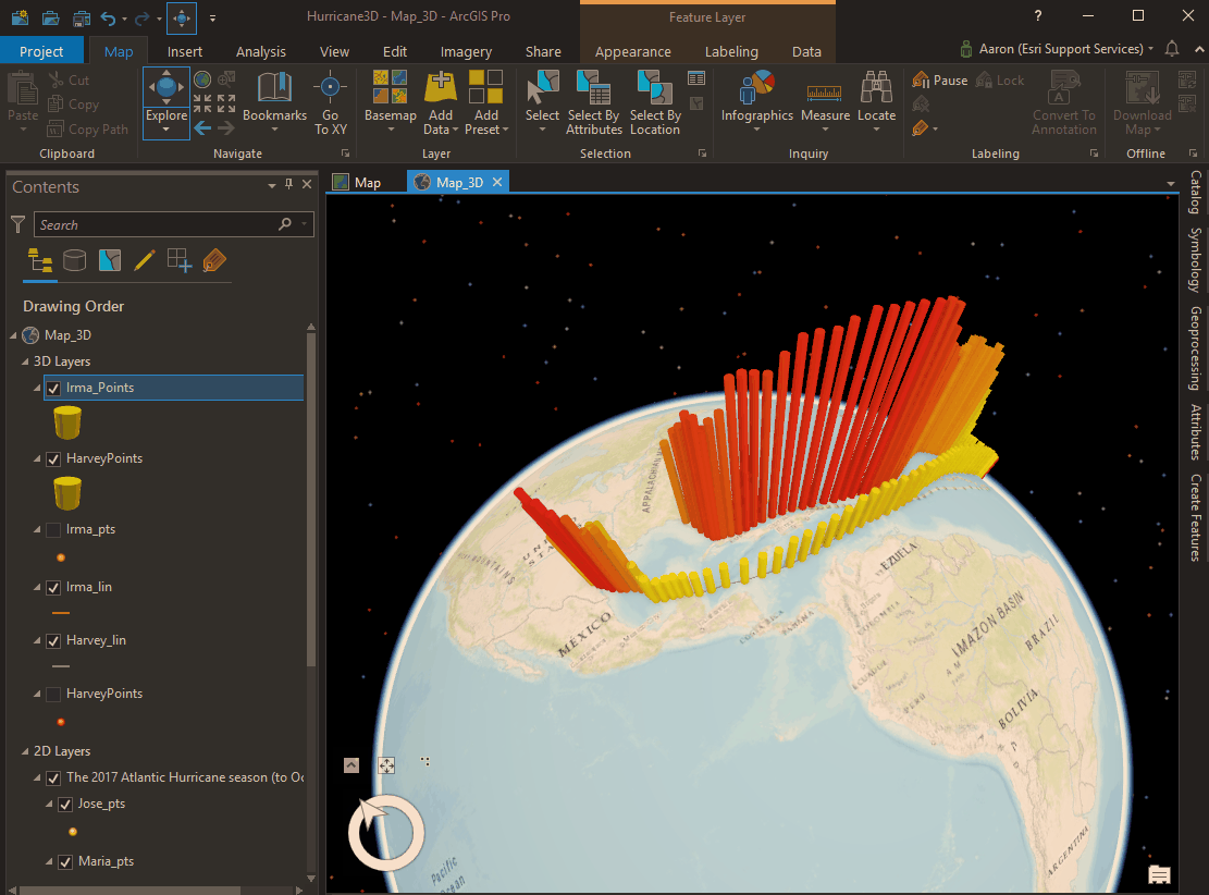
Feature attributes in your 2D data could be used to create 3D symbology, making for a more impactful presentation and overall map. Using preset layers to make energetic symbology is also another potential way to understand the data. This video from Esri Canada shows how this can be done with simple hurricane point data and preset layers to create a dramatic 3D cylinder effect to emphasize the hurricanes intensity. Check it out here.
If you want to experiment with this there are hurricane datasets available on ArcGIS Online that you can export for use with preset layers. In about 5 minutes with a 2017 Atlantic hurricane season feature layer, I was able to use a preset to show the intensity difference between Harvey and Irma as they made landfall:
Additional resources:
Mercator, it’s not hip to be square
When creating maps, the coordinate system plays a part in how the data will be interpreted. If you’re using Web Mercator for your thematic web maps could the results be misleading? Perhaps there is a better option for your web mapping needs? This blog discusses the history of Mercator, what's best for, and proposes some alternative workflows for when you are dealing with smaller scales and thematic content where visual comparison is essential for interpreting the data. Topics also include vector and raster tiles and the when to choose an equal area projection.
Additional resources:
I hope you enjoyed this week’s picks, mapping tips and tricks (or hacks). Thanks for reading and stay tuned for the next round and if you are interested, you can also check out “This Weeks Picks” for ArcGIS Online and ArcGIS Enterprise!
-Aaron
You must be a registered user to add a comment. If you've already registered, sign in. Otherwise, register and sign in.