- Home
- :
- All Communities
- :
- Products
- :
- ArcGIS Survey123
- :
- ArcGIS Survey123 Questions
- :
- Grid meets read only and constraint
- Subscribe to RSS Feed
- Mark Topic as New
- Mark Topic as Read
- Float this Topic for Current User
- Bookmark
- Subscribe
- Mute
- Printer Friendly Page
- Mark as New
- Bookmark
- Subscribe
- Mute
- Subscribe to RSS Feed
- Permalink
I want to conditionally hide a field in my gird. But when I do all the fields move up 1 space, totally messing up my form.
Is there a way around this?
Changing to read only would also work but it does not accept a formula.
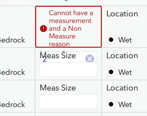
Other issue with grids is the constraint messages. It tries to squeeze it in there, which messes up the field to the point of the user cannot change the value. You cannot click on the X or anything.
Any ideas on these?
thanks
Solved! Go to Solution.
Accepted Solutions
- Mark as New
- Bookmark
- Subscribe
- Mute
- Subscribe to RSS Feed
- Permalink
Hi Doug,
I have a couple of workaround suggestions for dealing with your conditionally hidden grid cell. One is to implement a ‘placeholder’ question such as a Note that is relevant when your conditional cell is not. The width of this ‘placeholder’ question will be factored in to the grid layout even when not relevant which may not suit your survey.
The other suggestion may require you to re-order your cells. As you probably know, questions are automatically placed into a row if they fit. The key here would be to have your conditionally hidden cell on the end of a row and make sure that the following cell width does not fit onto the row.
The ‘readonly’ field can accept an expression so perhaps that is your best bet if this is acceptable to your use case? What expression are you trying to use? I’ve attached an XLSForm with an example of each.
Designing an effective Grid survey requires you to be mindful of your user devices. Could you consider using the default constraint message and then displaying the full constraint failure message as a note in a separate question? Obviously, making the constraint message shorter or the grid cell larger may also help here.
The long constraint message is pushing the input box outside of the grid cell, messing up the form. The correct behaviour occurs on the second and subsequent submit attempts, ie the cell expands to accommodate the custom message and the input box. I’ll create an internal issue to investigate a fix. It would be great if you could also contact the Support team regarding this so they can assign an official bug number that you can track. If the issue is reported by other customers, it will be attached to the same bug number. This helps us understand the impact of the issue and prioritize it accordingly in our development plan.
Thanks,
Brett
- Mark as New
- Bookmark
- Subscribe
- Mute
- Subscribe to RSS Feed
- Permalink
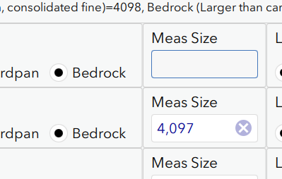
Thanks Brett. I did do the read only one but the issue there is that once you select a radio button choice you can not unpick it. Well at least this happened in 3.6.98 - I just tried 3.6.137 and it is now letting me uncheck it. So that works. But wait. If you select the radio the first time then my other field gets a calc and goes read only. If I uncheck the radio it does come back to editable but then the calc will no longer fire - and the calc circle icon does not ever come back.
Top one is no longer calc
I think grid will be tough to design unless the relevants keep their space. I would have to think of many possible user actions to make sure it doesn't mess up.
On errors how about highlight the field in red but then put the message at the bottom? That way we could always have long messages without issue. Just an idea.
Thanks again
- Mark as New
- Bookmark
- Subscribe
- Mute
- Subscribe to RSS Feed
- Permalink
I also have a style question.
This page says I cannot style a repeat that is inside of a grid. But it seems like I can also not style a repeat that has a gird in it? I have a top level repeat that is not inside of anything but it does have a grid in it. I cannot get it to change color.
My issue is I have one big master repeat around the form. Then I also use pages. And then some more repeats. This causes cases where I have 2 repeat boxes stacked - which is confusing. Is there any way to rename or style the actual + delete section yet?
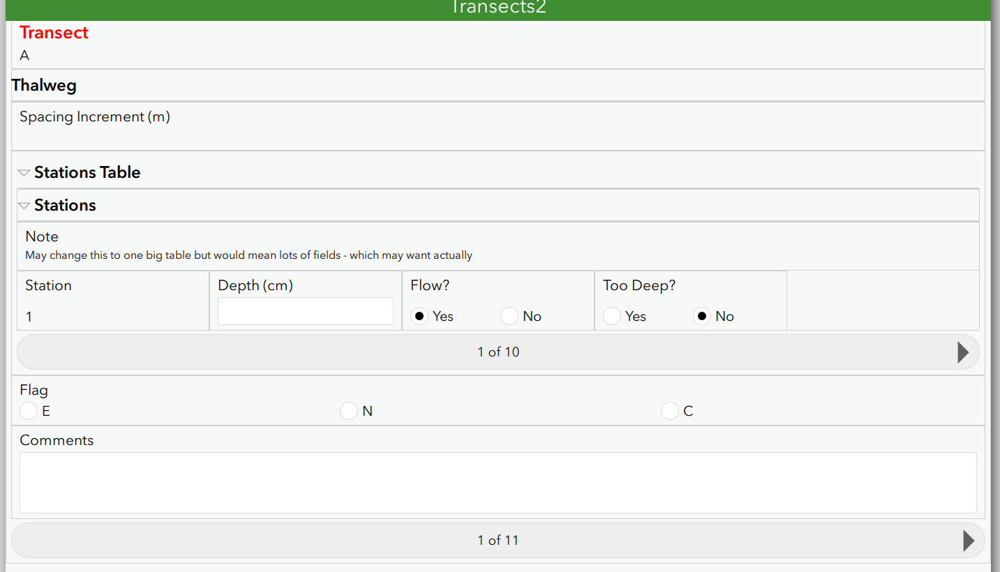
The Transect A at the top goes with the 1 of 11 at the bottom.
thanks
- Mark as New
- Bookmark
- Subscribe
- Mute
- Subscribe to RSS Feed
- Permalink
Hi Doug,
The in-line validation messages were a much requested feature that was implemented in 3.5 so I don't think we'll go back on that feature. I think the fix is straight forward for this as the correct behaviour is happening on the second submit attempt. We just need to get that behaviour to happen on the first attempt! Raising this with support so they assign a Bug number will help get this prioritised.
Brett
- Mark as New
- Bookmark
- Subscribe
- Mute
- Subscribe to RSS Feed
- Permalink
I mean you could highlight the field in red but put the message in a standard spot at the bottom or top. That way the message area is always the same size. The way it is now means I have to have short cryptic messages or break my form.
thanks
- Mark as New
- Bookmark
- Subscribe
- Mute
- Subscribe to RSS Feed
- Permalink
I am going to mark Brett as correct since a if in the read only worked out ok.
thanks