- Home
- :
- All Communities
- :
- Products
- :
- ArcGIS Online
- :
- ArcGIS Online Questions
- :
- Limited Color "palette" Hosted Feature Layer
- Subscribe to RSS Feed
- Mark Topic as New
- Mark Topic as Read
- Float this Topic for Current User
- Bookmark
- Subscribe
- Mute
- Printer Friendly Page
- Mark as New
- Bookmark
- Subscribe
- Mute
- Subscribe to RSS Feed
- Permalink
Hello GeoNet,
Thanks in advance.
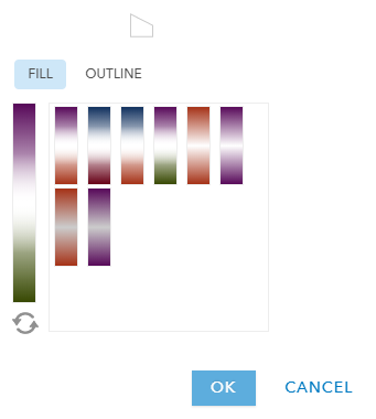
How do I increase the range of colors available in arcgis online for a hosted feature layer? See images and scenario.
Scenario Encountered.
In one account (my student/school) account I have a limited color palette for symbolizing Counts & Amounts. In contrast, my free account has a wide range of color choices. I need to use a hosted feature layer (not available with the free account) to source the data/map for a custom map using the esri javascript api (I hope that is the correct language - new to custom map design).
Solved! Go to Solution.
Accepted Solutions
- Mark as New
- Bookmark
- Subscribe
- Mute
- Subscribe to RSS Feed
- Permalink
Hi Doug,
The colour pallets that you are displaying are for different types of styling your data and will not be affected by your account type, but by the data and style type that you have selected.
Your School screenshot looks like you are using counts and amounts by size which results in a continuous colour ramp based on the theme that you select. More details about this method are available in this story map:
The Screen shot named free looks to be either unique symbols or predominant categories. The Smart mapping theme is selected based on your data type and chosen symbol type. If these are the same data and chosen to be styled the same, the available colours should be the same.
Check out this documentation for more information:
Change style—ArcGIS Online Help | ArcGIS
Style numbers—ArcGIS Online Help | ArcGIS
Style categories—ArcGIS Online Help | ArcGIS
Change Style reference—ArcGIS Online Help | ArcGIS
-Kelly
- Mark as New
- Bookmark
- Subscribe
- Mute
- Subscribe to RSS Feed
- Permalink
Hi Doug,
I believe the color differences you are seeing are because you are utilizing a student account of ArcGIS Online. A student account utilizes ArcGIS for Personal Use (or a Public Account) to access ArcGIS Online. This account offers a limited set of functionality compared to an organizational account.
How did you setup your free account? Is this a trial version of ArcGIS Online? Or something else? I can tell you that with an organizational account in ArcGIS Online, you will see a color palette more along the lines of what you see now with the free account.
Thanks,
Jonathan
- Mark as New
- Bookmark
- Subscribe
- Mute
- Subscribe to RSS Feed
- Permalink
Hi Doug,
The colour pallets that you are displaying are for different types of styling your data and will not be affected by your account type, but by the data and style type that you have selected.
Your School screenshot looks like you are using counts and amounts by size which results in a continuous colour ramp based on the theme that you select. More details about this method are available in this story map:
The Screen shot named free looks to be either unique symbols or predominant categories. The Smart mapping theme is selected based on your data type and chosen symbol type. If these are the same data and chosen to be styled the same, the available colours should be the same.
Check out this documentation for more information:
Change style—ArcGIS Online Help | ArcGIS
Style numbers—ArcGIS Online Help | ArcGIS
Style categories—ArcGIS Online Help | ArcGIS
Change Style reference—ArcGIS Online Help | ArcGIS
-Kelly