- Home
- :
- All Communities
- :
- Industries
- :
- State & Local Government
- :
- State & Local Government Questions
- :
- Traffic flow representation
- Subscribe to RSS Feed
- Mark Topic as New
- Mark Topic as Read
- Float this Topic for Current User
- Bookmark
- Subscribe
- Mute
- Printer Friendly Page
Traffic flow representation
- Mark as New
- Bookmark
- Subscribe
- Mute
- Subscribe to RSS Feed
- Permalink
I recently received an interesting request and I'd like to know what solutions the community might suggest. I should probably also state that I couldn't come up with a workable solution which annoys me hence this post.
The request was to portray historic traffic data on a map, particularly at intersection in order to view which intersection were leading to long wait times. Sounds simple enough on the face of it. However, given the focus on intersections it was important to delimit the data by lane (left turn, through traffic, right turn). As far as I can tell the only freely available road data for the contiguous US comes in vector line format giving no width nor distinction between lanes.
Does anyone have any potential solutions as to how to map this? I drew blanks and cycled through various notions including, symbology, cartographic representation and creating new features for each lane at each intersection. None of which turned out to be that practical. In addition, the intersection location is ostensibly point data and so symbolising four different directions (based on many potential combinations of flow data) didn't seem practical either.
If anyone does have any ideas I'd really like to hear from you.
- Mark as New
- Bookmark
- Subscribe
- Mute
- Subscribe to RSS Feed
- Permalink
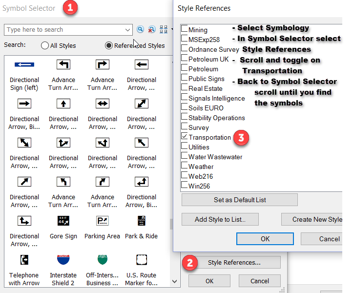
Lines can of course be symbolized based on line type varying the width, perhaps, to represent volume, but the point symbology that is the default doesn't have much. You could get started by looking at the Transportation Symbols as shown below. Beyond these built-ins, you could construct your own. The attached image will at least get you to the place to explore available default options
- Mark as New
- Bookmark
- Subscribe
- Mute
- Subscribe to RSS Feed
- Permalink
"The request was to portray historic traffic data on a map, particularly at intersection in order to view which intersection were leading to long wait times." How is the data given to you? Are they giving you the queue line lengths? Or just LOS (Level of Service) for each lane and then asking you to graphically represent it?
I would assume they are giving you LOS per lane. In which case you could rate intersection via color dots for what is the worst LOS lane in that intersection. This way you could map many intersection on one map and see patterns and trends. If one lane has horrible LOS then the intersection as a whole needs individual attention which is why you could get away with just a dot and not identifying the lane in the map. If you want to get more detailed you can have a layer for every type of lane (Left Lane, Left/Thru Lane, Thru Lane 1, Thru Lane 2, etc.) and use the same dot or better a colored sign indicating LOS and travel directions. But with that method you can only show only a couple or just one intersection at a time. If you filter the LOS to show only failing lanes then you could probably get away with more intersections shown on a map.
If you want to get real fancy with it you could combine both methods and have the Lane LOS information turn on once you zoom into an intersection. This method would be most useful for a Traffic Engineer to quickly access intersection issues from their desktop or in a presentation setting.
If you have no LOS data and they are asking you figure out what intersection are leading to long wait times, well that's a data collecting issue. Turn counts are needed and those kinds of things aren't cheap. An indirect way of figuring out if an intersection is having LOS issues is to look at crash data. Long lines at intersections will have a lot of rear end crashes away from the intersection where drivers weren't expecting to stop so far way from an intersection. For turning LOS you'll see angle crashes. This is especially true for turning lanes that are thru lanes too. Turning traffic causes traffic to build and then thru traffic at the rear of the line will change lanes and get into a crash. These conclusions can really only be vetted by looking at the crash reports filled out by the police. A good police officer will note where the crash is relative to the intersection and sometimes write the drivers reason for their driving actions, "Driver was changing lanes due to backed up traffic." This method is really time intensive task that is usually only done when an intersection has been flag as a high crash area and then a traffic study is done on that road/intersection where every crash report is read and depicted on a map along with the rest of crashes to see patterns and trends.
If you let me know what data you are given I may help you figured out a good method to convey the most pertain information and hide the rest of the information in the background.
- Mark as New
- Bookmark
- Subscribe
- Mute
- Subscribe to RSS Feed
- Permalink
Anthony, thank you. This is very helpful.
I have been provided with LOS data and I believe it came from HCS McTrans Center. The goal posts have moved a little since I last posted. The new requirement is:
Static map (e.g. pdf) by approach movement and 3 time periods (am, midday, and pm)
My feeling is that identifying the worst LOS for each time period for each intersection using the data I have could work. That way I could add labels identifying the direction the problem is at (Eastbound etc) and use different symbols to indicate direction of lane (Left turn etc) using a colour scheme on those symbols to indicate LOS.
The static map is still likely to be problematic given the extent and spread of intersections. Employing data driven pages might solve that but the requester is not keen on any form of inset or zoomed view. Webmapping is also not an option.
- Mark as New
- Bookmark
- Subscribe
- Mute
- Subscribe to RSS Feed
- Permalink
Are the LOS letter graded or actual numbered? I had a second idea that may prove useful. You could use dots with colors and numbers inside them too to indicate how many lanes at the intersection are at a specific LOS or lower. This would help show the extend of the issue at an intersection. The number of bad lanes to good lanes may also be useful but too difficult to fit clearly in a map. Numbered LOS would be best if you had it so you could separate the barely failing lanes from the greatly failing lanes. Essentially help prioritize the failing lanes/intersection. Indication of travel (east bound) would be very useful information to give, I'll keep that idea in the back of my head for future projects. It's unfortunate they want only static mapping. You'll have to generalize data and hide a good bit of some useful information to show the most pressing information clearly. Depending on the density of some areas multiple maps may be required. That or one very big map, lol.
Glad I help you out a bit. If anything I hope I was a catalyst to helping you get to a final solution if none my ideas prove viable.