- Home
- :
- All Communities
- :
- Products
- :
- Spatial Statistics
- :
- Spatial Statistics Questions
- :
- Trouble with cold spots in Optimized Hot Spot Anal...
- Subscribe to RSS Feed
- Mark Topic as New
- Mark Topic as Read
- Float this Topic for Current User
- Bookmark
- Subscribe
- Mute
- Printer Friendly Page
Trouble with cold spots in Optimized Hot Spot Analysis
- Mark as New
- Bookmark
- Subscribe
- Mute
- Subscribe to RSS Feed
- Permalink
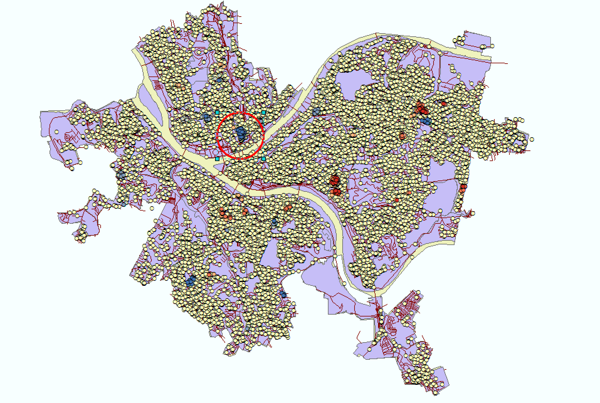
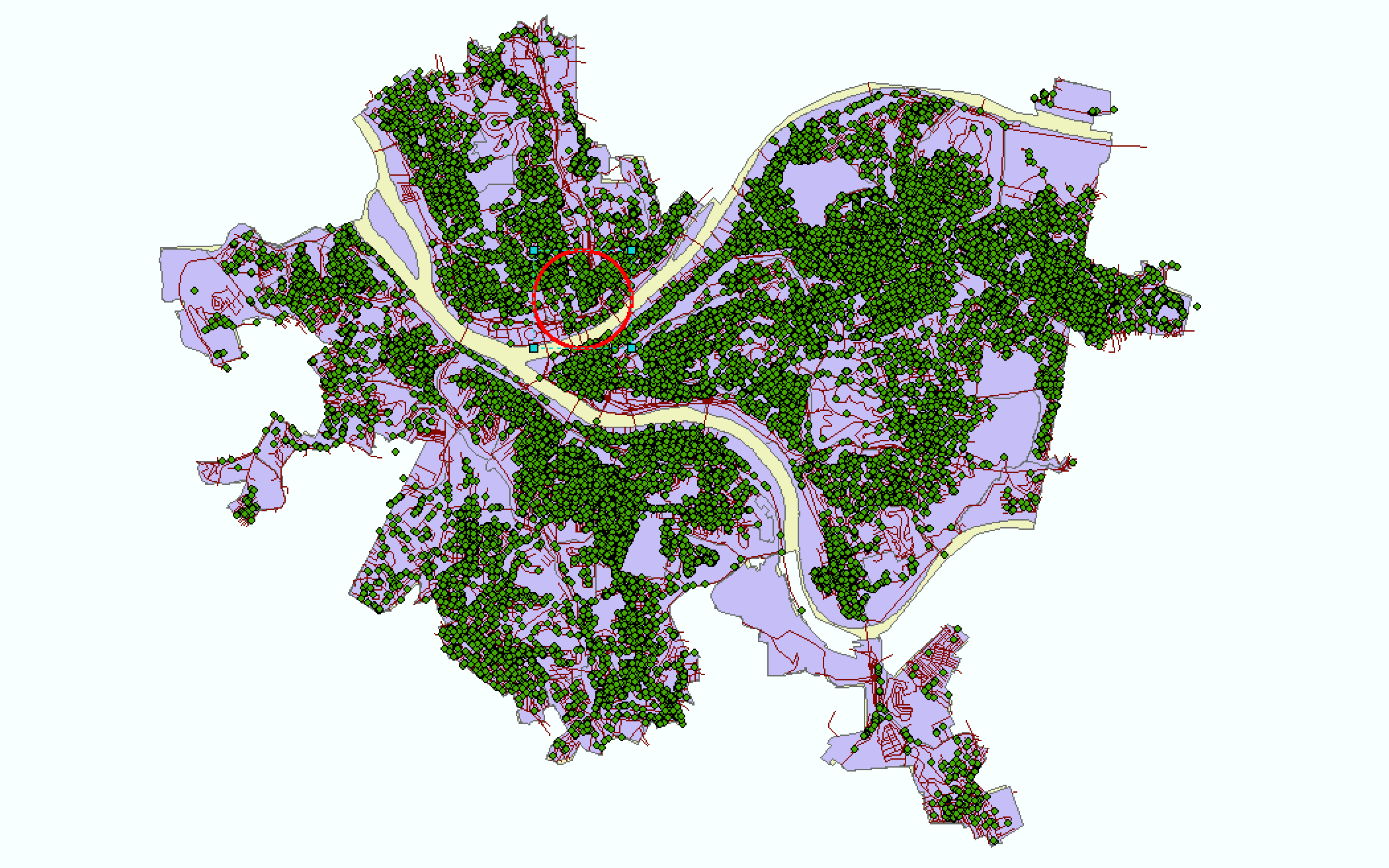
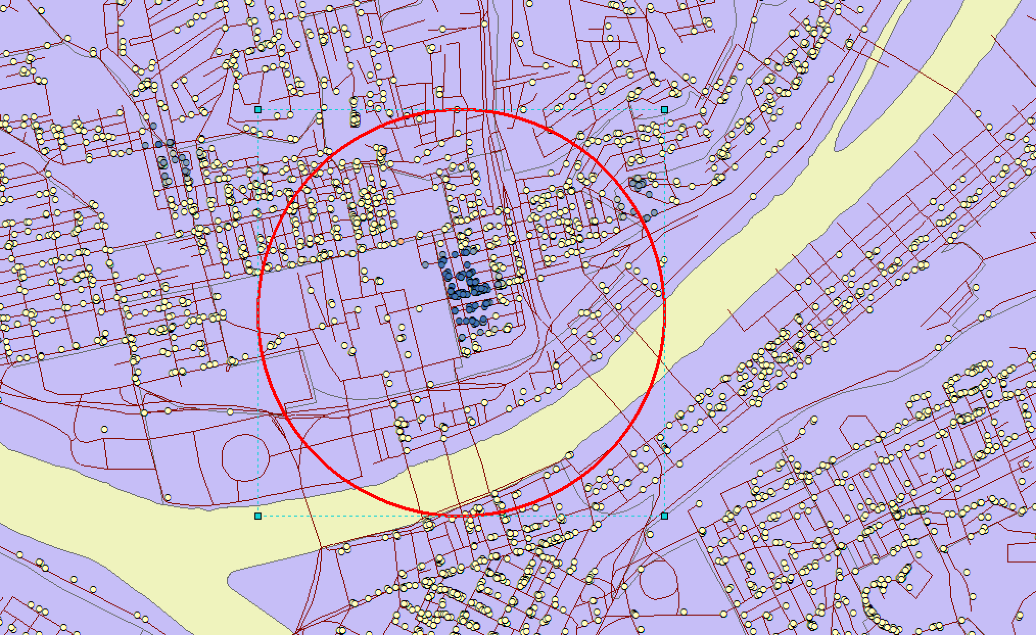
Hello everyone. I am running optimized hotspot analysis for point crime data. The hot spots identified in the analysis make sense to me but the cold spots do not align with a visual inspection of the data. My understanding is that cold spots represent low cell values (i.e., low crime counts as aggregated into cells using a fishnet cell overlay) surrounded by other low cell values. On visual inspection, it seems like there are many areas on the graph that are a lot “colder” than the identified cold spots. If anyone could assist with interpreting these cold spots, it would be greatly appreciated. I have attached 4 screen shots with the area in question circled in red. My email is [email protected]
Solved! Go to Solution.
Accepted Solutions
- Mark as New
- Bookmark
- Subscribe
- Mute
- Subscribe to RSS Feed
- Permalink
Hello,
Looking at the screenshots the hot and cold spots are for point values. What settings did you use in optimized hot spot analysis ? Selecting an analysis field it will calculate hot spots of the analysis field values. Leaving the analysis field blank will run the hot spot analysis by aggregating the points into a grid an analyzing the counts.
- Mark as New
- Bookmark
- Subscribe
- Mute
- Subscribe to RSS Feed
- Permalink
Hi Ryan,
Yes, you are 100% right. I actually was playing around with it this afternoon and saw that if I leave the Field blank, the analysis works. But thanks so much for confirming!