Nonprofit Program Blog

cancel
Showing results for 
Show  only  | Search instead for 
Did you mean: 

Other Boards in This Place

Latest Activity

(8 Posts)
ShareUser
Esri Community Manager

Announcing the release of the Community Mapping for Racial Equity and Social Justice tutorial collection, designed to equip young mappers with essential ArcGIS skills and focuses on mapping local communities through the lens of Racial Equity and Social Justice (RESJ) workflow.   

Read more...

more
0 0 107
by Anonymous User
Not applicable

Join us for a webinar and hear from nonprofits using storytelling.

Sign up here

Storytelling-Maps-Nonprofit-Webinar.jpg

Read more...

more
0 1 1,031
by Anonymous User
Not applicable

At the 2021 Esri FedGIS Conference, get inspired, connect and engage with leaders and peers, and learn about innovative solutions that can help you continue to make smarter, data-driven decisions.

Read more...

more
0 0 1,457
by Anonymous User
Not applicable

GIS Corps Mission
Operating under the auspices of URISA, GISCorps coordinates short-term, volunteer-based GIS services to communities in need worldwide.
GIS Corps Program

GISCorps provides volunteer GIS professionals to nonprofit organizations, non-governmental organizations, public entities, and professional associations. GISCorps also occasionally supports social enterprises or businesses undertaking a project for humanitarian purposes rather than for profit.

Request Volunteers

If you’re ready to request one or more volunteers, please start by filling out the form below to indicate your interest in partnering with GISCorps. We’ll then provide you with a link to our Volunteer Request questionnaire, where you’ll tell us more about the current project and volunteer request.

If you’ve partnered with GISCorps before, click here to go straight to the Volunteer Request questionnaire.

We will contact you after reviewing your questionnaire responses to further discuss the details. Thank you for your interest in GISCorps volunteers!

GIS Corps

more
0 2 1,534
by Anonymous User
Not applicable

Welcome to the Nonprofit Geonet Space –Let’s get started!

Welcome and thanks for joining the Nonprofit Program group onGeoNet! To get started we invite you to first review the group features on the overview page and familiarize yourself with the group info, admins, and GeoNet 101 information in the left column.

  • Share your own examples and workflows with the broader nonprofit community
  • Blogs/webinars and events from Esri 
  • Product pricing and updates for the nonprofit program
  • Share questions and issues and get answers from other nonprofit members and Esri staff

As you explore the group, you’ll also find tools to connect and collaborate so we encourage you to use them to share files, create blogs, ask/answer questions and read the latest blog posts and join discussions.

Next, we invite you to post a comment below to say “hello" and introduce yourself and share what you are looking forward to with this group.

We’re excited to connect and collaborate with you and we look forward to seeing your contributions.

more
10 19 4,158
by Anonymous User
Not applicable

We wanted to share with you a few different guides that you can use to help plan your time during the 3-day conference.

Nonprofit Agendas

Diversity, Equity, Inclusion & Racial Justice at the Esri User Conference 2020 

Sustainable World Events and Activities UC 2020.pdf 

Nonprofit Tips

Many of us will be attending the Plenary sessions along with you, but during Expo hours, users will have the opportunity to chat with us live, schedule 15-minute meetings with Account Managers, and visit the virtual kiosks of other Nonprofit organizations. We will be listed under terms like: Sustainable World, Nonprofit, Racial Equity & Social Justice, humanitarian, and conservation

All times for expo hours will be in Pacific Standard Time, with an afternoon session on Monday, then morning and afternoon sessions on Tuesday and Wednesday. 

There are other "virtual queues" you can place yourself into and these will range in topics from Esri products (ArcGIS Pro, Drone2Map), Esri programs (Esri Partner Network, Education), artificial intelligence, Imagery and Drone, local government solutions, and all other topics typically found on the expo floor in San Diego. 


more
0 0 620
by Anonymous User
Not applicable

Go to the data viewer

COVID-19 is amplifying health, racial, and economic inequality to create disparities in outcomes in the US.  Both illness and death rates are higher in communities of color. Health data shows the impact of the pervasive effects of racism in the United States. Health data is showing that…

In response, communities and companies are analyzing risks and designing equitable solutions. However, that challenging work begins with data. The new COVID-19 Health, Racial, and Economic Equity data gallery helps you start understanding and addressing inequity in your community. The data is now available on the Esri COVID-19 GIS Hub. This gallery contains a collection of Esri maps, data, and apps that can help guide decisions around health, racial, and economic equity during COVID-19 and beyond. This means that it includes layers related to the social determinants of health. More specifically, these include: economic stability, neighborhood and physical environment, education, food, community and social context, and health care system. These layers can be used to analyze racial inequity during COVID-19 (for guidance, see ArcGIS Blog Analyze Racial Inequity During COVID-19).

What Data Can I Find in the COVID-19 Health, Racial, and Economic Equity Collection?

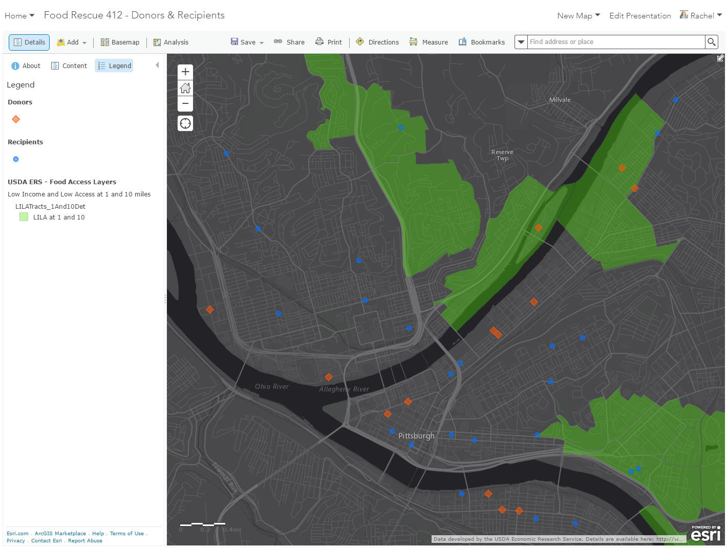
The gallery currently includes geographic data on the following: race, ethnicity, age, gender, immigration, language, child well-being, senior well-being, disability status, health insurance, income, disposable income, home ownership, housing costs, air quality, homelessness, diversity, food access, savings vulnerability, education, internet access, family living arrangements, population, poverty, transportation, unemployment, social vulnerability, occupations, business & economic vulnerability, life expectancy, low birth weight, COVID-19 providers, social distancing, and more. These ready-to-use layers, maps, and apps are available in ArcGIS Living Atlas of the World and can be used across the entire ArcGIS platform.

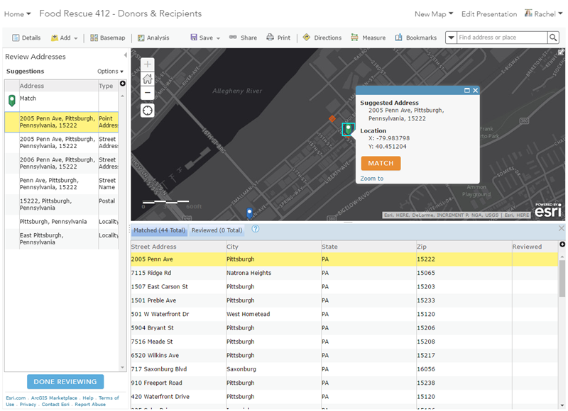
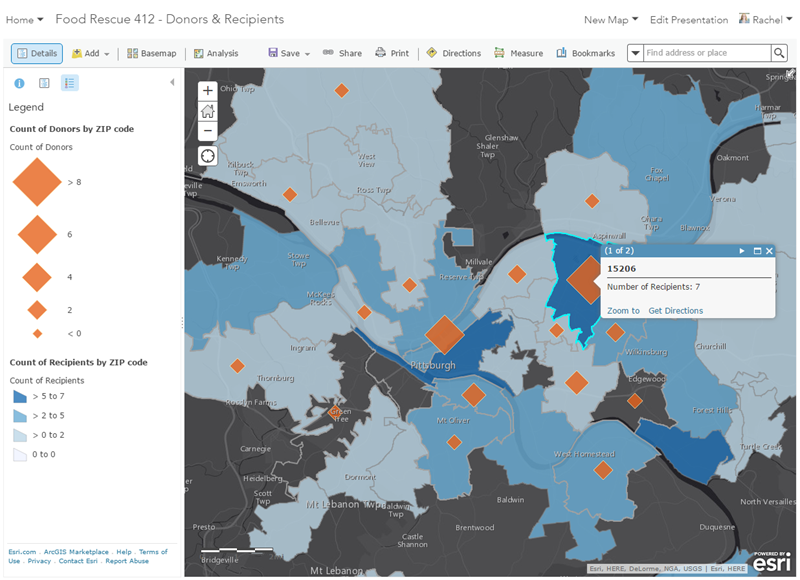
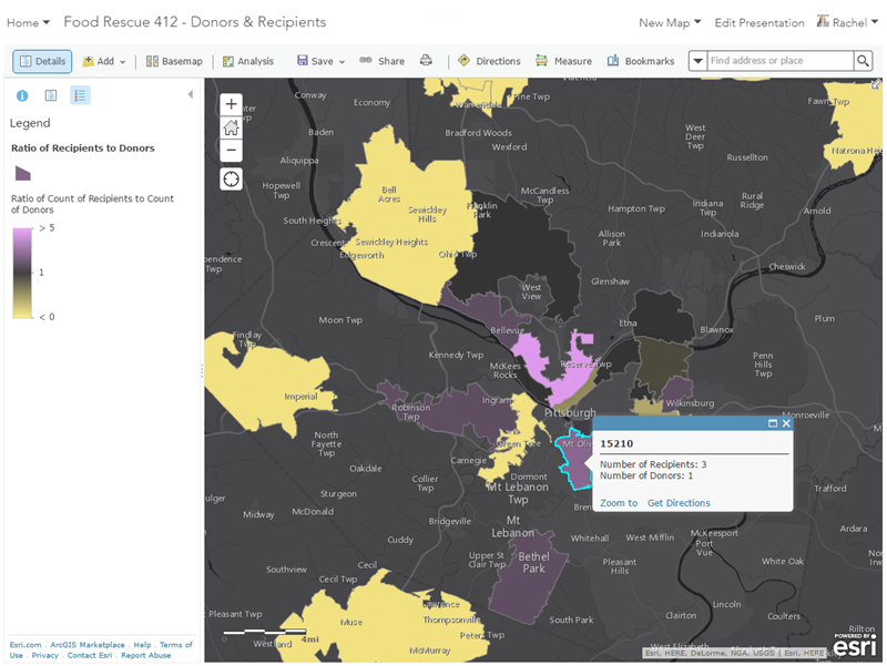
This collection is constantly growing as new data layers, maps, and other items become available. You can use the filter on the left of the application (shown in the screenshot below) to find data on specific topics.

Go to the data viewer

more
0 1 622
RachelWeeden
Esri Contributor

It all started with a Tweet:

A GIS call-to-action! I was curious how I could help, so I quickly Googled 412 Food Rescue (hint: they partner with food retailers, wholesalers, restaurants, etc. and redirect perfectly good food that would otherwise go to waste to community members in need) to learn a little more, and then responded to the Tweet. A few days later, I had a phone call with Jennifer England, Director of Operations at 412 Food Rescue; she explained to me that they had spreadsheets listing their donors and recipients and had dabbled with mapping those datasets before, but wanted to further explore how GIS could help her organization.

As Jennifer and I were talking, it wasn't hard to come up with ideas of how GIS could provide new insights. We agreed that she would send me data on their food donors and recipients, and I'd spend a little time working on some ideas that we could review together.

Based on what Jennifer wanted to achieve and the fact that they were new to GIS, I wanted to do this work in ArcGIS Online. I had a few reasons why ArcGIS Online was a great fit for this project:

  1. Ease of working with tabular data: Jennifer's donor and recipient lists were simple Excel spreadsheets with address information. Publishing a CSV file as a hosted feature layer provides geocoding and address review capabilities , which meant I could very quickly and easily covert her tabular data into accurate points on the map in a web-friendly format. Also, using this method means that I only need to geocode/upload the data once, and then it's available for re-use for other maps and  projects. As an aside - I find that many people are not aware of the ability to review/match addresses when batch geocoding in ArcGIS Online - the interface shows candidates and match types, making it easy to select the right location:FRMap3.png
  2. Tools for simple spatial analysis: Getting the points on the map was just the first step - but we needed to go further in order to answer questions like how is the data distributed, or what gaps in coverage exist. A first step was a spatial join - aggregating the donors and recipients to a common geography (ZIP codes, in this case). That's a standard operation for those who know their way around GIS software - but again Jennifer's organization was new to GIS and doesn't have access to ArcGIS Desktop or other tools. One of the great things about ArcGIS Online is that it takes some of the most common GIS operations and makes them accessible to anyone. From the ArcGIS Online web map, I used the Summarize Data: Aggregate Points tool to create a new layer of ZIP codes with donor and recipient counts - now, Jennifer and her staff have a clearer view of the spatial distribution of their data:FRMap2.png
  3. Smart Mapping: Prior to us working together, Jennifer had seen her data as points on a map - but she had not been able to style the data in ways that allow for further exploration of the relationships in the data. Once the spatial joins were done, we could really dive in and see what the data was telling us. A simple way to do this is with symoblogy. Smart Mapping  make it easy for those like Jennifer who are new to GIS apply fairly sophisticated cartographic techniques that can tell you so much about your data. For example, by selecting two variables and the 'Compare A to B' option, we could easily see ZIP codes where there was not a balanced number of recipients and donors:FRMap1.png
  4. Ability to add external data to your map: There are some great web maps that show food access and scarcity (like this example from Jim Herries), and a lot of work went into collecting and creating data that show poverty rates, distance to supermarkets and food spending. Jennifer asked was if we could add some of these already-existing layers to provide additional context that would help drive more informed decision-making in her organization. One data source that Jennifer wanted to use was the USDA Food Environment Atlas - they have dozens of map services pulled into a web app that gives a spatial overview of many food environment factors. These map services can easily be added into any ArcGIS Online map using the Add Layers from Web tool (which supports WMS, KML, GeoRSS and other common formats). One of the first layers I added was census tracts that have low income and low access to food - overlaying this with their donors and recipients will help Jennifer determine where areas of need are that they could expand into: FR4.png

Using these techniques, I was able to create a web map that 412 Food Rescue can start to use to explore the spatial relationships of their data - as they do, I'm sure more questions will come up, and it will be fun to continue working with them to refine the project. Some ideas I already have are incorporating Living Atlas content and exploring some additional analysis tools.

more
0 1 1,917
41 Subscribers