Turn on suggestions
Auto-suggest helps you quickly narrow down your search results by suggesting possible matches as you type.
Cancel
- Home
- :
- All Communities
- :
- Products
- :
- Mapping
- :
- Mapping Questions
- :
- Visual Representation (pie-chart) or Similar
Options
- Subscribe to RSS Feed
- Mark Topic as New
- Mark Topic as Read
- Float this Topic for Current User
- Bookmark
- Subscribe
- Mute
- Printer Friendly Page
Visual Representation (pie-chart) or Similar
Subscribe
1184
1
03-25-2019 10:58 AM
03-25-2019
10:58 AM
- Mark as New
- Bookmark
- Subscribe
- Mute
- Subscribe to RSS Feed
- Permalink
Hello,
I am trying to create a pie chart/ some visual representation of data to show a combination of attributes. I have zipcodes of businesses and the type of businesses in a single attribute table. I would like to show the number of a certain type of business based on the zipcodes. So, if I have 2 businesses with a SIC code 3, and 5 businesses with a SIC code 7, all in one zipcode area, I want the map to show a chart/ graph of the 2 businesses and 5 businesses.
I have tried to create a pie chart based on this information but, I need to have 2 comparable attributes to do this, which is not what I have.
Thanks!
1 Reply
03-29-2019
10:00 AM
- Mark as New
- Bookmark
- Subscribe
- Mute
- Subscribe to RSS Feed
- Permalink
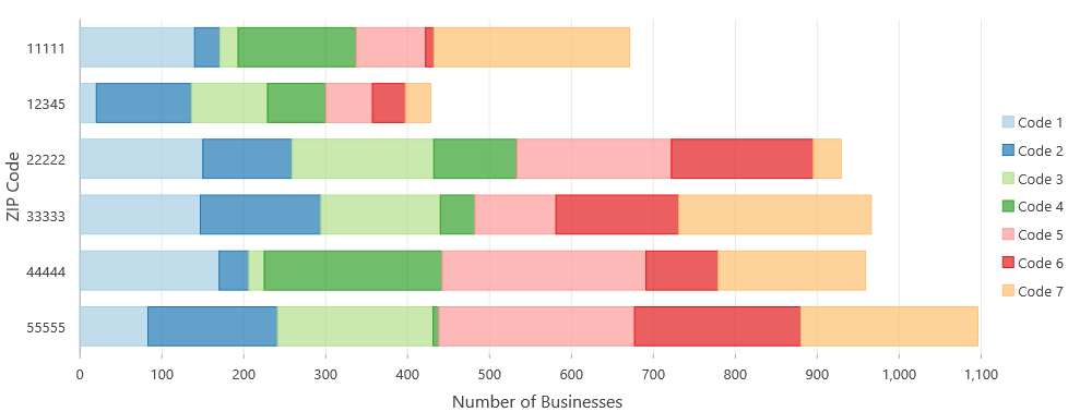
Maybe a stacked bar chart?
Example: