Turn on suggestions
Auto-suggest helps you quickly narrow down your search results by suggesting possible matches as you type.
Cancel
- Home
- :
- All Communities
- :
- Products
- :
- Mapping
- :
- Mapping Questions
- :
- Re: Visual Comparison of two maps with same color ...
Options
- Subscribe to RSS Feed
- Mark Topic as New
- Mark Topic as Read
- Float this Topic for Current User
- Bookmark
- Subscribe
- Mute
- Printer Friendly Page
Visual Comparison of two maps with same color ramp and different data range
Subscribe
2475
1
07-10-2012 07:08 AM
by
Anonymous User
Not applicable
07-10-2012
07:08 AM
- Mark as New
- Bookmark
- Subscribe
- Mute
- Subscribe to RSS Feed
- Permalink
Original User: magar1982
Hello everyone,
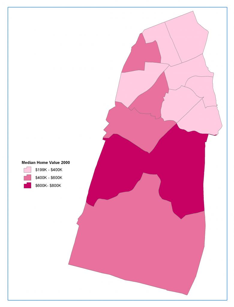
I am trying to make a choropleth maps of same variable (Median Home Value) over different time period to compare them visually. In attached maps, visual comparison might be misleading since highest data range has same color ( dark pink) but their value are different. Is there way to set color ramp according to data range (Min/Max value)?.
Thanks
[ATTACH=CONFIG]15919[/ATTACH] [ATTACH=CONFIG]15920[/ATTACH]
Hello everyone,
I am trying to make a choropleth maps of same variable (Median Home Value) over different time period to compare them visually. In attached maps, visual comparison might be misleading since highest data range has same color ( dark pink) but their value are different. Is there way to set color ramp according to data range (Min/Max value)?.
Thanks
[ATTACH=CONFIG]15919[/ATTACH] [ATTACH=CONFIG]15920[/ATTACH]
1 Reply
by
Anonymous User
Not applicable
07-11-2012
07:45 AM
- Mark as New
- Bookmark
- Subscribe
- Mute
- Subscribe to RSS Feed
- Permalink
Original User: withershin
In the symbology, import the color ramp and ranges rather than setting them individually. So just set the first layer and then copy the symbology to each other version. This way the color ramps will be the same across all of your features regardless of their actual values. I sometimes cheat and make a dummy polygon with the lowest value and highest value of my entire actual datasets and then set the symbology on this layer. I then use the the dummy layer in 'import symbology'
In the symbology, import the color ramp and ranges rather than setting them individually. So just set the first layer and then copy the symbology to each other version. This way the color ramps will be the same across all of your features regardless of their actual values. I sometimes cheat and make a dummy polygon with the lowest value and highest value of my entire actual datasets and then set the symbology on this layer. I then use the the dummy layer in 'import symbology'