- Home
- :
- All Communities
- :
- User Groups
- :
- GIS for Geology
- :
- Questions
- :
- How to create a vertical interpolated surface?
- Subscribe to RSS Feed
- Mark Topic as New
- Mark Topic as Read
- Float this Topic for Current User
- Bookmark
- Subscribe
- Mute
- Printer Friendly Page
How to create a vertical interpolated surface?
- Mark as New
- Bookmark
- Subscribe
- Mute
- Subscribe to RSS Feed
- Permalink
I'm not sure if I am just using the available tools incorrectly or there currently is no tool available that can solve my problem, but I will try to explain my problem the best I can;
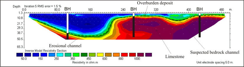
So I have performed an ERT servery to acquire various resistivity values at depth along a straight survey line. I have a point file along the line where the electrodes were located with measured values directly below these points, giving me a vertically oriented 2D array of points. What I am trying to do is interpolate a raster surface between these points to essentially create a cross-section raster that displays the variation in resistivity with respect to depth.
If the explanation of what I am trying to do does not make any sense, the output I am trying to achieve looks like the inversion image on the ERT Wikipedia page (Electrical resistivity tomography - Wikipedia ).
I have tried the various interpolation tools available in ArcScene, but they can't return a vertically oriented raster.
I have included one of the data sets i'm trying to interpolate if you want to try something out.
If anyone has a suggestion on what to try or where I might be going wrong I would be very appreciative!
- Mark as New
- Bookmark
- Subscribe
- Mute
- Subscribe to RSS Feed
- Permalink
3D interpolation is on the roadmap for ArcGIS Pro
https://community.esri.com/docs/DOC-12346-arcgis-pro-roadmap-september-2018
Have you looked at slices? Is this a profile along a line? or samples over an area?
If it were a profile along a line you could map distance versus depth and interpolate that
- Mark as New
- Bookmark
- Subscribe
- Mute
- Subscribe to RSS Feed
- Permalink
I have attempted to use the various 3D interpolation functions and the slice.
However, they only return a horizontal raster surface that does not show how resistivity changes with depth.
I am trying to get a vertical profile along a line.
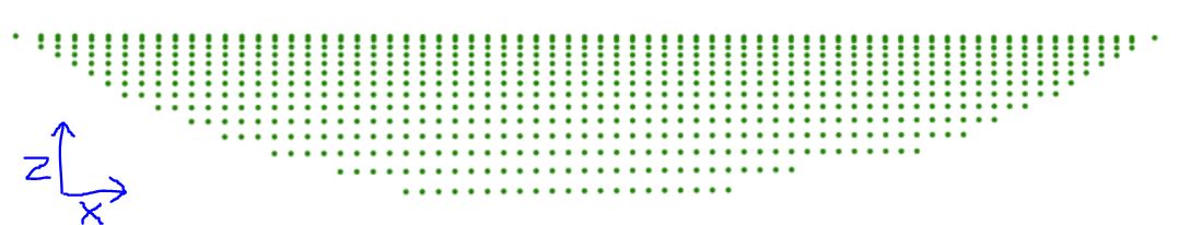
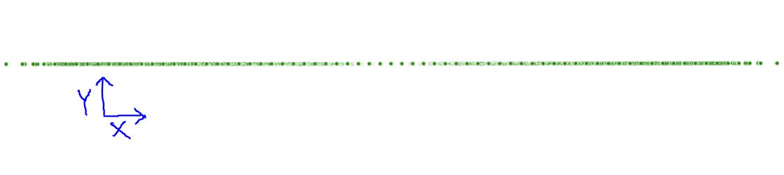
The point distribution is shown the first images below, and I am trying to get something similar to the third.
- Mark as New
- Bookmark
- Subscribe
- Mute
- Subscribe to RSS Feed
- Permalink
Dylan, that is why I asked if your data were along a profile line.
If they are, you need to calculate the distance between the X, Y locations, that becomes your horizontal axis (X.
Depth is your Y axis.
Resistivity is now your value at location (distance, depth) not at (X, Y).
So it is a 'map', just turned on an axis. Currently Arc* is not the platform to do that. There are many graphing packages (including some supplied with ArcGIS PRO) that handle this type of data.
For 3d plots where x and y have spacing
Sample plots in Matplotlib — Matplotlib 2.2.3 documentation
2D interpolation regardless what the 2 axes are
Contour plot of irregularly spaced data — Matplotlib 2.2.3 documentation