- Home
- :
- All Communities
- :
- Products
- :
- GeoAnalytics Engine
- :
- GeoAnalytics Engine Blog
- :
- Generating network paths from high volume movement...
Generating network paths from high volume movement data
- Subscribe to RSS Feed
- Mark as New
- Mark as Read
- Bookmark
- Subscribe
- Printer Friendly Page
Working with raw GPS data points can be challenging due to the volume of data and margin of error associated with GPS coordinate accuracy. ArcGIS GeoAnalytics Engine has a number of tools to help in processing and converting GPS data points so they can be used more easily in your analytics - for instance, the SnapTracks tool to "snap" GPS points to a road network, ReconstructTracks to connect sequential points into tracks, or Find Dwell Locations to identify when an asset being tracked has been stationary within set time and distance boundaries. While these tools are incredibly useful for many datasets, some questions and data types require more complex methodologies – like how can you convert the cloud of GPS points for hundreds or thousands of vehicles into a coherent line representing the central path? We’ll explore this problem in the context of identifying shipping lanes, using hundreds of millions of data points from the Automatic Identification System (AIS) for shipping vessels.
For our analytics, we will incorporate two new features from the GeoAnalytics Engine 1.2 release that make the process significantly easier: ST_Centerline and ST_BboxIntersects.
About the data
The AIS data that we are using consists of GPS locations for shipping vessels near the U.S. coast. The data are available from MarineCadastre.gov and include details on location, time, vessel type, speed, length, beam, and draft. For this example, we will start with ~242 million raw data points (one month of data).
To more clearly demonstrate the method for creating a set of single linestrings representing the main shipping lanes, we’ll simplify to focus on data in one area around the Galveston Bay in Texas, but at the end we’ll look at performance and scaling up the analyses to demonstrate the efficiency of working in GeoAnalytics Engine.
Preparing the data for analysis
The first step in just about every analytics workflow is to clean and prepare the data for analysis. For this workflow we are going to:
- Read in the data
- Create geometry and timestamp fields so that we can identify paths based on location and time
- Filter on attributes to only include the cargo and tanker class vessels
- Adjust the coordinate system to an equal area projection so that when we spatially bin the data the bins will be the same area
- Spatially filter the data to just the Galveston Bay area
This initial step of reading in the data and preparing it for analysis looks like this:
# read AIS observations
observations = spark.read.parquet(f"{data_dir}/{parquet_file}")

# create geometry and timestamps
observations = observations\
  .select(
        "MMSI",
        F.to_timestamp("BaseDateTime").alias("timestamp"),
        ST.point("lon", "lat", 4269).alias("geometry")
  )
# filter to cargo and tanker class vessels
observations = observations.where("vesseltype between 70 and 89")

# transform to projected coordinate system
world_cylindrical_equal_area = 54034
observations = observations.withColumn("geometry", ST.transform("geometry", world_cylindrical_equal_area))

# filter to analysis extent
bay_extent = (-10618709.0729918, 3107437.29107338, -10519821.7905498, 3153061.02094871)
observations = observations.where(ST.bbox_intersects("geometry", *bay_extent))
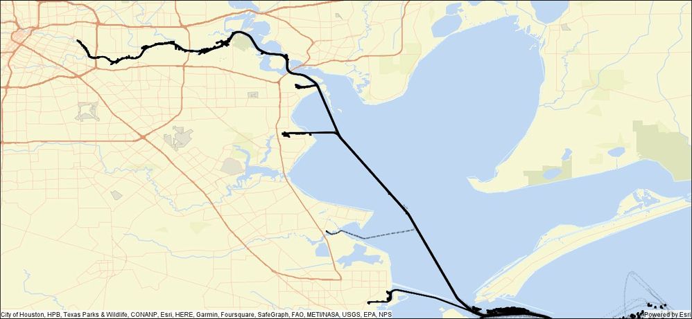
At this point in time, we will have a dataset that is ~1.2 million records. We can see the shipping lanes taking shape visually – but at this point it’s just a lot of individual points coalescing to form visual lines.
When we zoom in, we can see that it’s still a messy dataset with a lot of variation and noise in the paths.
Remove Dwells
In the detailed image above, we can see a particularly large amount of noise north of the area that looks like the main shipping lane. This is likely where vessels have anchored for periods of time. We don’t want that noise to skew our centerline calculations, so we can use the Find Dwell Locations tool to identify the points and remove them from our analyses.
In this case, we are defining a “dwell” as when a vessel hasn’t moved more than 500 meters within 120 minutes.
# find dwells
from geoanalytics.tools import FindDwellLocations

result = FindDwellLocations() \
            .setTrackFields("MMSI") \
            .setDistanceMethod(distance_method="Planar") \
            .setDwellMaxDistance(max_distance=500, max_distance_unit="Meters") \
            .setDwellMinDuration(min_duration=120, min_duration_unit="Minutes") \
            .setOutputType(output_type="Allpoints") \
            .run(dataframe=observations)
The dwell locations are identified in red below – and they seem to nicely match with the areas just off the main shipping route where the ships would reasonably anchor while waiting.
Convert AIS data into tracks for each vessel
Now that the Dwell points have been identified, we can easily select out the remaining points to convert into tracks for each vessel. To do this, we use the Reconstruct Tracks tool to connect the GPS points for each individual vessel (identified by the MMSI attribute) and limit the points used to only those where the DwellID is Null. This results in 1,172 unique vessel tracks.
From geoanalytics.tools import ReconstructTracks

tracks = ReconstructTracks()\
  .setTrackFields("MMSI")\
  .setDistanceMethod("Planar")\
  .setDistanceSplit(1, "kilometer")\
  .run(observations_dwell.where("DwellID is Null"))\
  .localCheckpoint()
Now, we have more than 1,100 unique vessel tracks, but we still need to reduce them down to a single polyline representing the shipping path. We can do that by:
- aggregating the tracks into bins
- identifying the bins with the greatest traffic through them
- converting the path through these high-traffic bins into shipping paths by finding the centerline through the bins
Aggregate the tracks into bins and identify the heaviest traffic bins
While we could visually pick out the overall pathway most traveled by the vessels because the lines for their tracks coalesced together into a single thick black line on the map, we don’t have a sense of where in that thick line the traffic is the heaviest. We can identify that by spatially binning the data and counting the number of paths crossing each bin. In this case, we’ll use a set of 50-meter square bins to find the areas with the greatest traffic.
bin_size = 50 # meters
bin_buffer = 50 # meters

bins = tracks.withColumn("bin", F.explode(ST.square_bins("track_geometry", bin_size, bin_buffer)))\
  .groupBy("bin").count()\
  .withColumn("bin_geometry", ST.bin_geometry("bin"))\
  .localCheckpoint()
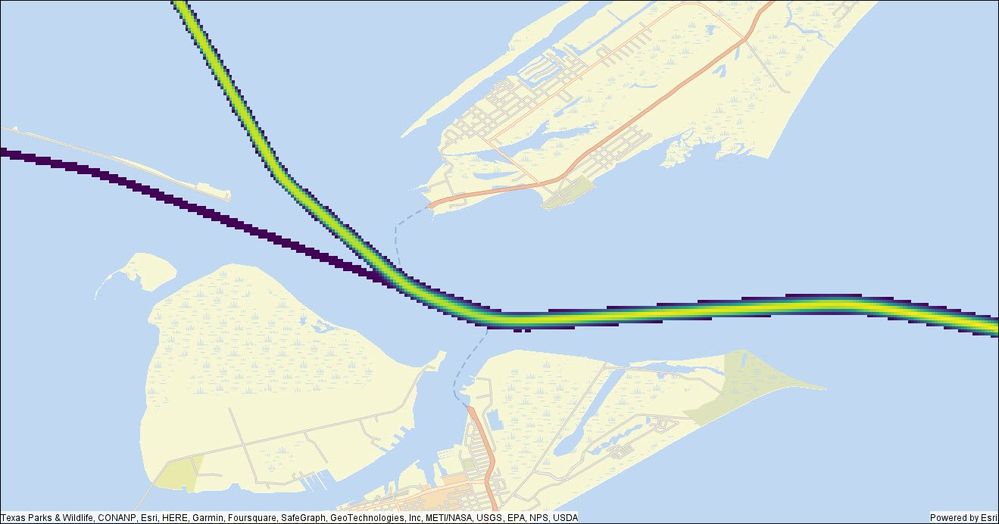
That gives us a nice set of data showing frequency of vessel traffic.
Now, we can clearly see the most traversed lane in the middle, but there is a lot of noise surrounding it – likely due to the ships traveling to or leaving anchor points or veering slightly off the main path. We can easily remove that by filtering down to just the bins with more than, say, 50 vessels traveling through that location. While this threshold is appropriate for this data, if you are working with much larger datasets your filter value will likely be higher.
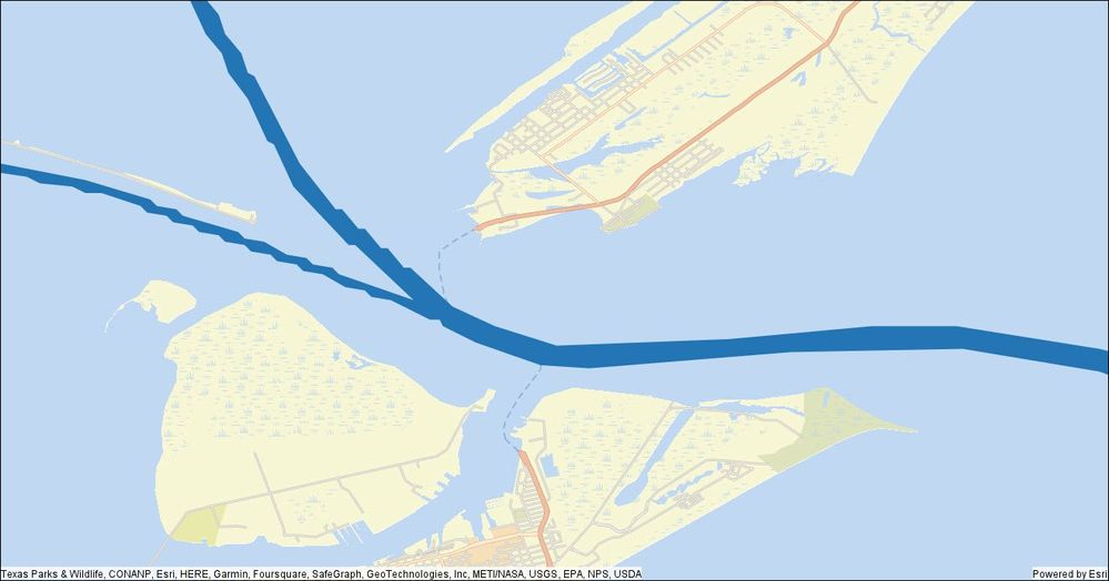
Filtering to just the bins with more than 50 vessels traveling through gives us a cleaner view:
But these are just square bins, how do we turn them into a shipping lane?
Union and generalize the bins to create travel regions
To convert the bins into a polygon showing the most traveled region we simply union them together to create a big polygon. Then to make it less ‘blocky’, we’ll generalize to smooth out the edges.
unioned = bins.where("count > 50")\
  .groupBy().agg(ST.aggr_union("bin_geometry").alias("unioned"))\
  .withColumn("unioned", ST.generalize("unioned", 50))\
  .localCheckpoint()
Pull out the centerline for the travel regions
Once we have those polygons, we can quickly pull out the final shipping lane by taking the centerline of the polygons.
# use the centerline tool to create the "route" polyline
centerline = unioned.withColumn("centerline", ST.centerline("unioned")).drop("unioned")\
  .localCheckpoint()
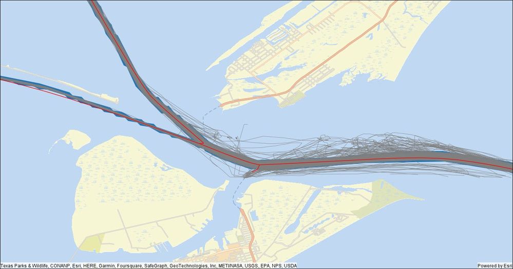
That leaves us with a nice single polyline representation of the common pathways!
Here is the final result for the whole Galveston Bay region, from raw GPS data points to streamlined shipping lane polylines!
Performance
On the Houston Bay dataset for cargo and tanker vessels (~1.2 million records), the entire workflow took 38.6 seconds in a local spark cluster on a mid-range laptop!
For the entire dataset (~52 million records when reduced to cargo and tanker vessels), it took 4 minutes and 4 seconds in this local spark cluster. Using a larger bin size of 300 meters – more appropriate for small-scale mapping (large geographic area), instead of the 50-meter bins used for the Galveston Harbor subset, reduces the processing time to about 90 seconds. Even better performance can be achieved by transitioning this workflow to a larger cloud computing cluster that is optimized for data processing at scale. With a more performant computing cluster, this workflow can easily scale up to work with hundreds of millions, or billions, of data points!
While the example we walked through demonstrated a use case for creating shipping lane data, this technique will work for other datasets, for instance, to map new roads or pathways through areas that are off the street network (e.g., parking lots, etc.). We hope this gives you some ideas on ways to work with large volume GPS track data in your workflows. We would love to hear about how you can use these tools and methodology in your analysis work, or if you want to know more about other GeoAnalytics Engine tools and functions! Please feel free to provide feedback or ask questions in the comment section below.
Blog authored by Sarah Battersby, Product Manager for ArcGIS GeoAnalytics Engine, and Michael Park, Development Lead for GeoAnalytics Engine.
You must be a registered user to add a comment. If you've already registered, sign in. Otherwise, register and sign in.


