New Learn Paths
A Learn Path is sequenced set of resources for learning about a particular topic. Here's a roundup of new paths in the Learn ArcGIS Gallery that have appeared in the last month.
 Get a jump start on editing raster datasets with the Pixel Editor tools in ArcGIS Pro.
 Explore how responsive smart mapping in the new Map Viewer can show you a different view of your data and help you make better decisions more quickly.
New Learn Lessons
A Learn Lesson is a step-by-step tutorial that uses a real-world scenario to introduce key ArcGIS tools and workflows. Here's a roundup of new lessons in the Learn ArcGIS Gallery that have appeared in the last month.
Use ArcGIS AppStudio to build a 311 mobile app (AppStudio)
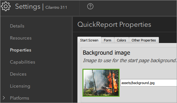 ArcGIS AppStudio provides ready-to-use configurable templates to help you create and deploy mobile apps that run on multiple platforms and don't require you to write any code. In this lesson, you'll configure and test a mobile app for citizens to submit nonemergency community 311 requests, such as graffiti removal, streetlight repair, and tree maintenance, to the City of Cilantro.
Create a report in ArcGIS Insights (ArcGIS Insights)
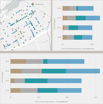 The number of fatal cycling accidents in Ottawa, Canada, increased between 2015 and 2018. Cycling advocates have called for the city to adopt a Vision Zero policy to eliminate traffic fatalities and increase public safety. You have completed your analysis of cycling safety, and now you must share your results with stakeholders.
You want to have a professional-looking report that clearly and effectively communicates your findings. In this lesson, you'll apply cartographic principles and custom design choices to an existing Insights workbook before you share the report.
Updated Lessons
The Learn ArcGIS Team updates lessons for the latest version of software products. Here's a round up of lessons that were updated to new software versions.
Map Breast Cancer Differences by Ethnicity (ArcGIS Insights 2020.2)
 In a 2017 report, the American Cancer Society estimated that, in the United States, American women incurred 252,710 new cases of breast cancer and that 40,610 women had died from the disease. ACS statistics also reveal significant disparities between white and black women. Although the survival rate between those two ethnic groups is narrowing, significant disparities remain. In this lesson, you'll take a deep dive into those reasons by mapping mortality rates and risk factors.
Get started with ArcGIS Insights (ArcGIS Insights 2020.2)

The number of fatal cycling accidents in Ottawa, Canada, increased between 2015 and 2018. Cycling advocates have called for the city to adopt a Vision Zero policy to eliminate traffic fatalities and increase public safety.
In this lesson, you'll create a workbook in ArcGIS Insights to analyze which city wards have the most accidents and which route types are safest (or most dangerous) for cyclists. By combining charts and maps, you'll determine what steps the city can take to make cycling safer.
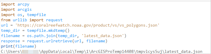
Update Real-Time Data with Python (ArcGIS Pro 2.6)
National Oceanic and Atmospheric Administration (NOAA) Coral Reef Watch frequently updates data on coral bleaching. If you map this data, it'll likely become outdated within a few weeks. How do you automate updates so that your GIS layers use the latest data as soon as it becomes available?
One way is to use a feed routine. A feed routine is a workflow where data is queried from a live feed repository and the information is passed to a map. In this lesson, you'll use Python to create two feed routines, one that automatically updates feature classes in ArcGIS Pro and one that automatically updates feature services on ArcGIS Online or ArcGIS Enterprise.
This lesson will introduce you to both basic and advanced Python topics.
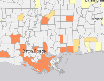
Analyze fire preparedness with the ArcGIS GeoEnrichment Service (ArcGIS Pro 2.6)
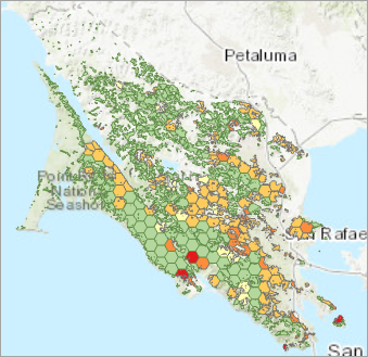 Marin County, California, is known for its heavily forested areas and has many homes in areas with a high risk of fire. County supervisors plan to partner with the American Red Cross to educate the community about fire prevention, preparation, and response as part of its Home Fire Campaign.
In this lesson, you'll perform regional analysis of Marin County's forested areas. In particular, you'll determine the percentage of homes that have a smoke detector. This information will help officials target their campaign geographically.
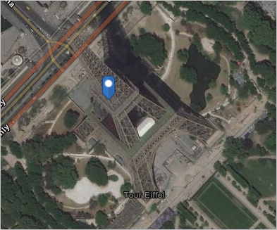
Get started with ArcGIS Online (ArcGIS Online June 2020)
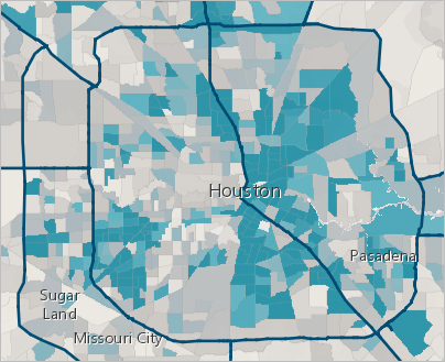 Hurricanes can result in tremendous damage and loss of life. With online maps, you can help plan evacuation strategies and share your findings with the people who make decisions. You'll create a map of Houston, Texas, based on publicly shared data. By analyzing vehicle ownership across the city, you'll pinpoint areas that may have difficulty evacuating in time. Then, you'll present your results as a professional-looking web app for others to explore.
Manage data in ArcGIS Online (ArcGIS Online June 2020)
Manage data in ArcGIS Enterprise (ArcGIS Enterprise)
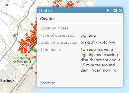
Human-wildlife interactions are becoming more prevalent, and many communities have inevitably found that some of their neighbors are coyotes. To inform the community where they may have a higher risk of encountering coyotes, you'll publish a data layer for people to report and view coyote activity. There are three different audiences for this data, each with unique requirements as follows:
- Public—Adding observations to a map
- Public—Viewing only reported coyote activity that has been reviewed for quality
- City staff—Adding observations to a map and viewing and modifying all recently reported coyote activity
You'll create hosted feature layer views from your published layer to give each intended audience a focused experience when working with the coyote activity layer. Hosted feature layer views provide a unique set of capabilities that allow you to meet the needs of each audience. Using views helps to simplify your work, reduce unintended edits, and avoid duplicating the source data. Finally, you’ll add the views to a map so you can compare the different user experiences. You'll add and delete features to confirm your views are ready for use in your organization and the community.
Policy mapping - Improve newborn health (ArcGIS Online June 2020)
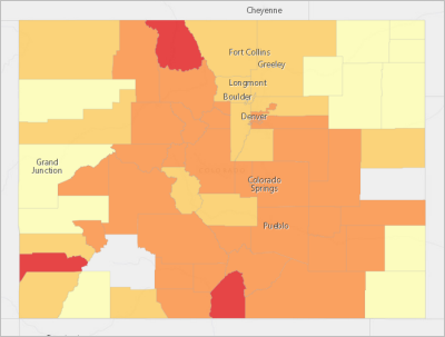
The Centers for Disease Control and Prevention recently set a goal: By 2020, no more than 7.8 percent of newborns in the United States should have a birth weight under 5.5 pounds. You want to suggest policy actions to your state government to improve newborn health and help reach this goal.
To do so, you'll create a policy map that identifies two groups of counties: those closest to meeting the goal and the major outliers impacting the state's average. You'll ensure your map visually communicates clear policy goals, and then share it as a web app.
This lesson is targeted toward government employees or any civic-minded individual who wants to make a difference in their community.


 We've got
  We've got
  Make a map in a minute
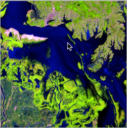 GIS for population and development studies: Data analysis and visualization
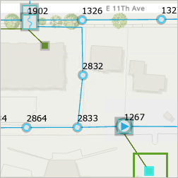 Validate edits in the utility network with attribute rules
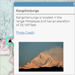 Map the highest mountains
 The Learn ArcGIS Team unveiled a beta website,