Esri Tutorials Blog

cancel
Showing results for 
Show  only  | Search instead for 
Did you mean: 

Other Boards in This Place


Latest Activity

(101 Posts)
SilpaGadi
Esri Contributor

New Esri tutorials
 
Esri tutorials are step-by-step workflows that use real-world scenarios to introduce key ArcGIS tools, products and modern best practices. 
Check out the newest additions to the gallery—just released last month!
 
Set up a flood simulation 

image.png

In 2024, the United States experienced 27 weather- and climate-related events that resulted in damage of more than $1 billion each to affected communities and their infrastructure. Severe rainfall and flooding events make up a significant portion of these costs, with Hurricane Helene alone causing $79.6 billion in damage to the southeastern United States. Understanding and preparing for flooding caused by these extreme weather events has become a critical need for communities.

In this two-part tutorial series, you'll use ArcGIS Pro to perform a sophisticated flood simulation for a hypothetical high rainfall event in Houston, Texas. By analyzing the results alongside structure and road data, it's possible to predict how infrastructure might be impacted by such an event.

In this tutorial, the first in the series, you'll prepare the data necessary to perform the simulation. In particular, you'll use land cover and impervious surface data to create a water infiltration raster layer that shows how quickly water enters the soil, with areas of low infiltration being more susceptible to flooding. In the second tutorial, you'll use the data you prepared to simulate flooding and analyze potential impacts to infrastructure.


Simulate a flood 

image.png

In this tutorial, the second in the series, you'll use the prepared data to perform the simulation. Then, you'll export the results as a flood depth raster, which you'll compare to buildings and roads data to determine how much infrastructure might be impacted by the flood event. You'll also configure flood depth charts to quickly view the impacts at different flood levels.


Calculate a field in Map Viewer 

image.png

You've received sales data from a colleague for your company's store locations. You must identify any regional or spatial patterns in the data that might explain how stores are performing. After mapping the data, you notice that the dataset is missing a key metric—net operating income (NOI)—that you'll need to calculate. There are several options for calculating data in Map Viewer. In this tutorial, you'll decide on the best method for your goals and calculate a new field in Map Viewer to better understand regional performance patterns.


Clip raster data 

image.png

You have a raster image of a historical paper map of Hallstatt, Austria, that you want to use as a background layer in ArcGIS Pro. However, the image is much larger than your area of interest. The unneeded parts of the image take up storage space and increase the image processing time. In this tutorial, you'll make a copy of the raster image that is clipped to the area of interest. Because you have other raster datasets you want to clip for the same reason, you'll perform batch processing to clip all of them at once. Lastly, you'll package the results as a project package so they can all be shared as one file.


Combine raster data into a mosaic 

image.png

To properly visualize and analyze raster data, it's sometimes necessary to merge multiple raster datasets into one. A mosaic is a combination of two or more images. In this tutorial, you have two elevation datasets for the area of Hallstatt, Austria. You want to compare these datasets to another layer and use them for analysis. Rather than compare and analyze each dataset individually, you'll create a mosaic that combines them.


Create a 3D subsurface visualization of aquifers 

image.png

Kent and Sussex counties in Delaware depend on groundwater for household consumption, agriculture, and industry. To effectively use and manage this critical natural resource, it is important to understand the geographic extent and thickness of the aquifers. Geologists used borehole records to identify the depth to, and thickness of, 12 confined aquifers throughout the counties.

In this tutorial, you'll create a public visualization of the aquifers. You'll create 3D models in ArcGIS Pro and publish them in ArcGIS Online to view in Scene Viewer.

Get started with ArcGIS Data Pipelines 

image.png

The New York City Department of Parks and Recreation (DPR) maintains a database of capital improvement projects as a .csv table. However, other departments within the city would like to know additional information about each capital project, such as the age of each project from its initial design or which neighborhood contains each capital project.

In the past, adding more information to this list of park projects has been a time-consuming, manual process. Specifically, it entails the following:

  • Querying projects that are in the construction phase
  • Projecting data to an appropriate coordinate system for New York City
  • Calculating the amount of time that has passed since the project was initially designed
  • Determining which neighborhood tabulation area the project falls within
  • Determining which community district each project falls within
  • Removing numerous attributes that are not necessary for the stakeholders
  • Renaming three attribute fields whose current names are vague and unintuitive

To automate this workflow and keep your data up to date, you'll use ArcGIS Data Pipelines to extract information from the New York City OpenData website, load it into ArcGIS Enterprise, and transform it by adding the requested attributes. Finally, you'll have this data pipeline run on a schedule to keep your list of capital projects current.


Inspect and visualize imagery 

image.png

Imagery is an important type of data used in most remote sensing-based workflows. Imagery can be any optical satellite or aerial image. You can use it as a backdrop for other layers or analyze it to extract information beyond what the eye can see. In this introductory tutorial, you'll learn how to understand and display imagery in ArcGIS Pro. First, you'll inspect the properties of an imagery dataset to learn more about its cell size, pixel characteristics, and spectral bands. Then, you'll change the image's appearance to make it smoother and more vivid. Lastly, you'll change the band combination to better distinguish vegetation in the image. The skills you'll learn in this tutorial can be applied to nearly any imagery workflow in ArcGIS Pro.


Solve common projection issues 

image.png

Projections are calculations that allow you to draw the round earth on a flat screen or piece of paper. To function in a GIS, every layer needs to be defined within a coordinate system, which allows it to be projected onto the map. Issues with the projection can cause data to not appear correctly or at all.

In this tutorial, you'll identify and fix the following three common projection issues:

  • A layer with no defined projection, causing it to appear in the wrong place
  • A layer with a projection that is different than the one used in the project
  • A layer that is misaligned with the other map layers

You'll primarily work with raster data, although the issues and their solutions also apply to other types of data, such as feature classes. To learn how to resolve projection issues for a feature class, try the Fix data when it appears in the wrong place tutorial.


more
1 0 141
SilpaGadi
Esri Contributor

New Esri tutorials
 
Esri tutorials are step-by-step workflows that use real-world scenarios to introduce key ArcGIS tools, products and modern best practices. 
Check out the newest additions to the gallery—just released last month!
 
Enable query response caching to optimize services 

image.png

An organization in New Zealand wants to make its Hochstetter's frog habitat data publicly accessible to increase awareness and support conservation efforts. By sharing this information openly, the organization expects a growing number of users to view maps and submit queries through web maps, apps, dashboards, and other client applications.

While increased access is a positive outcome, the organization is concerned that a high volume of repeated queries could place additional strain on its ArcGIS Enterprise system. Rather than scaling infrastructure by adding more CPU and RAM, the organization looks for a more efficient way to handle this anticipated load. Because many users are expected to request the same data repeatedly, the Enterprise administrator decides to use query response caching to improve performance and reduce database load. Query response caching is a technique used in computing and data systems where the results of a query (a request for data or information) are stored temporarily in a cache. When the same query is requested again, instead of processing the query from scratch, the system retrieves the stored result from the cache and returns it immediately. Benefits of query response caching include improved performance and speed, reduced load on backend systems, scalability, and more.

You'll use a sample hosted feature layer representing the Hochstetter's frog habitat to enable response caching in Enterprise. You'll learn how response caching works, when it is appropriate to use, and how to configure it for hosted feature layers. Once you complete this tutorial, you'll have the skills to configure response caching for your own hosted feature layers, which improves performance for users accessing biodiversity maps, conservation dashboards, and other applications that rely on consistent query patterns.


Compare locations based on nearby amenities 

image.png

A corporation is looking to open a new regional office space in Portland, Oregon. There are many variables to consider when picking an office location. For example, employees may be more interested working in an office when it is near cafes and restaurants.

In this tutorial, you'll use ArcGIS Business Analyst Web App to create sites for your potential office locations, add a web layer of transit stops, and assess which potential office location has the most desirable nearby amenities.


Get started with ArcGIS Tapestry 

image.png

ArcGIS Tapestry is an advanced demographics dataset that groups areas based on shared demographic, socioeconomic, and lifestyle characteristics. Its detailed summaries reveal patterns and provide insights about a community's complexity that go beyond what can be seen when looking at a single statistic.

In this tutorial, you'll use Tapestry data to help a local politician running for a city council seat in Albany, New York. To guide their campaign strategy, they want to understand their voting base, not just with census numbers, but with detailed information about their demographic and lifestyle patterns. In ArcGIS Business Analyst Web App, you'll map Tapestry data across the city and summarize the findings with an infographic.

Though this tutorial uses Business Analyst, you can access Tapestry data using a variety of ArcGIS products and capabilities, including the Enrich Layer tool in ArcGIS Online and the Enrich tool in ArcGIS Pro. To learn more about Tapestry, including other examples of real-world use cases, see the ArcGIS Tapestry story.


more
2 0 248
ShareUser
Esri Community Manager

If you’re curious about how artificial intelligence and geographic information systems intersect, now is a great time to explore GeoAI in ArcGIS.

In this blog post you'll explore five Esri Tutorials designed to get you hands-on with object detection, deep learning, land cover extraction, and more.

Read more...

more
0 0 493
SilpaGadi
Esri Contributor

New ArcGIS tutorials
 
ArcGIS tutorial is a step-by-step workflow that uses a real-world scenario to introduce key ArcGIS tools, products and modern best practices. 
Check out the newest additions to the gallery—just released this quarter!
 
Share a scene 

image.png

Any map or scene has an audience. Usually, the audience is diverse and can range from GIS experts to the public. This tutorial shows you the tools necessary to create an easy and intuitive 3D presentation of your scene and your story. Whether you are informing your team about the latest development projects, publishing research results, or sharing hiking trails with the public—the tools for presenting scenes make your scene accessible to everyone.

This tutorial is the third in the series called Get started with Scene Viewer. If you are new to Scene Viewer or haven't completed the first two tutorials in the series, it is recommended that you complete the other tutorials first: Explore a scene and Create a scene.


Classify a lidar point cloud 

image.png

The City of Copenhagen, Denmark, is redeveloping the district of Tuborg Havn, and they want to use a lidar point cloud for modeling the neighborhood in 3D. This will support further urban planning activities. In this tutorial, as a remote sensing analyst for the city, you will classify lidar cloud points representing the ground, buildings, vegetation, or noise. You will also learn to filter the points based on their assigned class for visualization and processing. Classifying a point cloud is a key step to support many workflows, such as creating elevation rasters or extracting 3D buildings and trees, and help better communicate what the world around us looks like.


Configure a map for a bilingual app 

image.png

In this tutorial, you're a GIS professional working for the United States National Park Service. You've been tasked with creating a map of the Santa Monica Mountains National Recreation Area near Los Angeles. Specifically, your map will need to display information in pop-ups about trailheads and trails in both English and Spanish.

First, you'll review the attribute tables of the trailhead and trail layers available to you. Then, you'll use Arcade to build pop-ups for each layer. Finally, you'll confirm the map delivers the information required in both languages.


Explore Landsat imagery of a volcano eruption 

image.png

In 2018, the eruption of the Kilauea volcano on Hawaii's Big Island was a major event and caused significant destruction. In this tutorial, you'll prepare and explore Landsat satellite imagery captured before, during, and after the eruption. Landsat is the longest running satellite program for Earth observation in the world. It has captured millions of images that provide continuous, global coverage over several decades, making Landsat an unparalleled resource for analysts and decision makers. You'll access this data as a ready-to-use online imagery layer available through ArcGIS Living Atlas of the World.


Extract high-resolution land cover with GeoAI 

image.png

High-resolution land cover layers are valuable tools for mapping and understanding the environment. They provide detailed information about the different types of land cover—such as vegetation, buildings, water bodies, and roads—at a fine-grained spatial resolution. One approach to creating such layers is to use GeoAI applied to drone imagery, classifying the imagery pixels into their corresponding land cover types. While it is possible to train your own deep learning model for this task, you can also take advantage of a pretrained model provided by ArcGIS Living Atlas of the World.

In this tutorial, focused on the township of Alexandra, South Africa, you'll try out this approach in ArcGIS Online, with the goal of identifying green spaces and computing their overall surface area. Information about green space distribution is crucial for urban planning, resource allocation, and social development initiatives.


Try the Utility Network Migration Wizard 

image.png

In this tutorial, you'll assume the role of a GIS analyst at a small municipal government tasked with a pilot project to migrate your organization's geometric networks to Utility Network. Your small city has departments that manage data for electric, gas, water, wastewater, and stormwater. This tutorial includes sample data and instructions for migrating each of these five geometric networks, so you can focus on using the dataset that interests you most. You'll use the Utility Network Migration Wizard to create a utility network using an existing geometric network. While you are guided through this process by the wizard, you must understand the basic workings of the network so you can set sources and sinks, set the tier definition for the network, and map source classes to the proper asset types. Once you complete the wizard, your geometric network features will be migrated into a utility network.


Get started with ArcGIS Flight 

image.png

In this tutorial, you have been assigned to capture high-quality drone imagery of the University of Redlands campus for a future housing construction assessment. The imagery you collect will be used to generate high-fidelity 3D products of the campus and infrastructure, enabling evaluation for new planned developments.


Predict home prices with regression analysis and machine learning 
image.png

You've created three statistical models that were trained on and tested using real home sales price data in King County, Washington. In this tutorial, you'll use these models to predict the sales prices of homes that have not been sold yet. Then, you'll compare the results to better understand the advantages and disadvantages of each modeling approach.


more
3 0 551
SilpaGadi
Esri Contributor

New ArcGIS tutorials
 
ArcGIS tutorial is a step-by-step workflow that uses a real-world scenario to introduce key ArcGIS tools, products and modern best practices. 
Check out the newest additions to the gallery—just released this past month!
 
Flatten water bodies in surface models with water polygons 

image.pngAs a geospatial strategist working for the city of Frankfurt, you provide foundational content for the city's emergency response, planning, and maintenance efforts in the form of digital surface models (DSMs). The city's quality standards for DSMs require water surfaces to be flat and smooth.

ArcGIS Reality Studio is used to generate outputs such as DSMs, True Orthos, and meshes from aerial imagery data. To learn more about the basic reality mapping workflow with ArcGIS Reality Studio, see Get started with ArcGIS Reality Studio.

In general, this highly automated process creates high-quality products that can be shared with stakeholders or used in other workflows. You may need to manually correct small deficiencies in reality mapping products. In this tutorial, you'll edit and refine reality mapping outputs to correct reconstruction artifacts. You'll define a region of interest, define water bodies and assign them constant heights.


Refine irregular surfaces with correction polygons 

image.png

As a geospatial strategist working for the city of Frankfurt, you provide foundational content for the city's emergency response, planning, and maintenance efforts in the form of digital surface models (DSMs) and True Orthos. The city's quality standards state that objects in DSMs and True Orthos must have straight edges.

ArcGIS Reality Studio is used to generate outputs such as DSMs, True Orthos, and meshes from aerial imagery data. To learn more about the basic reality mapping workflow with ArcGIS Reality Studio, see Get started with ArcGIS Reality Studio.

In general, this highly automated process creates high-quality products that can be shared with stakeholders or used in other workflows. You may need to manually correct small deficiencies in reality mapping products. In this tutorial, you'll edit and refine reality mapping outputs to correct reconstruction artifacts. You'll define correction geometries to straighten and flatten an irregularity in the surface, and to straighten walls for a courtyard.


Repair a mesh with correction geometries 

image.png

As a geospatial strategist working for the city of Frankfurt, you provide foundational content for the city's emergency response, planning, and maintenance efforts in the form of digital surface models (DSMs), True Orthos, and a 3D mesh. The city's quality standards state that 3D mesh buildings must be complete, with no holes.

ArcGIS Reality Studio is used to generate outputs such as DSMs, True Orthos, and meshes from aerial imagery data. To learn more about the basic reality mapping workflow with ArcGIS Reality Studio, see Get started with ArcGIS Reality Studio.

In general, this highly automated process creates high-quality products that can be shared with stakeholders or used in other workflows. You may need to manually correct small deficiencies in reality mapping products. In this tutorial, you'll define correction geometries to repair a mesh.


Get started with the ArcGIS Survey123 web designer 

image.png

You recently opened a food truck, Cilantro City Cafe, and want to collect information from your customers to find out how you're doing. In addition to asking questions about how they found the food and the service, you can ask questions to help you decide which channels to use for marketing, where most customers are finding your food truck, and more.


Get started with distributed collaboration 

image.png

Distributed collaboration allows you to share content between two ArcGIS Enterprise organizations, or between ArcGIS Enterprise and ArcGIS Online organizations. This is useful for many workflows, including exposing ArcGIS Enterprise content to the public through ArcGIS Online and making data visible across different departments in an organization.

In this fictional scenario, you've recently been promoted to the head of GIS for the city of Moncton, Canada. The city has both ArcGIS Online and ArcGIS Enterprise, and one of the first things you plan to do is to connect the two organizations so you can share content between them. For example, you must share a feature layer representing potholes from ArcGIS Enterprise to ArcGIS Online so the public can edit it. You also must share a feature layer from ArcGIS Online to ArcGIS Enterprise so people in both organizations can track response teams that have been deployed during emergencies.

In this tutorial, you'll create a distributed collaboration to connect the two organizations. You'll create two workspaces within the collaboration: one that shares feature layers as copies, and one that shares feature layers as references.


Get started with ArcGIS Knowledge 

image.png

ArcGIS Knowledge allows you to create and model graphs that track complex ecosystems of real-world data through ArcGIS Enterprisewith ArcGIS Pro. These graphs, called knowledge graphs, are built with two types of information: entities (also known as nodes) and relationships (also known as edges or links).

In this tutorial, you're an agronomist for a midsized farm in Iowa who has just invested in ArcGIS Enterprise software. You want to understand the farm's role in the local food distribution supply chain to track disruptions and manage shipments. You'll create a knowledge graph to map your farm's suppliers and farm shipments. Then, you'll add the knowledge graph data to a link chart, which allows you to visualize entities and relationships both spatially and nonspatially, and edit its symbology. Finally, you'll track the path of a specific commodity, milled flour, through the link chart to your suppliers and distributors in response to crop yield issues through query processing.


more
2 0 623
HeatherSmith
Esri Alum

Are you intimidated by licensing ArcGIS Enterprise? There's a new guide to help you get through the process smoothly and successfully. @MarleyGeddes and I wrote a three-part tutorial series in ArcGIS Blog that walks you through licensing. It helps you identify which licenses you need, explains the difference between user types and member roles, shows you what to do in My Esri, and how to authorize your license files once you have them.

Read more...

more
2 0 809
SilpaGadi
Esri Contributor

New ArcGIS tutorials
 
ArcGIS tutorial is a step-by-step workflow that uses a real-world scenario to introduce key ArcGIS tools, products and modern best practices. 
Check out the newest additions to the gallery—just released this past month!
 
Explore a scene 

image.png

In this tutorial, you'll work with a 3D scene, which is a method used to display and explore three-dimensional data. You'll open an existing 3D scene and learn how to navigate it in Scene Viewer, a dedicated web app for visualizing geospatial data in 3D. You'll also apply a 3D basemap to enhance the scene, perform measurements, adjust the time of day to display shadows, and change the weather for the scene. Finally, you'll search for your hometown or other locations to continue exploring.

Create and visualize a lidar point cloud 

image.png

In this tutorial, you'll discover how to create and visualize lidar point clouds with ArcGIS Pro. You'll create a LAS dataset from several LAS data files and display it in a 3D scene. Then, you'll examine it, learn about its properties, and style it based on elevation, intensity, and number of returns.


Create a tactile map 

image.png

Tactile maps are maps that, when printed on swell touch paper, have raised features that can be read by touch, making them accessible to people with visual impairments.

In this tutorial, you'll create a tactile map for a friend who is visually impaired. Your friend lives in Washington, D.C., and likes to visit Murrow Park. Though they are fully able to navigate the area, they want an overview of the neighborhood to better understand its topology, including the relative locations of the park and nearby roads and buildings.

Using ArcGIS Pro, you'll map Murrow Park with symbology that is distinguishable by touch. You'll improve the map's legibility by simplifying and combining certain features and symbols. Then, you'll create a layout with a title, scale bar, and legend in Braille. Your ultimate result will be a map that is ready to be printed on swell touch paper as a tactile map.

Though this workflow maps Murrow Park in Washington, D.C., the techniques you learn can be applied to create tactile maps for locations around the world.

Create forms and templates for editing 

image.png

The City of New York shares information about local parks on a public website to help residents identify recreational areas that meet their needs. To ensure information remains accurate, the New York City parks dataset must be updated regularly. In this tutorial, you'll act as a GIS Data Technician working for the New York City Department of Parks and Recreation. You'll create an editing form that will be used to maintain the New York City parks dataset more efficiently. To accomplish this task, you'll configure fields, implement Arcade expressions, and create templates, which help to simplify the editing workflow.

Explore imagery - Spectral resolution 

image.png

An important characteristic of imagery data is its resolution. There are four types of resolution: spatial, temporal, spectral, and radiometric, as illustrated in our growing tutorial series Explore imagery resolution. In this tutorial, you'll learn about spectral resolution.

You'll become familiar with several concepts such as spectral resolution, spectral bands, multispectral imagery, band combination, and spectral profile. You'll examine and manipulate satellite imagery of different spectral resolutions in ArcGIS Pro, with a focus on the region of Brandenburg, Germany. Finally, you'll learn how to change the number of spectral bands in your imagery.

Get started with ArcGIS Web Editor 

image.png

In New York City, the Parks Department is planning a city-wide tree trimming initiative to ensure public safety and maintain urban greenery. Due to recent storms, many trees are at risk of falling, requiring immediate attention. The department needs to update geographic tree-trimming data to prioritize high-risk areas. Field crews have given you data for planning the tree trimming activities in a neighborhood close to the shore where winds are high during storms. The updated data will help streamline the tree trimming process and ensure efficient allocation of resources.

In this tutorial, you'll learn how to use ArcGIS Web Editor to select, create, copy, move, and reshape individual features, as well as perform bulk attribute updates.


more
3 2 1,059
SilpaGadi
Esri Contributor

New ArcGIS tutorials
 
ArcGIS tutorial is a step-by-step workflow that uses a real-world scenario to introduce key ArcGIS tools, products and modern best practices. Here's a roundup of new tutorials in the ArcGIS tutorial Gallery that have appeared in the last month.
 
Add data to a web map from ArcGIS Living Atlas 

image.png

One of the main challenges when starting a GIS project is finding the right data. The ArcGIS ecosystem contains thousands of data layers that have been shared publicly. Many of these layers, even those with information at regional or national scales, can be used alongside your own data to enhance analysis and visualization. In this tutorial, you'll search for data using authoritative layers that have been shared in ArcGIS Online.

As an analyst beginning to study housing access in the city of Boston, Massachusetts, you need to find data on affordability. Affordable housing is a major challenge in many places. While the causes and effects of both affordability and availability vary by area, many cities are facing a shortage of affordable housing that is driving up costs. You'll start by exploring data from the American Community Survey, and then filter the data and customize your map so that it only shows data for your community.

Animate a map through time 

image.png

In this tutorial, you'll use ArcGIS Pro to create a short animation of earthquakes in Japan. You'll learn how to configure time properties for a feature layer, animate 2D data through time, add both static and dynamic text overlays to an animation, and export an animation to a video.

In this scenario, you've been asked to create an animation for use on a TV documentary that illustrates the frequency of earthquakes in Japan. Animated maps are also useful for sharing geographic stories on web sites, social media, and in presentations. Once you've completed the tutorial, you could use the same process to animate other geographic data, for example to show the changing extent of a wildfire, the travel paths of airplanes, and crime patterns over space and time.

Measure the benefits of green space with metrics 

image.png

Pfingstweid Park in Zurich West is an example of how urban spaces can adapt to meet the evolving needs of a community. Originally used for grazing land, it became a community garden for local factory workers after World War I. As the area transitioned to residential use, the park was redesigned and reopened in 2015 through a community design competition.

In this tutorial, you'll step into the role of a planner for Zurich, giving new purpose to Pfingstweid Park as it continues to evolve and serve the changing needs of the community. Green space in a city can serve many important functions. First, you'll review your colleague's metrics to determine whether the park provides enough green space per resident to meet the World Health Organization's recommendations. Then, you'll build new metrics to analyze how these green spaces contribute to reducing stormwater runoff. This aligns with Zurich's "Sponge City" initiative, which aims to improve climate resilience by reducing impervious surfaces and enhancing stormwater management. These metrics will help measure the effectiveness of green spaces in managing stormwater and supporting the city's environmental goals.
Publish data from ArcGIS Pro to ArcGIS Online 

image.png

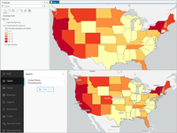
You've created a layer in ArcGIS Pro that shows homelessness by state in the United States, and now you want to share it with the public. In this tutorial, you'll publish your layer as a web layer in ArcGIS Online, where it can be viewed by anyone with a URL to the data.


Set up custom data for infographics in ArcGIS Pro 

image.png

California's climate disruptions are characterized by increasingly severe wildfires, prolonged droughts, and extreme heatwaves. All these issues are exacerbated by climate change, which threatens housing markets, water resources, agriculture, and overall ecosystem stability. Climate-driven disruptions have continued to grow in frequency and severity, impacting businesses in California.

Many investors, insurers, financial services providers, and nonprofit organizations rely on information about localized physical climate risks, like floods, hurricanes, and wildfires. The outcomes of these risk projections have significant economic consequences, including allocating investment capital, impacting housing prices and demographic shifts, and prioritizing adaptation infrastructure projects.

With the help of FEMA's National Risk Index data and the custom data setup workflow in Business Analyst, decision-makers and executives can fully understand how region-specific risks impede their operations or the downstream impact they will have. In this tutorial, you'll learn how to integrate this data source, set up custom variables, categorize them, and apply them to assess risks effectively for your specific region.

Find suitable areas for new affordable housing 

image.png

Affordable housing is an increasing problem, especially in urban areas. A lack of affordable housing can impact a city's growth, livability, and sense of economic mobility. As housing becomes more expensive, renter-occupied housing units increase, diminishing the percentage of residents able to build wealth through their home. Expensive aging homes also cause higher homeowner expenses for improvements. Ultimately, residents may leave a city that does not have enough affordable housing, causing population decline.

In 2023, the United States Census Bureau estimated that the population of Long Beach, California, had declined since 2020. This decline might be due to high housing prices compared to the city's average household income. In this tutorial, you'll use infographics in ArcGIS Business Analyst Web App to learn more about housing in Long Beach. Then, you'll perform a suitability analysis to determine which census block groups throughout the city would most benefit from the development of new affordable housing.


more
0 0 920
HeatherSmith
Esri Alum

Use our template and tips to write your own tutorials.

Read more...

more
3 3 1,898
SilpaGadi
Esri Contributor

New ArcGIS tutorials
 
ArcGIS tutorial is a step-by-step workflow that uses a real-world scenario to introduce key ArcGIS tools, products and modern best practices. Here's a roundup of new tutorials in the ArcGIS tutorial Gallery that have appeared in the last month.
 
Extract informal settlements with SAMLoRA 

image.png

The Township of Alexandra, South Africa, contains many informal settlements. A local nonprofit needs to map the area to provide better services to the community. They plan on applying GeoAI techniques to drone imagery to extract informal settlement building footprints. However, out-of-the-box pretrained deep learning models may not be fully effective on these intricate informal neighborhoods. Another option is the SAMLoRA (Segment Anything Model with Low-Rank Adaptation) model. It is based on SAM, a multipurpose foundational model that was trained on massive datasets. It uses the LoRA approach to quickly teach the model how to identify specific features (buildings, roads, solar panels, trees, and so on) after being exposed to only a small number of examples.

In this tutorial, you'll train the SAMLoRA model in ArcGIS Pro to identify informal settlements in your imagery. You'll then apply the trained model to extract informal settlement building footprints. You'll also learn how you can use the same method to extract other features, including a wide range of building types and roads.

Create watersheds to calculate upstream area 

image.png

Atlantic salmon are an important aquaculture export for Canada. In the coastal province of Nova Scotia, many dams have been retrofitted with artificial waterways so Atlantic salmon can swim upstream and access fresh water, ensuring that the salmon can reproduce. One of the dams in the Mersey River Hydro system needs maintenance work, which will cause the dam's fishway to temporarily be inaccessible. You need to calculate the area of the watershed that will be temporarily interrupted to assess the financial impact on the Atlantic salmon population.


Download census data 

image.png

The United States Census Bureau collects and shares a massive amount of accurate, high-quality data about the population of the United States. This data can be combined with spatial data, such as geographic boundaries, and mapped using GIS.

In this tutorial, a health network in Mesa County, Colorado, wants to offer mobile primary care centers that bring services to residents who may be underserved. To determine the best areas to target, the network plans to map census data about age and poverty.

To help them, you'll go to the Census Bureau website, find relevant data, and download it. Then, you'll upload the data to ArcGIS Online and add it to a web map as a table. Lastly, you'll join the table to geographic boundary data and display it on the map. The final result will show areas of Mesa County with a large number of older adults who may require financial assistance.


Plan routes to optimize deliveries 

image.png

Farm Collective in Canterbury, New Zealand, offers a community supported agriculture (CSA) program to deliver fresh produce directly to customers. Farm Collective's CSA program is rapidly growing and the business requires help in planning its produce deliveries. The routing functionality in Map Viewer uses the ArcGIS Routing service to find the most efficient routes for multiple vehicles based on constraints like travel capacity and stop duration. In this tutorial, you'll use the Plan Routes tool to optimize the CSA deliveries for a fleet of drivers.


more
2 0 1,256
149 Subscribers