- Home
- :
- All Communities
- :
- Products
- :
- Data Management
- :
- Data Management Questions
- :
- Separate Features in a Layer
- Subscribe to RSS Feed
- Mark Topic as New
- Mark Topic as Read
- Float this Topic for Current User
- Bookmark
- Subscribe
- Mute
- Printer Friendly Page
Separate Features in a Layer
- Mark as New
- Bookmark
- Subscribe
- Mute
- Subscribe to RSS Feed
- Permalink
- Mark as New
- Bookmark
- Subscribe
- Mute
- Subscribe to RSS Feed
- Permalink
Hello all, I currently quite new to ArcMap/ArcGIS and am still figuring out the details to the program. I have an ArcMap I'm working on. I'm trying to figure out a particular layer (Specifically, habitats for different creatures)with lots of different categories that overlap/cover up each other. I want to have the capability to have only one habitat-type visible at a time, however, these habitat-types are polygons, and when I affect one of them (once I separate all the different categories out) I affect ALL of them. Does anyone know how to only manipulate one portion or field of a layer at a time?
Not sure about the end goal, but normally I would create a definition query on the layer to filter just one habitat type. Right click on the layer and choose Properties. Press the Definition Query tab. Build an SQL statement to select a single habitat. You can use the Query builder to choose the field name containing the habitat names, and then press the show all values button under the list box to the left to see all of the habitat names. So if your field name was HABITAT and your species was 'LEAST BELLS VIREO" you would end up with:
"HABITAT" = 'LEAST BELLS VIREO'
Once filtered (after pressing the OK or APPLY buttons) the List All Values list box will only show the filtered value. To see all values again clear the definition query and press the APPLY button, then get the list.
You can make as many layers for the Habitat feature class as you want, so you can set up one layer for each Habitat if you like.
If you plan on editing in one of the layers you should permit NULL values to appear or set the edit template for the layer to prepopulate the Habitat name with the value you want to work on. To see null values the Definition Query would be:
"HABITAT" = 'LEAST BELLS VIREO' OR "HABITAT" IS NULL
- Mark as New
- Bookmark
- Subscribe
- Mute
- Subscribe to RSS Feed
- Permalink
There was a script in back 9.x (can't recall if it was Python or VBS) that would create a new layer for each item symbolized in the selected layer within the map document...I'm still looking for it.
- Mark as New
- Bookmark
- Subscribe
- Mute
- Subscribe to RSS Feed
- Permalink
You could do as Richard Fairhurst suggests or you could use the symbology tab then categories to symbolize by type and also use the display tab to set a little transparency so you could see overlapping polygons.
- Mark as New
- Bookmark
- Subscribe
- Mute
- Subscribe to RSS Feed
- Permalink
This functionality would automate the process of creating new layers for each category:
http://www.arcgis.com/home/item.html?id=22eaf8fc4ba84adda99220dc2a6c7453
- Mark as New
- Bookmark
- Subscribe
- Mute
- Subscribe to RSS Feed
- Permalink
As an addition to what Wes suggests, another idea is to create the symbology for all the types, make multiple copies of this, then remove all the types from each copy but the one you want displayed. Then repeat for each single item you want displayed, so you end up with multiple "layers" of the same data each only showing one item, which gives you flexibility on displaying the data.
Not an elegant approach (Definition Queries are preferred), but workable if all you want to do is easily display data without having to figure out queries.
To do so:
- In the Table of Contents area in ArcMap, right-click on the layer you want to symbolize.
- Choose "Properties..." from the list that shows up.
- Click on the "Symbology" tab.
- On the left, under "Show:", click on "Categories" and then select "Unique Values" (or "Unique Values, many fields" if that is more appropriate to your data).
- In the "Value Field" box, click on the pulldown and choose the field in your table that provides the differentiation.
- Choose a "Color Ramp" that looks good for your data.
- Hit OK. Now, to copy the symbolized layer, right-click on it in the Table of Contents and choose "Copy"
- In the Table of Contents, right-click on the word "Layers" and choose "Paste Layer(s)". Repeat as needed.
- To reduce the categories showing in a symbolized layer, first repeat steps 1-3 to get back into the symbology tab.
- Then right-click on the symbology that you don't want displayed and choose "Remove Value(s)" (or highlight it and click the "Remove" button).
- Under "Symbol", uncheck the checkbox by "<all other values".
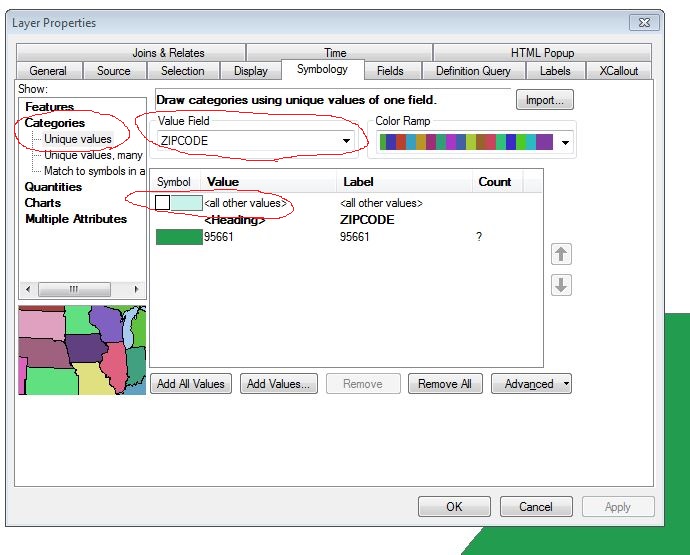
Hit OK when done. Now one can use the checkboxes next to each symbolized layer to turn each layer on and off as desired.
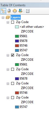
Caveat: This method only works for visual display of the data. It does not limit the data in the table; the data table for each layer still has all the data. So if you want to know how many of a type you have, you will need to take additional steps to determine that.
Chris Donohue, GISP