- Home
- :
- All Communities
- :
- Products
- :
- Data Management
- :
- Data Management Questions
- :
- Re: GeoStatistical Analysis on two shapefiles
- Subscribe to RSS Feed
- Mark Topic as New
- Mark Topic as Read
- Float this Topic for Current User
- Bookmark
- Subscribe
- Mute
- Printer Friendly Page
GeoStatistical Analysis on two shapefiles
- Mark as New
- Bookmark
- Subscribe
- Mute
- Subscribe to RSS Feed
- Permalink
Hi,
I have two shapefiles each containing a set of polygons. The polygons in both shapefiles contain pieces of land and all have a value. There's no relationship between the classes, I only want to search for a possible spatial relationship like "what happens to the values from set 1 if they are close to a polygon of set 2"?
How would you suggest to do this?
Sincerely, P
- Mark as New
- Bookmark
- Subscribe
- Mute
- Subscribe to RSS Feed
- Permalink
what do you mean by 'what happens to the values' ?
what process are you studying?
are you just checking to see if there a co-location relationship? (ie if X is found, Y is found nearby, but if there is no Y, then there is no X)
An image would also go a long way to illustrating what pattern of attributes you are looking at
- Mark as New
- Bookmark
- Subscribe
- Mute
- Subscribe to RSS Feed
- Permalink
I assume that Near—Help | ArcGIS Desktop would at least give you a distance to the nearest feature in the other featureclass. You could use Creating scatterplot graphs—Help | ArcGIS Desktop to graph the values against the distance and examine if there is a relationship, but keep in mind that relationships are often more complex and other factors are involved too.
- Mark as New
- Bookmark
- Subscribe
- Mute
- Subscribe to RSS Feed
- Permalink
Hi Dan,
Thanks for your response!
I included a picture. I want to know if there's a relationship between the value of the green polygons and nearbyness of the yellow polygons. Is this better understandable?
P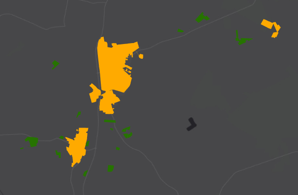
- Mark as New
- Bookmark
- Subscribe
- Mute
- Subscribe to RSS Feed
- Permalink
Hi Peter Merx ,
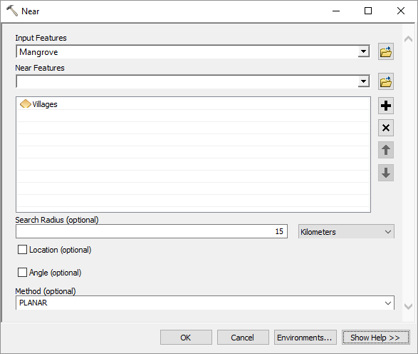
You could use Near—Help | ArcGIS Desktop to calculate the distance to the nearest orange feature for each input green feature:
After that you can graph your prices against the NEAR_DIST field using a scatter plot:

...and investigate if there is a trend between the two data fields.
However, you probably should dive in a little deeper to see if the size of a orange polygon influences and perhaps there is a cumulative effect when you have multiple orange polygons nearby.
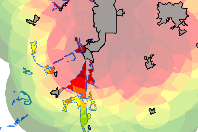
In my case of analyzing impact on mangrove (blue outline) due to nearby villages I had to include the cumulative effect of multiple nearby villages and taking into account the size of the villages (grey polygons):
To obtains this result I had to:
- use Multiple Ring Buffer—Help | ArcGIS Desktop on different ranges of the villages
- determine the potential impact due to distance and village size
- Merge—Help | ArcGIS Desktop the 3 multiple ring buffer featureclasses into one
- Intersect—Help | ArcGIS Desktop the merged rings with a single polygon covering the entire area (this will also intersect all the overlapping ring polygons, creating a huge amount of overlapping polygons)
- Use Feature To Point—Help | ArcGIS Desktop to create label points inside each polygon
- define a ID based on the X and Y coordinates (round those and concatenate them into a new field)
- use Add Join—Help | ArcGIS Desktop to join those ID's to the polygons
- use Dissolve—Help | ArcGIS Desktop to dissolve the small polygons applying a SUM on the potential impact value
This resulted in this:

But you can also choose to use a raster approach:

- Mark as New
- Bookmark
- Subscribe
- Mute
- Subscribe to RSS Feed
- Permalink
Hi Xander,
Thank you for your post. Very good understandable and also very interesting to see how you approach my question.
What I did was Generate a Near Table with a search radius of 3 km and a maximum of 5 features. Input is the Green Polygons and Near Features the Orange Polygons. As in your example my orange polygons also have a value which might have an impact so I exported it to SPSS and made a function (value/near_distance)/near_distance. I made it this way because I expect a positive relation between the values of green and the values of orange, and I expect that the closer they are to each other the higher the values of green will get.
So I have now for each green polygon 1-5 values of the weight of the orange polygons. I then sum those values and divide them by the number of it. Then I have an averaged weight of the value x distance of the nearby orange polygons.
Then I can use these values to perform a regression...You have comments or suggestions on this method?
@Xander Bakker: Is the approach you're using almost the same as creating a Heat Map with values as weight in ArcGIS Pro?
- Mark as New
- Bookmark
- Subscribe
- Mute
- Subscribe to RSS Feed
- Permalink
Hi Peter Merx ,
I'll try to answer your questions and comment on other parts.
What I did was Generate a Near Table with a search radius of 3 km and a maximum of 5 features. Input is the Green Polygons and Near Features the Orange Polygons. As in your example my orange polygons also have a value which might have an impact so I exported it to SPSS and made a function (value/near_distance)/near_distance. I made it this way because I expect a positive relation between the values of green and the values of orange, and I expect that the closer they are to each other the higher the values of green will get.
Your suggestion of using the Generate Near Table, made me think that this could serve the analysis of mangrove and villages. So I did a test and the it is interesting because it allows me to view things from 2 different perspectives (at least in my case). If there is a demand for mangrove in a village to which mangrove forest they will go use that probability on impact to sum all those potential impacts from each village on the mangrove polygons. Now you mention that you exported the result to SPSS to make a function and do some analysis. I think most of the analysis surely could have been done in ArcGIS, but normally this is a choice depending on what one feels comfortable with.
It would be interesting if you could share a screenshot from your result to see what it looks like.
So I have now for each green polygon 1-5 values of the weight of the orange polygons. I then sum those values and divide them by the number of it. Then I have an averaged weight of the value x distance of the nearby orange polygons.Then I can use these values to perform a regression...You have comments or suggestions on this method?
Is it really a matter of the average of the weights from multiple orange polygons around the green ones or would a sum of those values be better? In other words, is there a cumulative effect?
@Xander Bakker: Is the approach you're using almost the same as creating a Heat Map with values as weight in ArcGIS Pro?
A heat map is normally a representation to indicate where a certain feature is more present. IMHO it is not really an exact analysis but more a visualization. To do a "real" analysis you could use hot spot analysis (An overview of the Mapping Clusters toolset—Help | ArcGIS Desktop ) or use one of the Density tools in Spatial Analyst (An overview of the Density toolset—Help | ArcGIS Desktop )
- Mark as New
- Bookmark
- Subscribe
- Mute
- Subscribe to RSS Feed
- Permalink
Hi Xander,
Thank you for your response! My one is a little later due to a little holiday...
But it's very interesting. I mainly did it in SPSS because I first exported to Excel to make a pivot table to get the averages from each field. The number of found nears per polygon vary so the only way I think I could do it is this way.
In my research I investige the (potential) relation between the price of Agricultural Lots (the Green Polygons) and the nearbyness and number of inhabitants of Villages (the Orange polygons). I'm also putting in some other variables which theoretecally might cause variance.
I'm also using the "Agricultural Areas" division by the CBS ( CBS StatLine - Gebieden in Nederland 2013 ) to proxy for type of use and quality of the agricultural lots. So for each lot I have a (averaged) weight for the proximity to the nearest maximum of 5 villages within 3 km, with the number of inhabitants in account. By adding a dummy for "Agricultural Area" I can calculate interaction for them ( Weight x AgriculturalDummy ).
You're suggestion on using a sum of instead of an average is very interesting. I think it's reasonable to say that making a sum gives a better weight to nearness to a big city and that's what i'm trying to figure out.
Nice to see that we can help each other further in our calculations! I will head back in a few hours to post some results of both 🙂
- Mark as New
- Bookmark
- Subscribe
- Mute
- Subscribe to RSS Feed
- Permalink
So we did a test with the Generate Near Table and used a distance of 30 km calculated from the mangrove forests, with no limite on the number of villages. This resulted in a table with a little over 30.000 records. In order to determine the impact (or get some value that could indicate that impact) we joined the areas of mangrove polygons and village polygons and calculated the following things:
- LogDist = Log([NEAR_DIST]), which yielded (after correcting distance values of less than 1) in value from 0 to 10.30893
- ImpactDist = (1 - ([LogDist] / 10.30893)) * 9 +1, in order to get values from 1 to 10 as impact based on distance
- LogAreaPob = Log([AreaPob]), to process the areas (km²) of the villages and get a range values from -6,610361 to 4,618072
- ImpactPob = (( [LogAreaPob] + 6.610361) / (4.618072 + 6.610361)) * 9 + 1, to get a range from 1 to 10 for potential impact based on village size (no info on population available)
- Impact = [ImpactDist]* [ImpactPob], to get the total impact combining distance and village size (values ranging from 1 to 100).
- LogAreaMang = Log ( [AreaMang] ), to include the size of mangrove polygons, since when the pressure of the villages is distributed over a larger area it will yield a lower impact/area.
- FactorMang = (( [LogAreaMang] +17.444594) / (5.080119 + 17.444594)) * 9 +1, to translate the values of the mangrove polygon size to a range of 1 to 10.
- ImpactIndividual = [Impact] / [FactorMang], to reduce the impact when the mangrove polygon is large
After summarizing the table in IN_FID (Mangrove) it produced a table that could be joined to the Mangrove polygons to display the potential impact per polygon.
Since village also benefit from mangrove forests (coast protection and things like that) I also calculated:
- Benefit = [ImpactDist] * [FactorMang] / [ImpactPob]
... and summarized that by NEAR_FID (villages) to visualize the benefit por village. Not really a quantitative result, but something that can be used visually to see where most likely mangrove forest are in danger.

or villages benefit most from mangrove forests:

- Mark as New
- Bookmark
- Subscribe
- Mute
- Subscribe to RSS Feed
- Permalink
Hi Xander,
What I find the most hard in this case is creating the relationship between the impact of the village population size and the impact of the distance and (in my case) the price of agricultural parcels. I've been looking into some other studies and found that Reilly's gravitational function is often used. If I look at your name I suppose your Dutch so you can read this . If you CTRL+F for Reilly you will find the function. I used it to reprocess my results....And the results don't differ much from my own created function 🙂