- Home
- :
- All Communities
- :
- Products
- :
- ArcGIS StoryMaps
- :
- Classic Esri Story Maps Questions
- :
- story map series tabbed layout
- Subscribe to RSS Feed
- Mark Topic as New
- Mark Topic as Read
- Float this Topic for Current User
- Bookmark
- Subscribe
- Mute
- Printer Friendly Page
story map series tabbed layout
- Mark as New
- Bookmark
- Subscribe
- Mute
- Subscribe to RSS Feed
- Permalink
- Report Inappropriate Content
Hi All
I am using story map series, tabbed layout for hosting some of the data. It was working great all the while, but as long as I use the application on bigger screens. eg. laptop computers.
The issue comes when the application is accessed, from smaller screens. eg. ipads, and other mobile devices. There are five pop ups in the story map for one of the tab, but only one pop up is visible when opened in smaller screens, all other pop ups are not seen. How can I access multiple pop ups on an ipad for story map tabbed layout series? Appreciate the help and thank you.
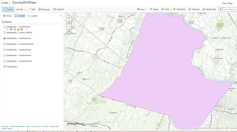
I have attached pictures.
ipadissue1.jpg: In that image the small arrow at the top enables us to go to the next pop up.
ipadissue2.jpg: I can see only one pop up. Is there a way I can access all other four as in image1.
Thanks,
Sara
- Mark as New
- Bookmark
- Subscribe
- Mute
- Subscribe to RSS Feed
- Permalink
- Report Inappropriate Content
Hi Sara,
Sorry about your issue.
We did not enable the navigation on the mobile popup in an attempt to encourage creating simple story.
What we recommend is that you author your story in a way that users will always get one thing when clicking on a map feature. In your case it looks like you are selecting a large polygon, is there more layer under that are not visible to the user. Would it help if those data where above?
But I do understand this is not always possible so I kept track of your issue at Popup on the mobile view don't have the navigation buttons · Issue #13 · Esri/map-series-storytellin... we will let you know there if we fix it.
Thanks
- Mark as New
- Bookmark
- Subscribe
- Mute
- Subscribe to RSS Feed
- Permalink
- Report Inappropriate Content
Thank You, for the reply. There are layers one below the other. I created them only for the purpose of allowing multiple data to be viewed. 
the application is for the public to see multiple ballots like senate , house etc. Most of the users would be using mobile devices. if they click one county the election results for all races should show. i have five of other tabs for different constituencies, all are working fine. They have one pop up though. For, countywide we wanted multiple pop ups.
- Mark as New
- Bookmark
- Subscribe
- Mute
- Subscribe to RSS Feed
- Permalink
- Report Inappropriate Content
i am providing the link to see the difference when opened in ipad and a laptop or a computer.
Thanks,Sara
- Mark as New
- Bookmark
- Subscribe
- Mute
- Subscribe to RSS Feed
- Permalink
- Report Inappropriate Content
Hi Sara,
Thanks for providing the link to your story. It's looking very nice and will be a great way to provide election results!
As Greg mentioned he's created an issue that you can track regarding your request, but the idea to have just one pop-up available on mobile was by design. We've found that even with the desktop/laptop layout most viewers don't realize that little arrow at the top shows additional pop-ups or are confused as to why there are different pages, so that is not a good experience either. Either way having multiple pop-ups at the same location is not a storytelling pattern that we'd recommend.
I'd encourage you to try to find another way to provide the county wide information, especially since the map is not really adding anything in that case (there is just one feature). Perhaps you could remove the tab for county-wide results and just put a link in the header to a PDF of the county-wide results (like you have in the upper right)? Do you think that would meet your requirements?
Owen
Lead Product Engineer | StoryMaps
- Mark as New
- Bookmark
- Subscribe
- Mute
- Subscribe to RSS Feed
- Permalink
- Report Inappropriate Content
Thank you for the reply. Also, very glad the application looked good.
Even on our side, we started thinking the same. Users might not be able to recognize the small arrow. So, we decided to go with one pop up. Plan is to add all the pop ups into one.
it would be one long pop up.
Thanks again, greg and owen for the quick replies.