- Home
- :
- All Communities
- :
- Products
- :
- ArcGIS StoryMaps
- :
- Classic Esri Story Maps Questions
- :
- Story Map Design Question - AWESOME Design
- Subscribe to RSS Feed
- Mark Topic as New
- Mark Topic as Read
- Float this Topic for Current User
- Bookmark
- Subscribe
- Mute
- Printer Friendly Page
- Mark as New
- Bookmark
- Subscribe
- Mute
- Subscribe to RSS Feed
- Permalink
- Report Inappropriate Content
Hi,
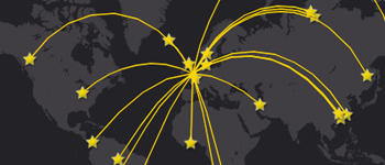
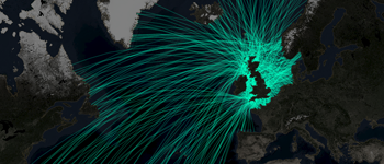
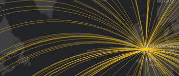
One of ESRI's story map examples has an AWESOME - see attached screenshots - design that I'd like to learn how to do. I tried the regular app features but could not get there...Any ideas on how to do or get started to get there?
John
Solved! Go to Solution.
Accepted Solutions
- Mark as New
- Bookmark
- Subscribe
- Mute
- Subscribe to RSS Feed
- Permalink
- Report Inappropriate Content
I found out the flowline thing. One way to do it from AGOL analysis is to use proximity >>> Connect Origins to Destinations - see below.
- Mark as New
- Bookmark
- Subscribe
- Mute
- Subscribe to RSS Feed
- Permalink
- Report Inappropriate Content
John,
Those are nice looking story maps! It would help to post the link to the map along with a screen shot:
https://trans.maps.arcgis.com/apps/MapSeries/index.html?appid=23351791377146f39cab17e2253f912b
It looks like they just performed an analysis with the data they have:
Perform analysis—ArcGIS Online Help | ArcGIS
In the analyses for the time delivery map, I would assume they used summarize nearby and maybe find nearest.
- Mark as New
- Bookmark
- Subscribe
- Mute
- Subscribe to RSS Feed
- Permalink
- Report Inappropriate Content
Thanks Adrian, I'll have to dig in deeper and see and take into account Raul's reply below. I'll post whatever i come up with or not!
Regds,
John
- Mark as New
- Bookmark
- Subscribe
- Mute
- Subscribe to RSS Feed
- Permalink
- Report Inappropriate Content
- Mark as New
- Bookmark
- Subscribe
- Mute
- Subscribe to RSS Feed
- Permalink
- Report Inappropriate Content
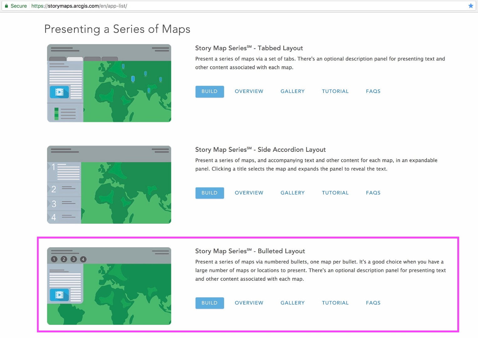
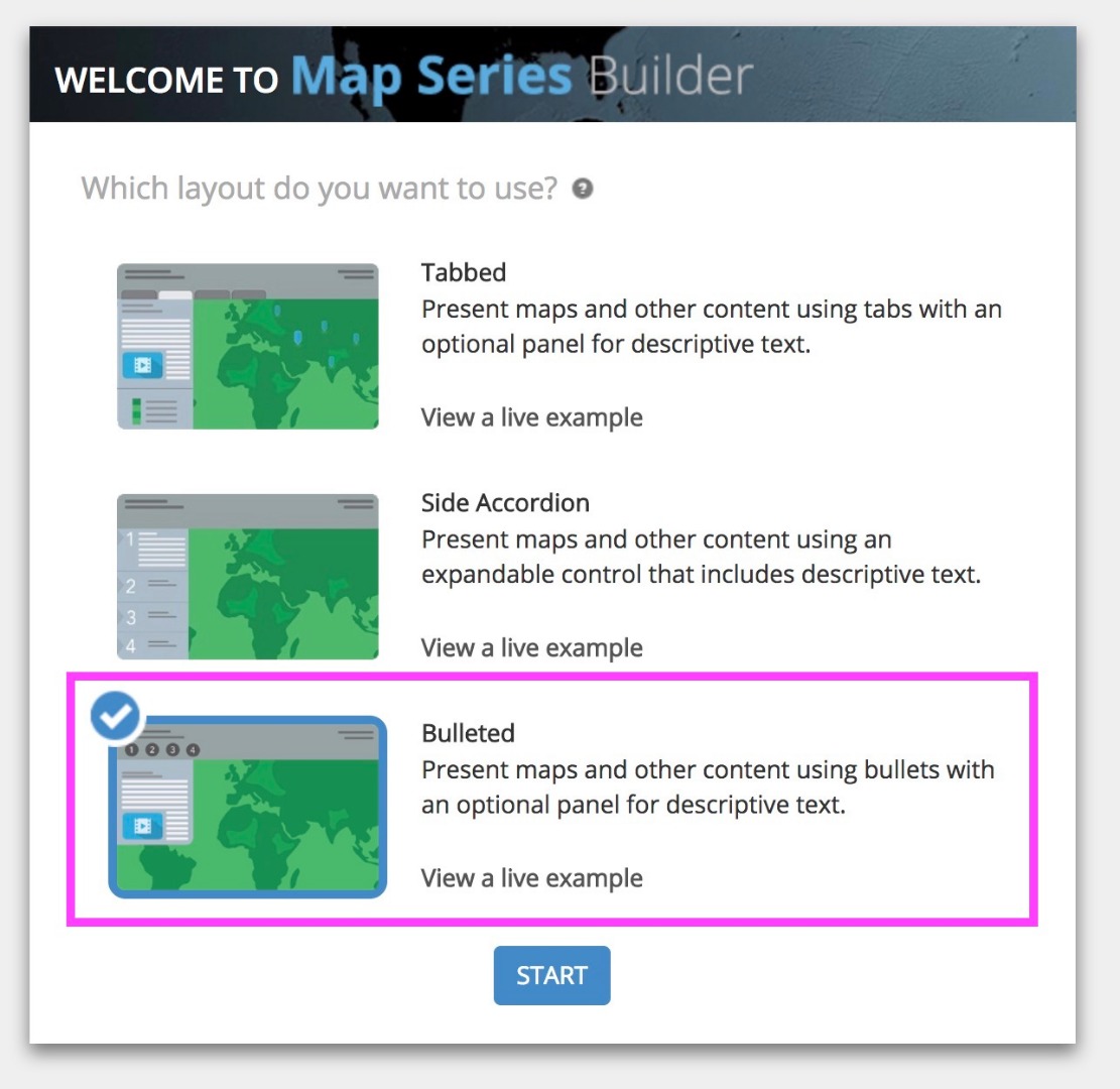
John -- Are you asking about how the maps were made or about the layout of the story map (numbered bullets across the header)? If the latter, that's just the Bulleted Layout of the Map Series app.
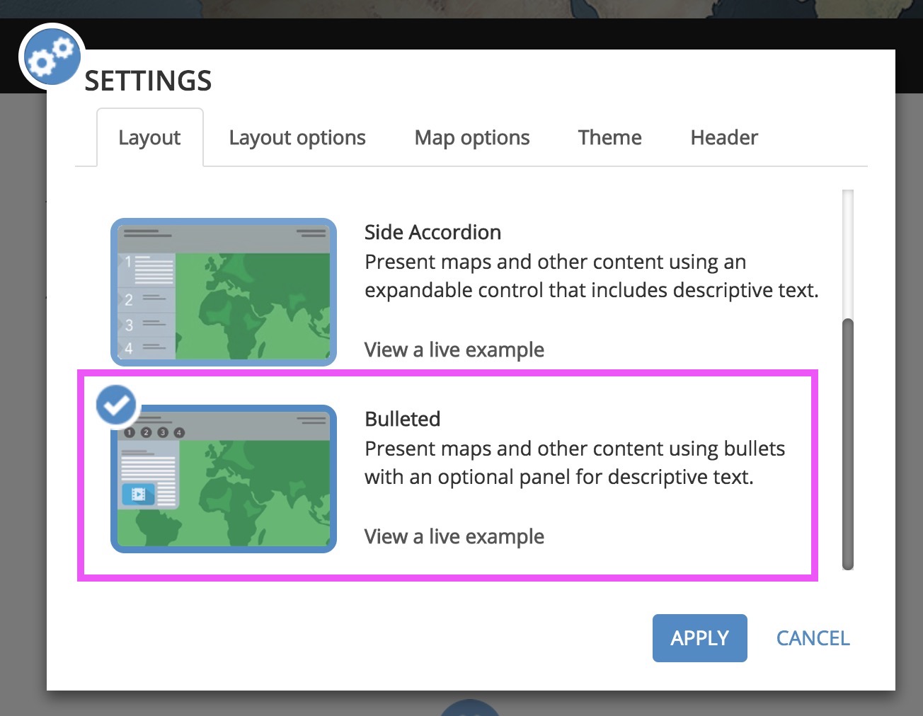
You can choose the Bulleted Layout for your Map Series story in a few ways: 1) launch the builder with Bulleted Layout pre-selected from the Apps page on our website, 2) choose Bulleted in the first screen when you launch Map Series Builder, or 3) select it for an existing story from Settings > Layout (note that on some screens you have to scroll down to see the Bulleted Layout option in the list of layouts in Settings, but it's there right below Side Accordion).
Lead Product Engineer | StoryMaps
- Mark as New
- Bookmark
- Subscribe
- Mute
- Subscribe to RSS Feed
- Permalink
- Report Inappropriate Content
Owen:
Thanks for your reply. I was more after the travel pathway - arch shaped graphics from one location to another.
John
- Mark as New
- Bookmark
- Subscribe
- Mute
- Subscribe to RSS Feed
- Permalink
- Report Inappropriate Content
I found out the flowline thing. One way to do it from AGOL analysis is to use proximity >>> Connect Origins to Destinations - see below.
