- Home
- :
- All Communities
- :
- Products
- :
- ArcGIS StoryMaps
- :
- Classic Esri Story Maps Questions
- :
- Map Journal Pop-Ups not functioning (optimal) on m...
- Subscribe to RSS Feed
- Mark Topic as New
- Mark Topic as Read
- Float this Topic for Current User
- Bookmark
- Subscribe
- Mute
- Printer Friendly Page
Map Journal Pop-Ups not functioning (optimal) on mobile devices
- Mark as New
- Bookmark
- Subscribe
- Mute
- Subscribe to RSS Feed
- Permalink
Hi,
I have made two different Story Maps; A Tabbed Map Series and a Story Map Journal. The pop-ups for the Tabbed Map Series show up nice and center on the screen with the ability to scroll up and down in the pop-up window on a mobile device, while the pop-ups for Story Map Journal are too large, go out of the screen and are very difficult to see all of the content on a mobile device. Is there a setting for pop-up display or are they just configured differently between the two applications? Any info will be much appreciated. Thanks!
Solved! Go to Solution.
Accepted Solutions
- Mark as New
- Bookmark
- Subscribe
- Mute
- Subscribe to RSS Feed
- Permalink
Sorry about this and thanks for your feedback. Unfortunately that's not a settings, Map Journal and Map Series popup are different. Map Journal is using the default style popup whereas Map Series is displaying the popup in a separate panel. Displaying the popup in a separate panel seems to works best, we are going to work on standardizing this across our apps.
- Mark as New
- Bookmark
- Subscribe
- Mute
- Subscribe to RSS Feed
- Permalink
Hi Tyler,
Sorry you are seeing some issues with the pop-up display on Map Journal. Could you please share links to both of your apps (either here or in a private message to me) so I can take a look?
Owen
Lead Product Engineer | StoryMaps
- Mark as New
- Bookmark
- Subscribe
- Mute
- Subscribe to RSS Feed
- Permalink
Sorry about this and thanks for your feedback. Unfortunately that's not a settings, Map Journal and Map Series popup are different. Map Journal is using the default style popup whereas Map Series is displaying the popup in a separate panel. Displaying the popup in a separate panel seems to works best, we are going to work on standardizing this across our apps.
- Mark as New
- Bookmark
- Subscribe
- Mute
- Subscribe to RSS Feed
- Permalink
Thanks for the reply Gregory! Yes, the popup display in a separate window works and looks great on mobile devices. Very clean and neat display.
- Mark as New
- Bookmark
- Subscribe
- Mute
- Subscribe to RSS Feed
- Permalink
Hi Owen,
Thanks for the reply. I want to add that ESRI Story Maps and Web Apps have added a whole new dimension to bringing GIS out of the software and allowing the public to interact with and understand data. Map stories are the best medium for presenting geographic information there is, hands down. It helps to show people the value of location based information and GIS without them having to understand the technical aspects of it. Great work to all involved in the development and maintenance of the ArcGIS Online tools.
Here are the links to the two different web maps:
Map Journal: http://arcg.is/1Fu6jne
Map Series: http://arcg.is/1L0hoyU
Another question: In Map Journal, there is the ability to fit images in the Main Stage that center them in that area (from the edge of the side panel) making them fit nicely across devices and screen sizes. In Map Series, images on the Main Stage in the "fit" position center on the whole screen (including the area behind the side panel).
See screen shots:
Image Position (Fit) - Centers on whole screen
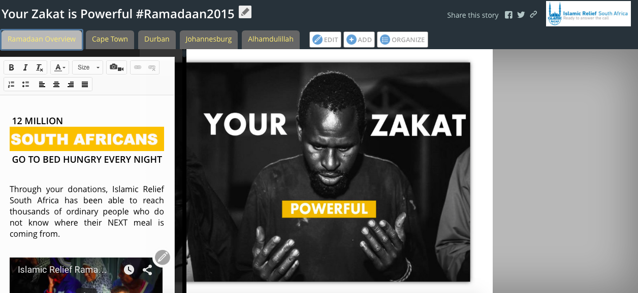
Image Position (Fit) - Centers on Main Stage
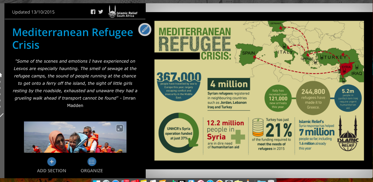
Is there a way to fit / center images just on the main stage in a Map Series like in Map journal?
- Mark as New
- Bookmark
- Subscribe
- Mute
- Subscribe to RSS Feed
- Permalink
Hi Tyler,
Thanks for the kind words about Story Maps! 🙂 The team is certainly working hard to bring you new and innovative ways to tell your stories using your great maps and data.
Regarding your other question about Map Series, I think the option you should use to get the desired layout in this case is Center. This will center the image in the area to the right of the description panel.
Lead Product Engineer | StoryMaps
- Mark as New
- Bookmark
- Subscribe
- Mute
- Subscribe to RSS Feed
- Permalink
Thanks Owen,
The trouble I'm having with the "center" option in map series is the image gets cropped across different screens sizes like below:
"Center" option Map Series
Large Screen Desktop 24"
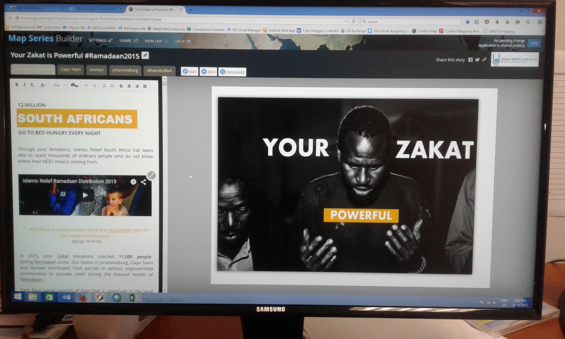
"Center" option Map Series
Laptop 13"
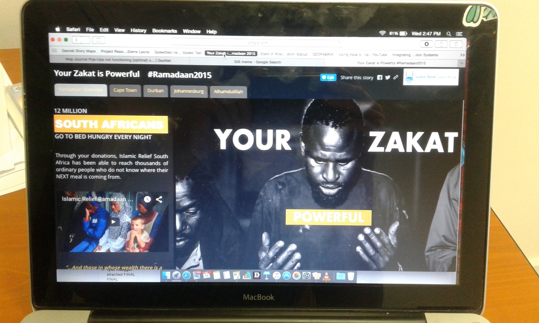
"Center" option Map Series
Mobile Phone 4.5" screen

The "fit" option in Map Journal centers the image on the main stage AND makes the image responsive to fit on any sized screen. I think the difference in the fit option between Map Series and Map Journal is that Journal fits the image on the Main Stage (excluding side panel) and Series fits the image across the whole screen (side panel include).
"Fit" Option on Map Journal
Mobile phone 4.5" Screen
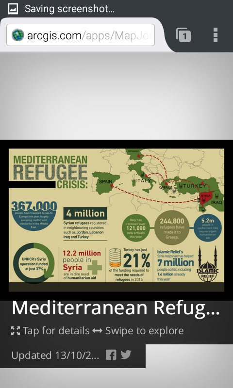
As you have no idea what your audience will be viewing the app on, the 'fit' option in Map Journal is the best option for making the image remain consistent across all devices. With the 'center' option on Map Series, your audience may or may not see the whole image depending on the device they are viewing the app on due to the cropping (as seen in the three screen shots above)
Is there a way to make the image 'fit' only on the main stage in Map Series (like in Journal) and not 'fit' the whole window? Sorry if this is confusing and thank you for your assistance!
- Mark as New
- Bookmark
- Subscribe
- Mute
- Subscribe to RSS Feed
- Permalink
Hi Tyler,
Thanks for the kind note.
Unfortunately the image positionnement in Map Series with the center option is as you noticed not optimal, that's a technological limitation. We kept it there as it's useful for some case on Desktop but we don't recommend it.
In Map Series tab and bullet layout, the description panel is floating over your content. So with Fit, Fill and Stretch your image will use the full main stage and some part will be under the description panel.
In Map Series, if you use the accordion layout as the accordion will be on the side, the fit, Fill and Stretch option will work as you expect and you won't miss some part of the image. Another option that has a big constraint is to not have any description text in tab or bullet, that way you won't miss some of your images.
Sorry we know this is a limitation and Map Journal may be your only solution if you don't want your image to be partially hidden.
- Mark as New
- Bookmark
- Subscribe
- Mute
- Subscribe to RSS Feed
- Permalink
Gregory,
I didn't realize that using the accordion layout will solve the issue. Good to know. Thank you both for being so helpful and efficient. Keep up the great work!