- Home
- :
- All Communities
- :
- Products
- :
- ArcGIS StoryMaps
- :
- ArcGIS StoryMaps Questions
- :
- Re: Issues with maps in slideshow
- Subscribe to RSS Feed
- Mark Topic as New
- Mark Topic as Read
- Float this Topic for Current User
- Bookmark
- Subscribe
- Mute
- Printer Friendly Page
- Mark as New
- Bookmark
- Subscribe
- Mute
- Subscribe to RSS Feed
- Permalink
I'm having three issues with the new slideshow, both related to maps.
Issue 1) First issue I'm having is the slideshow does not compensate for different screen sizes; specifically pop-ups. On my desktop the way I have it set up when I select a county my pop-up displays nicely. However, when I view it on a smaller screen (my laptop), the title of the pop-up is covered by the text box.
Issue 2) Second issue is that my pie chart is not sized correctly when first displayed. First time my pop-up appears the pie chart appears rather small. But if I select a different county that pop-up will display correctly. Every pop-up within that same map will be displayed correctly.
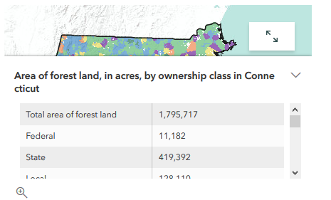
Issue 3) Third issue, and this actually spreads across all maps in StoryMaps. Titles for pop-ups do no space correctly. For instance,

Slideshow
I've noticed this in other maps as well whether the were in text, sidecar, or slideshow.

Sidecar

In text
I have attached two videos to show exactly what I mean. First is my desktop screen and the second is laptop screen. I was practicing a presentation when this issue came up so I'm glad I caught this before the big one.
Solved! Go to Solution.
Accepted Solutions
- Mark as New
- Bookmark
- Subscribe
- Mute
- Subscribe to RSS Feed
- Permalink
Bryan -- this issue should be addressed with last week's update. Please let me know if you are still able to observe the problem.
Lead Product Engineer | StoryMaps
- Mark as New
- Bookmark
- Subscribe
- Mute
- Subscribe to RSS Feed
- Permalink
Hi Bryan - Thanks for providing this feedback. We'll look into issues 2 and 3. Could you share a link to the story and web map you're using so we can take a look? I can't reproduce the issue with the pie chart being a different size at first.
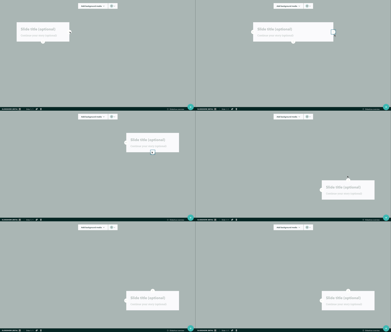
For issue 1, if you plan to show pop-ups you can simply move your panel to a different position so it won't overlap with the pop-ups. Just use the arrows on the narrative panel to move it to one of the other positions that works better.

Lead Product Engineer | StoryMaps
- Mark as New
- Bookmark
- Subscribe
- Mute
- Subscribe to RSS Feed
- Permalink
Bryan -- this issue should be addressed with last week's update. Please let me know if you are still able to observe the problem.
Lead Product Engineer | StoryMaps