- Home
- :
- All Communities
- :
- Products
- :
- ArcGIS StoryMaps
- :
- ArcGIS StoryMaps Questions
- :
- Caption for expanded images narrow and not consist...
- Subscribe to RSS Feed
- Mark Topic as New
- Mark Topic as Read
- Float this Topic for Current User
- Bookmark
- Subscribe
- Mute
- Printer Friendly Page
Caption for expanded images narrow and not consistent
- Mark as New
- Bookmark
- Subscribe
- Mute
- Subscribe to RSS Feed
- Permalink
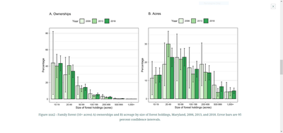
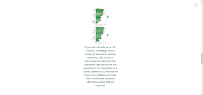
When building story maps I have some images that are wide and some that are long. Captions at times can be long as well. The issue I am running into is when expanding the images that are long the captioning is pretty narrow, as if it is tied to the width of the image. This creates a very small expanded image but a long caption. If the image is wide the caption will fill the screen and the image is enlarged. Below are two images of what I am seeing.
wide image
long image
Is there a way to improve this for expanded images? My suggestion would be not to tie the width of the caption to the width of the image. If the captioning would fill the screen regardless of image width I think it would look better.
Solved! Go to Solution.
Accepted Solutions
- Mark as New
- Bookmark
- Subscribe
- Mute
- Subscribe to RSS Feed
- Permalink
@Anonymous User - Thanks for reporting this. Looks like a bug. We'll look into fixing this in an upcoming release.
Lead Product Engineer | StoryMaps
- Mark as New
- Bookmark
- Subscribe
- Mute
- Subscribe to RSS Feed
- Permalink
@Anonymous User - Thanks for reporting this. Looks like a bug. We'll look into fixing this in an upcoming release.
Lead Product Engineer | StoryMaps
- Mark as New
- Bookmark
- Subscribe
- Mute
- Subscribe to RSS Feed
- Permalink
Cool, thanks for the quick response!

