- Home
- :
- All Communities
- :
- Products
- :
- ArcGIS Spatial Analyst
- :
- ArcGIS Spatial Analyst Questions
- :
- Re: Having problems with displaying density map
- Subscribe to RSS Feed
- Mark Topic as New
- Mark Topic as Read
- Float this Topic for Current User
- Bookmark
- Subscribe
- Mute
- Printer Friendly Page
Having problems with displaying density map
- Mark as New
- Bookmark
- Subscribe
- Mute
- Subscribe to RSS Feed
- Permalink
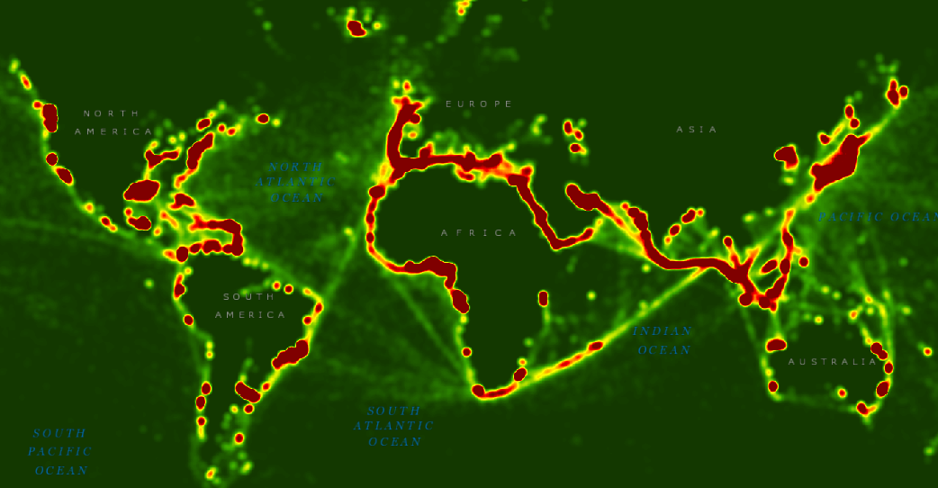
I am using a shapefile from the European Commission on world maritime traffic. They have developed a map of maritime traffic as shown here.
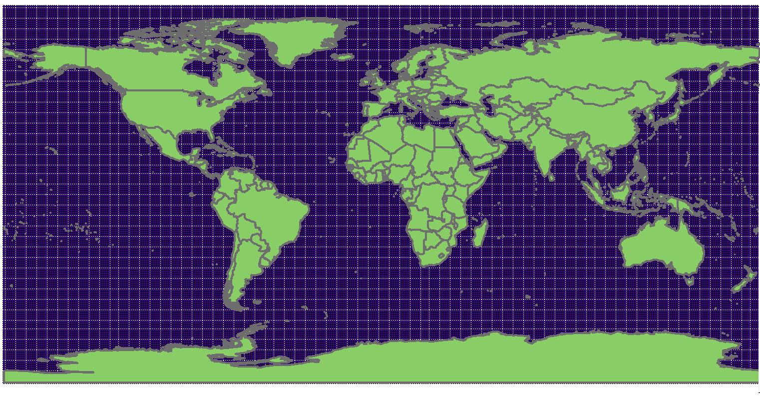
I would like to replicate the same map on ArcMap 10.3 so then I can zoom into Europe and use my map as a discussion for a research paper on the European maritime industry. I have downloaded the point shapefile of the data from the European Commission site. When I add it to my map document, there are lots of uniformly spaced dots as shown here.
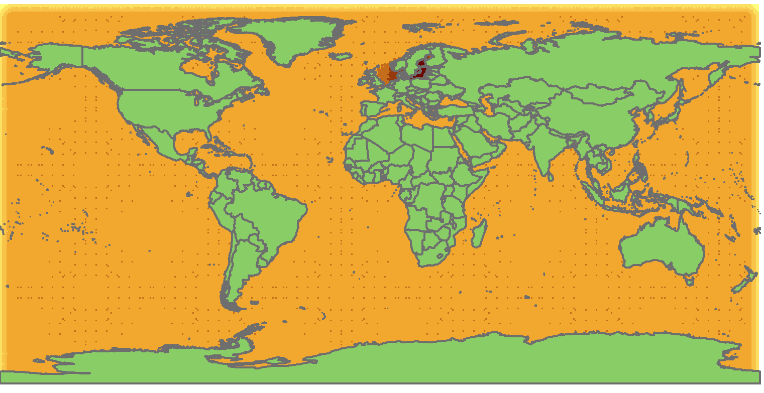
So then, I tried to use the Spatial Analyst tool to better depict the densities. I went to Spatial Analysis -> Point Density -> Used the point feature, Output Cell Size: 0.716, Neighborhood: Circle, Neighborhood Settings: Radius: 6, Units: Map. I then made an edit in the Properities -> Symbology tab -> Natural Breaks. Now my map looks like this, but it does not quite look like the map that the European Commission made.
Any ideas on how to fix this would be really great!
- Mark as New
- Bookmark
- Subscribe
- Mute
- Subscribe to RSS Feed
- Permalink
what field/attribute did you use for the density determination? The raster that you showed was for a 1 x 1 degree grid and the number of observations per grid. It looks like the density calculation was based on the default selection of the parameter to use for the calculation rather than your selection of the appropriate attributes
- Mark as New
- Bookmark
- Subscribe
- Mute
- Subscribe to RSS Feed
- Permalink
I am not sure what you mean exactly. The spatial analyst tool for Point Density does not allow you to select the field/attribute to conduct the dot density. It only allows you to select the point feature (for Point Density).
- Mark as New
- Bookmark
- Subscribe
- Mute
- Subscribe to RSS Feed
- Permalink
Then I am confused since your points on the map look like the boundary of a 1x1 degree grid and the link you provided is the final result. If you have the link to the original raw data you used for the point density, that might help
- Mark as New
- Bookmark
- Subscribe
- Mute
- Subscribe to RSS Feed
- Permalink
Here's the link to the data and map: Maritime traffic density - results of PASTA MARE project - European Commission
On the right hand side, you'll see the Attachments section. There, you can download a copy of the same final result map that I want to make and the Shapefile.zip that I downloaded.
- Mark as New
- Bookmark
- Subscribe
- Mute
- Subscribe to RSS Feed
- Permalink
Yes, I downloaded the data, unfortunately they used a point representation of the 4 corners of each grid cell, so you could try just converting the points to raster with a cell size of about 1 using the average option with the Value field, which seems to be a duplicate of the All ships data. You will have to mess around with cell size, colour ramp etc, but if you are working in a smaller area, you might have some luck. Point density is definitely not the route to go, since the points represent the corners of the grid cells, so as such, are inappropriate for such analysis.
- Mark as New
- Bookmark
- Subscribe
- Mute
- Subscribe to RSS Feed
- Permalink
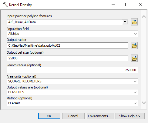
Dan Patterson is right. See below an example of using the Kernel Density tool which provides a smoother result:
Using the following settings (in this case unit are in meters, and I used the WGS_1984_Web_Mercator_Auxiliary_Sphere reference system):
- Mark as New
- Bookmark
- Subscribe
- Mute
- Subscribe to RSS Feed
- Permalink
Thank you, Mr. Patterson! I got a much better result using Point to Raster! I'll post the final result!
- Mark as New
- Bookmark
- Subscribe
- Mute
- Subscribe to RSS Feed
- Permalink
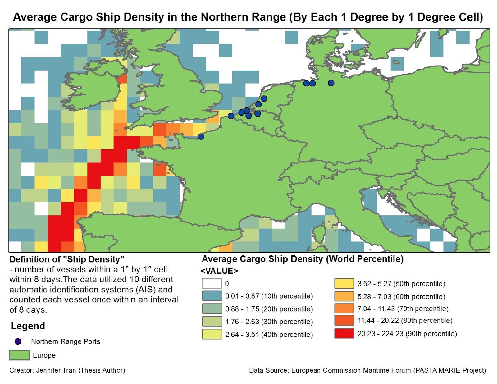
I followed the suggestions and here's the final result if anyone is interested in seeing it. It was one of the maps that I submitted as part of a larger thesis project.
- Mark as New
- Bookmark
- Subscribe
- Mute
- Subscribe to RSS Feed
- Permalink
Thanks Jennifer for the followup. Glad everything worked out and nice presentation.