- Home
- :
- All Communities
- :
- Products
- :
- ArcGIS Pro
- :
- ArcGIS Pro Ideas
- :
- Table field selection
- Subscribe to RSS Feed
- Mark as New
- Mark as Read
- Bookmark
- Follow this Idea
- Printer Friendly Page
- Mark as New
- Bookmark
- Subscribe
- Mute
- Subscribe to RSS Feed
- Permalink
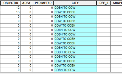
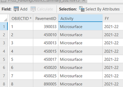
Table field selection should highlight entire field column like in Arcmap. No options are available for tables like in ArcMap. Please add table appearance options!:
ArcMap Field Selected:
Pro Field Selected:
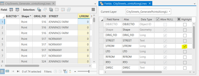
Not to mention the column where you hover your mouse is highlighted the same way as the selected column. Can you tell which is selected and which has the mouse over it in this picture?
The "Is connected" column is the selected column -- it has a dark blue line under it. But I think that distinction is too subtle; I didn't notice it until I went in Pro after reading this. However, my mouse pointer clearly shows me what I am hovering over; what happened to your pointer?
CherylTrine, correct, it is the "is connected" field, but like you said it isn't very clear. Also, the fact that "Asset Group" is colored in orange makes it look like it is more highlighted than the highlighted field.
@JonathanNeal No sir, this has to do with just selecting a field and have it highlight like in Arcmap mainly for distinctly showing it's the field I have selected for Search or calculating values. Thank you for replying and hope you gave it a thumbs up!
There is a thick blue line under the selected column
What I like about the way it is set up is that if you have a feature selected and a column the intersecting Cell stands out.
I could see it as an option but would not like to see it as a default.
This functionality has been added in ArcGIS Pro 3.0. See Ideas in ArcGIS Pro 3.0 to see this and all of the other ideas you can look forward to when you upgrade.
Also be sure to check out the What's New documentation: https://pro.arcgis.com/en/pro-app/latest/get-started/whats-new-in-arcgis-pro.htm
You must be a registered user to add a comment. If you've already registered, sign in. Otherwise, register and sign in.


