- Home
- :
- All Communities
- :
- Products
- :
- ArcGIS Pro
- :
- ArcGIS Pro Ideas
- :
- Show the class table for symbology methods that re...
- Subscribe to RSS Feed
- Mark as New
- Mark as Read
- Bookmark
- Follow this Idea
- Printer Friendly Page
Show the class table for symbology methods that rely solely on the histogram for setting class breaks
- Mark as New
- Bookmark
- Subscribe
- Mute
- Subscribe to RSS Feed
- Permalink
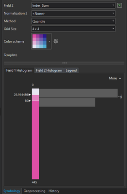
With both bivariate and unclassed colors symbology, the current histogram-driven interface for viewing and adjusting class breaks is flawed in that when two breaks are close to one another, there is no way to select, modify, or even view the hidden number without modifying the other class. This can happen easily in datasets with a highly skewed normal distribution:
In this case, quantile class breaks resulted in two class breaks right around 30, but you wouldn't know it as there's a second number hiding under the 29.9 value. The only way to see what that hidden value is is to drag the other one away, at which point you're unable to go back to what you had without resetting the symbology for the entire layer.
Some symbology methods provide a different default, which is preferred - the table. The table view shows all class breaks at a glance and is much more easy to quickly than sliders -- I can just view or type the break value and move on. Please improve these symbology methods by giving the user the same fine-grain control found in other methods.
Thank you for this idea. We are happy to report that it has been implemented in ArcGIS Pro 3.5 as follows:
The symbology histogram for class-based symbology includes the following enhancements:
- You can change the zoom level.
- You can change the bin count to show more or less detail in feature counts.
- You can hover over a bin to see the feature count.
- Labels are more legible, and keyboard accessibility was improved.
See Use Symbology Histograms for more information.
See the ArcGIS Pro 3.5 Ideas Wrap-up blog for all the ideas we implemented in ArcGIS Pro 3.5.
You must be a registered user to add a comment. If you've already registered, sign in. Otherwise, register and sign in.

