Turn on suggestions
Auto-suggest helps you quickly narrow down your search results by suggesting possible matches as you type.
Cancel
- Home
- :
- All Communities
- :
- Products
- :
- ArcGIS Pro
- :
- ArcGIS Pro Ideas
- :
- New Comparative Symbology Styles
Options
- Subscribe to RSS Feed
- Mark as New
- Mark as Read
- Bookmark
- Follow this Idea
- Printer Friendly Page
New Comparative Symbology Styles
Follow this Idea
1333
2
03-15-2012 12:12 PM
Status:
Under Consideration
- Mark as New
- Bookmark
- Subscribe
- Mute
- Subscribe to RSS Feed
- Permalink
I would like to suggest an enhancement regarding the graph symbology selector:
Add more comparative symbology styles to the symbol selected. Specifically, add a style similar to a pie graph, but the size of the piece indicates percentage.
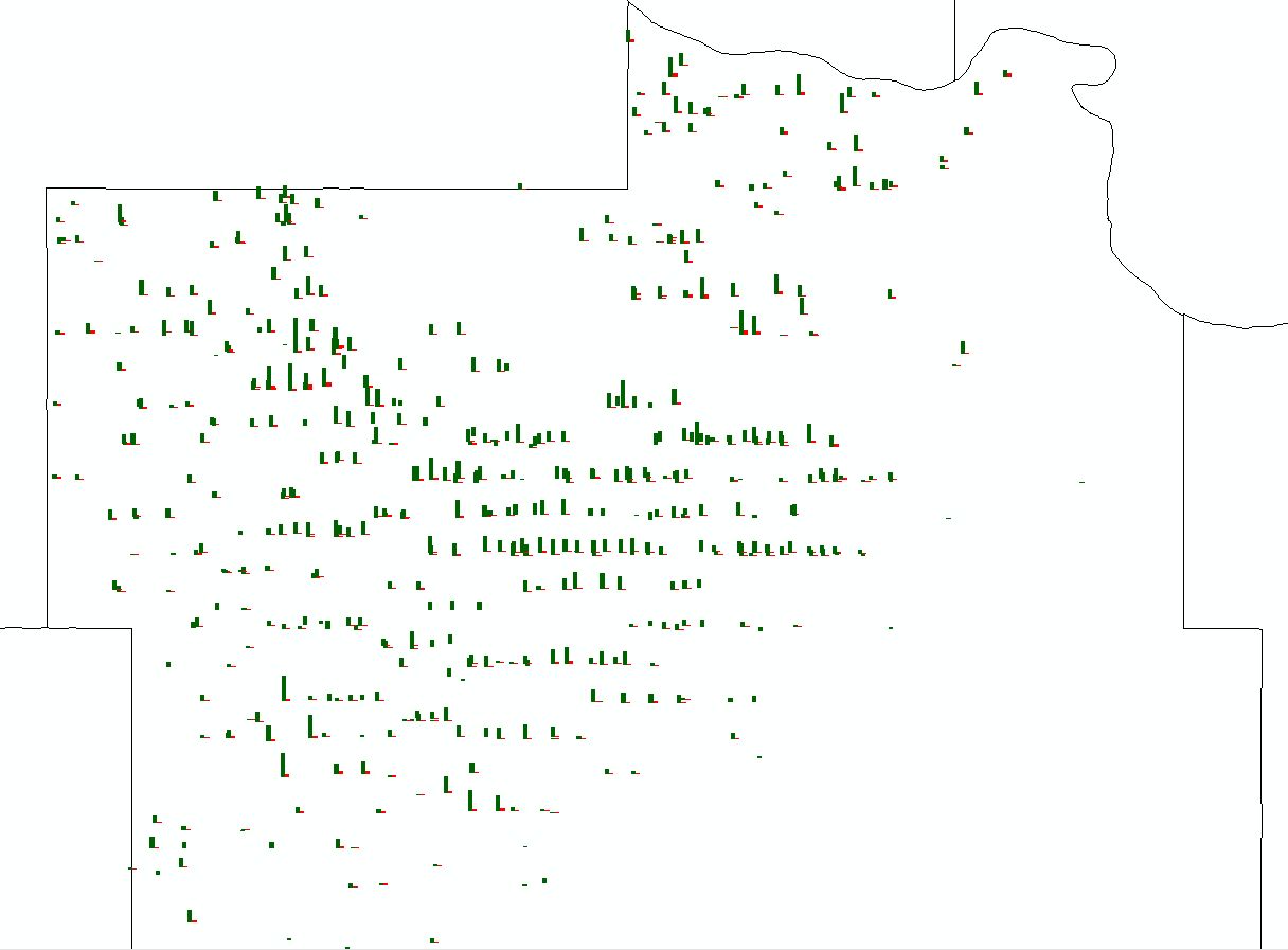
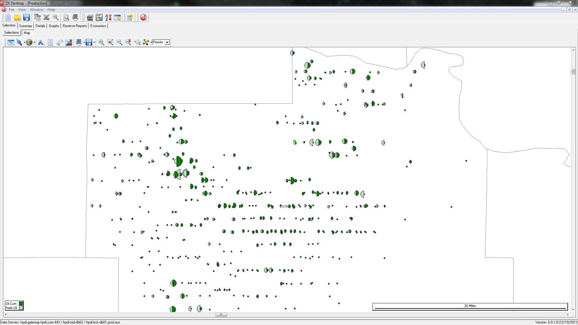
Arc offers bar graphs, both side by side and stacked, and pie graphs as graphic symbology. The pie graph is inadequate for my purposes because it displays the data in the pie graph as a percent of the total value of the pie graph.
The preferred representation, which is accomplished by both the bar graph in the first ArcMAP image and the bubble graph in the second DrillingInfo.com image, shows values in the same location compared to eachother but as a percentage of each set of data. Thank you.
Add more comparative symbology styles to the symbol selected. Specifically, add a style similar to a pie graph, but the size of the piece indicates percentage.
Arc offers bar graphs, both side by side and stacked, and pie graphs as graphic symbology. The pie graph is inadequate for my purposes because it displays the data in the pie graph as a percent of the total value of the pie graph.
The preferred representation, which is accomplished by both the bar graph in the first ArcMAP image and the bubble graph in the second DrillingInfo.com image, shows values in the same location compared to eachother but as a percentage of each set of data. Thank you.
2 Comments
From Esri: Great Idea! This is being considered for a future release.
ArcGIS Ideas Moderator
ArcGIS Ideas Moderator
You must be a registered user to add a comment. If you've already registered, sign in. Otherwise, register and sign in.