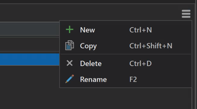
Out of all the more technically difficult troubleshooting I've helped students with regarding Network Analyst, the most common question I got was elementary - "how do I add a new cost/travel mode?"
"See that little menu?"
"What menu?"
"Those tiny lines in the corner."

The menu has four (or five for travel modes) commands total. Could they not be brought out, and put along the top, as a toolbar?
You could also then dispense with this verbose warning, obviously necessitated by the poor UI, which ironically takes up about the same amount of space as a normal toolbar would.

(I don't think it's even clear what the "menu" button is, it's hiding in the corner and not labeled "menu.")
I don't understand the need to hide the few commands needed under a second click. That second click adds up every time you need to do something.