- Home
- :
- All Communities
- :
- Products
- :
- ArcGIS Pro
- :
- ArcGIS Pro Ideas
- :
- Make pop-up charts configurable in ArcGIS Pro
- Subscribe to RSS Feed
- Mark as New
- Mark as Read
- Bookmark
- Follow this Idea
- Printer Friendly Page
Make pop-up charts configurable in ArcGIS Pro
- Mark as New
- Bookmark
- Subscribe
- Mute
- Subscribe to RSS Feed
- Permalink
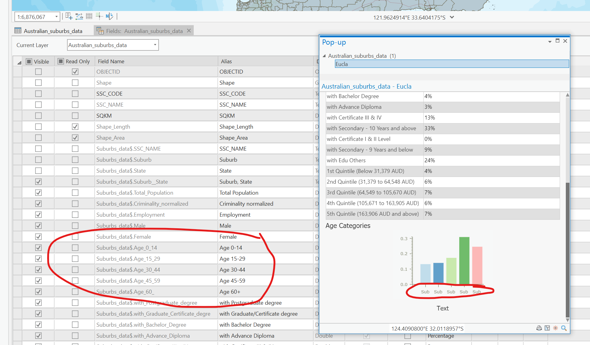
Charts available in pop-ups are great, however x & y axis are not configurable. By default the x axis is derived from the Field Name as opposed to the Alias, and its direction cannot be edited, which means in the best case scenario, you'll see the first 2 letter of Field name.
For example with following Field Name:
- Suburbs_data$.Age_0_14
- Suburbs_data$.Age_15_29
- Suburbs_data$.Age_30_44
- Suburbs_data$.Age_45_59
- Suburbs_data$.Age_60_
The chart legend will be AU..AU..AU..AU..AU.. instead of allowing you to change scale and orientation of axis to display:
- Age 0 - 14
- Age 15 - 29
- Age 30-44
- Age 45-59
- Age 60+
...which makes the chart understandable for everybody.
Same applies for all types of charts: Column, Line, Pie and Bar charts.
All my work is in a GDB.
This is exactly the dilemma I am having right now as well.
I need the bottom labels in my Pop-Up chart to read Total Population, Enrolled on Reservation, AIAN Alone, AIAN Alone OR in combo with 2 or more races....etc. instead of "CDAR":

Configuring charts in Tableau seems almost easy a Cave Man could do it, wish the same could be said for ArcGIS Pro. It would also add a lot more power to ArcGIS Dashboards.
You must be a registered user to add a comment. If you've already registered, sign in. Otherwise, register and sign in.