- Home
- :
- All Communities
- :
- Products
- :
- ArcGIS Pro
- :
- ArcGIS Pro Ideas
- :
- Improve distinctness of quick access buttons
- Subscribe to RSS Feed
- Mark as New
- Mark as Read
- Bookmark
- Follow this Idea
- Printer Friendly Page
Improve distinctness of quick access buttons
- Mark as New
- Bookmark
- Subscribe
- Mute
- Subscribe to RSS Feed
- Permalink
A very little thing bothers me every time I use ArcGIS Pro:
The icons in the quick access toolbar are difficult to distinguish. They are too small and look too similar (all somehow pale blue except of tiny differences). I nearly have to press my nose onto the screen to hit the correct button... 😞
If you cannot enlarge the quick access buttons (I think this might be a general issue in all ribbon GUI apps?) please use clearer icons. Just a yellow folder for Open, white page for new, just a floppy disk for save - as for example in MS Office: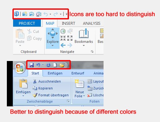
Agreed. I didn't even notice the toolbar there.
An option for the user to customize the icon size would be helpful. The icons are very small compared to the ribbon icons and they get lost on the interface.
Four years after this was first requested, nothing has improved. Maybe a little color has been added to icons, but the quick tools - and everything else in the UI - are pale, low-contrast and small. Lines and text are thin. This low visibility is especially bad with the dark theme, which should be better on your eyes, but instead it's just harder to distinquish anything.
You must be a registered user to add a comment. If you've already registered, sign in. Otherwise, register and sign in.