- Home
- :
- All Communities
- :
- Products
- :
- ArcGIS Pro
- :
- ArcGIS Pro Ideas
- :
- Dynamic Solution for Overlapping Points
- Subscribe to RSS Feed
- Mark as New
- Mark as Read
- Bookmark
- Follow this Idea
- Printer Friendly Page
- Mark as New
- Bookmark
- Subscribe
- Mute
- Subscribe to RSS Feed
- Permalink
It would be wonderful to have a dynamic solution for dispersing overlapping markers for point data. This could work similar to the way Labels in Maplex can be configured for placement. If the Maplex Label engine can do this dynamically, and we have other symbol effects that work dynamically, it seems possible to have a dynamic disperse points option.
This could be very helpful for our mapping workflows, where we have data in an enterprise database and we make many maps with lots of markers. Instead of having to maintain separate data for cartography, or fiddle with 'labelized' versions of the symbology, this solution would make our mapping easier.
- « Previous
-
- 1
- 2
- Next »
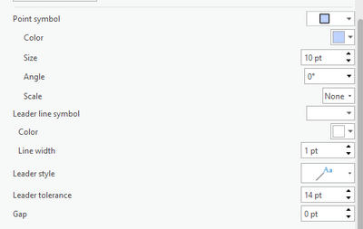
@GISJess, then in that case I suspect you need to make the font size much smaller, and change the Label expression to something small like "." or "*". The leader is extending from the edge of the text box - even though it is fully transparent, the text is larger than the little blue square so the leader starts outside the blue square.
@JesseWickizer That worked!🎉 I originally had ".", but changed it to play with the settings, and didn't change it back. Thanks for the workaround.
Thanks a bunch!
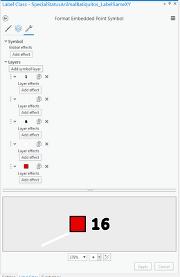
Another question: these points represent bird observations, (each color representing a different species), and some points represent more than one bird observation for a particular species. I was originally using labels to display the number of birds, if the point represented more than one bird observation. Now that some of these modified points are labels themselves, is there a way to offset a number label to the side of this new symbol-label? I figure I can use graphic text as a workaround.
Update: I played around with 'Format Point Symbol' under Callout. Since I didn't see any halo effects, I created two extra numbers in white in bold with bigger outline widths in white to go under the black numbers. All of these number were offset from the square point.
I feel like I am close, but it's not 100% what I want. The font, even though it is the same format as the regular labels, the numbers don't quite match.
@GISJess, here are a few ideas to consider.
Numbers not matching label style:
The black 16 in the image looks like it might have a stroke on it because the letters look "rounded" - or it could be you're just using a rounded looking font. But if you're adding a stroke around the black text it will look different than label text because the added stroke rounds out the appearance of each character.
Using Shape text symbol for numbers in icons:
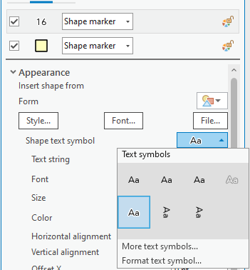
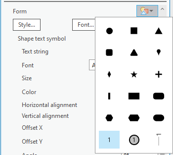
Instead of adding a '1' and a '6' twice each to make '16' with a halo, you could use a "Shape text symbol" with the "White halo" style in 1 layer.
Label marker symbols with dynamic text:
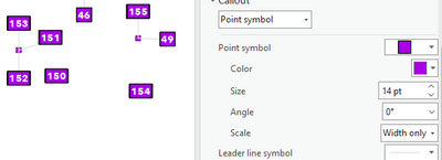
Making individual label classes for every icon with various quantities of observations could be tedious if there are many different amounts to create symbols for. Perhaps you could label the squares with the number of observations inside the square. Then you may only need a couple label classes - one simple square where there is only 1 observation that uses the blank number. Then another label class that labels the square with the number of observations. You can set the background callout point symbol to scale by width to allow the icon to widen to accommodate bigger numbers.
Composite Callout:
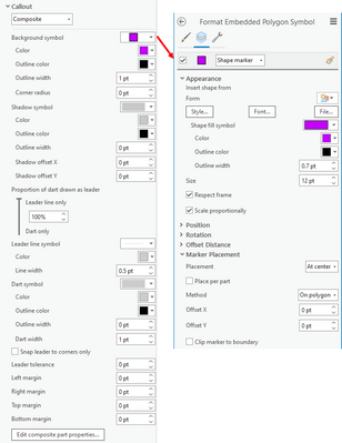
Another idea is to use the Composite callout symbol. It takes a little more configuration with various Text formatting tags, but you can achieve something similar to what you're describing and allow for dynamic labels to be used.
In this example I use this label expression to set following:
- Set the placeholder asterisk to the middle position of the composite callout.
- Change the color of the placeholder asterisk to transparent.
- Place the objectid field label in the right position of the composite callout and offset it 5px to the right.
"<PART position='middle'>" +
"<CLR red='255' green='255' blue='255' alpha='0'>oo</CLR></PART>" +
"<PART position='right' x_offset='3'>" + $feature["objectid"] +
"</PART>"
Then I configure the Composite callout symbol so that the background is actually a point marker symbol centered in the polygon.
The final symbol looks like this:
@JesseWickizer Thank you for all of your help, I was able to get the number labels to match, I just had to play with outline thickness.. 😅
I am glad that there is a work around, and I learned so much from this exercise thanks to you.
It would be nice to have tool to be able to separate two points that share coordinates to give a similar result like we just created. It would be great if the tool could do this whether the points are from the same or separate layer.
Thanks again for all of your help!!
Back here to say that while the labeling can work in some cases, it's tedious compared to what's being suggested, which is to disperse point markers dynamically, for instance with dynamic symbol effects.
Please see the Point Displacement renderer in QGIS.
Hello @JesseWickizer , I want to thank you for the solution you provided, which has been very helpful for my project. In ArcGIS Pro, everything works perfectly, but when attempting to publish the service to ArcGIS Online, the labeling configuration is not being maintained. Could you please let me know if there is a solution for this issue?
Thank you!
hi,
i have a similar issue that isnt really addressed by the previous solutions.
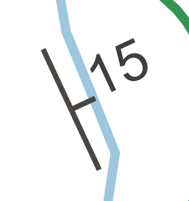
our geological maps and data commonly have points for localiteis where structural data has been collected in the field. often more than one reading is taken at each point. the points are rotated symbols visually showing the orientation of the structure in question (dip of a bedding plane or rock surface etc). these points are also labelled with a value corresponding to the angle of dip of this plane, as shown in the image below.
so the issue with the previous workaround is that i cant label the point with the symbol as i need the label for the numeric value.
so i require the entire object; symbol and label to be distributed around the point location with an accompanying callout/leader to show exactly where the reading was taken. this should be available as a dynamic option and also map scale dependent so that this can be shown on a layout.
at the moment i am essentially losing data as i cannot use the 'distribute' tool as i am left with inaccurate point data that doesnt tell the reader/user where the measurment was taken.
i would love to hear that this has progressed to development, especially when i can see from other comments that this is possible in QGIS. i might have to learn that software after all........
We would like to see weights added to symbology like it is added to labels. To allow symbols to be moved around so they do not overlap other symbols as well as ability to decide which symbols are static and which ones move. This would help maps look so much cleaner. I really like this ability for labels.
You must be a registered user to add a comment. If you've already registered, sign in. Otherwise, register and sign in.
