- Home
- :
- All Communities
- :
- Products
- :
- ArcGIS Pro
- :
- ArcGIS Pro Ideas
- :
- Coxcomb / rose tool integrated into ArcGIS Pro
- Subscribe to RSS Feed
- Mark as New
- Mark as Read
- Bookmark
- Follow this Idea
- Printer Friendly Page
Coxcomb / rose tool integrated into ArcGIS Pro
- Mark as New
- Bookmark
- Subscribe
- Mute
- Subscribe to RSS Feed
- Permalink
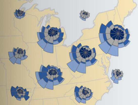
Coxcombs / roses are great for showing numbers of events at a site over time, e.g. tourist numbers, Birds vs Aircraft by Month Map | Maps We Love - Esri, Exploring spatial and temporal patterns of invasive aquatic species—Analytics | ArcGIS Desktop.
Please could you consider:
- Decoupling the coxcomb tool from the mussels case study Exploring spatial and temporal patterns of invasive aquatic species—Analytics | ArcGIS Desktop,
- Enabling it to handle null values,
- Enabling the attribute table to retain site name and other helpful attributes,
- Making the tool available in ArcGIS Pro,
- Providing help which shows an example of the idea data structure required e.g. Site, X, Y, Jan, Feb, Mar, Apr, May, Jun, Jul, Aug, Sep, Oct, Nov, Dec fields; and explains how to make multi-theme coxcombs like the bird strike example?
I see that Pro will make data clocks, but as a chart, these do not appear to be able to be displayed on a map.
This idea appears related: Wind Rose Report on Core ArcGIS Desktop (Rose Diagrams).
Many thanks for your time.
I remember wanting to achieve something similar and used Rotate marker symbol layers—ArcGIS Pro | Documentation in the end.
You must be a registered user to add a comment. If you've already registered, sign in. Otherwise, register and sign in.