- Home
- :
- All Communities
- :
- Products
- :
- ArcGIS Pro
- :
- ArcGIS Pro Ideas
- :
- Color schemes toggle for color blind
- Subscribe to RSS Feed
- Mark as New
- Mark as Read
- Bookmark
- Follow this Idea
- Printer Friendly Page
- Mark as New
- Bookmark
- Subscribe
- Mute
- Subscribe to RSS Feed
- Permalink
Since cartography is audience oriented, it would be incredibly considerate and handy if Symbology had a "Color Blind" friendly color scheme toggle.
This is an excellent idea. Right now we have to pop over to other tools to filter out color combos that are not accessible.
Hi @AndrewLintz
Thank you for submitting this idea. Have you checked out the built-in ColorBrewer color schemes? See this post https://community.esri.com/t5/arcgis-pro-ideas/provide-color-blind-symbology-sets-in-arcmap/idc-p/96...
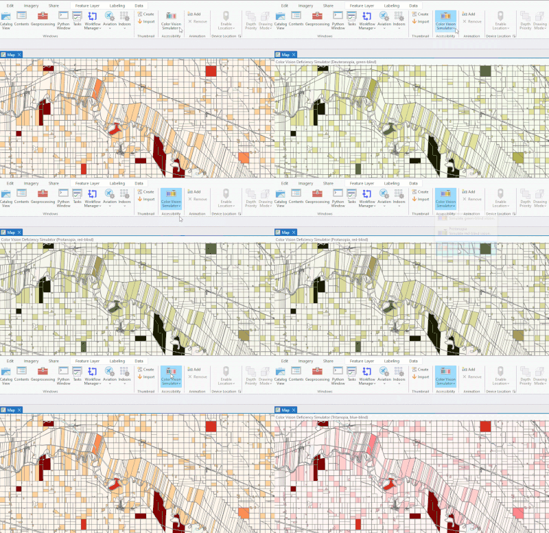
Also of note is that ArcGIS Pro 3.0 will bring a Color Vision Simulator based on this idea: https://community.esri.com/t5/arcgis-pro-ideas/colorblind-mode-in-arcgis-for-cartographic-design/idi...
Here is a preview:
Do you think that will meet your needs or were you looking for something else specifically?
+ @SallyHoll1 for your opinion.
Thank you
Please add a new option so that when configuring symbology to use a pre-made color ramp, users can toggle a check mark off to filter by colorblind-friendly ramps. Currently, there are no filters or easy ways to determine which pre-made ramps might be colorblind friendly. This is a huge issue. With the advent of ADA Title II and requirements for digital accessibility, it is important that there are clear and easy ways for users to create accessible GIS products. Adding a check box to filter for colorblind-friendly ramps in ArcGIS Pro would be a step in the right direction.
Please see the attached screen capture of what this looks like now and where I believe this checkbox filter should go. According to documentation I've seen online, there are colorblind-friendly ramps in Pro, however the names do not indicate this and it is very difficult to figure out the appropriate choices in any easy way.
In addition, a colorblind-friendly filter is already available in ArcGIS Online's map viewer. Something similar needs to exist in Pro.
Thank you,
Erica
You must be a registered user to add a comment. If you've already registered, sign in. Otherwise, register and sign in.
