- Home
- :
- All Communities
- :
- Products
- :
- ArcGIS Pro
- :
- ArcGIS Pro Ideas
- :
- Charts - Treat double fields as integers
- Subscribe to RSS Feed
- Mark as New
- Mark as Read
- Bookmark
- Printer Friendly Page

- Mark as New
- Bookmark
- Subscribe to RSS Feed
- Permalink
Allow the user to specify the way bins are labeled. This chart is showing integer data (ranging from 3-11 - 9 unique values and 9 bins), and while I found the option to only use one decimal place, my chart still has glaring issues. I have two sevens, and it's not immediately clear which bar the integers are each referring to. Before the two 7's, the number is before the bar; after the 7's, you must read the number to the right of the bar.
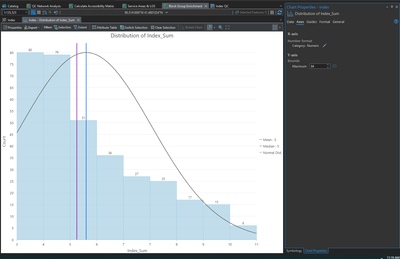
It would be better if the bin values could be labeled underneath, centered like the counts above.
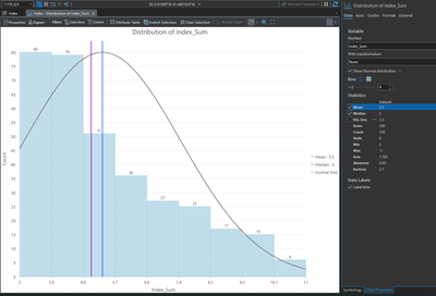
For reference, this is what it shows by default.


Hi @wayfaringrob ,
Thanks for the question!
A histogram divides your data into bins, where each bin represents a range of values and the height of the bar represents the total number of values from your data that occur within that range. For instance, in the second screenshot you posted, there are 27 values in the "Index_Sum" field that fall between 6.6 and 7.4:
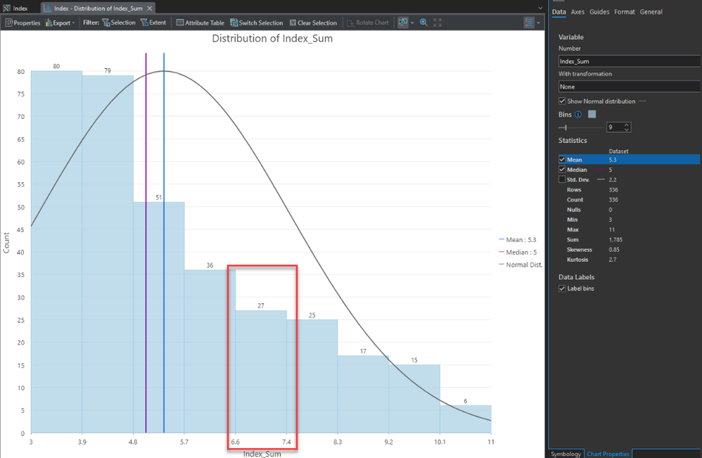
Because each bin in a histogram represents a range of values, it's important to show the lower and upper values for that bin.
If you are more interested in visualizing the number of occurrences for each integer value in the "Index_Sum" field, then you might want to use a bar chart instead.
Thanks,
Chris
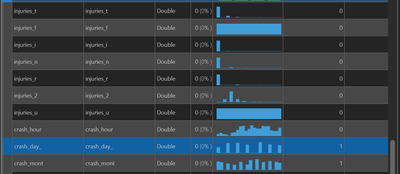
Circling back to this: I'm unsure what was going on in my earlier post, but I've run into this again, and I think it has to do with the field type. Even if a decimal field type (e.g. double) holds only integers, the bar chart option isn't there; you get a histogram with unsatisfactory bins and no option to use the field values as axis categories. Now, if I were making the dataset, I wouldn't make a double type field to hold integer data, but I don't always make the data I use. Yes, I could add a new integer field and calculate and re-make my chart, but the option to use quantity categories on any numeric field would save time and be useful. I can also imagine scenarios where I do have decimal data and would still like to have a discrete bar chart rather than a histogram.
For example, in working with crash data, my data source has all of these integer values stored as double; it's a little inconvenient to have to convert each and every field to integer just to take a glance at a reasonable chart. I suppose the idea, then, is to allow for more chart types from decimal fields.
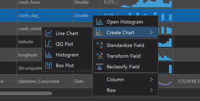
@wayfaringrobThanks for the update and clarification!
As you've discovered, it’s currently not possible to create a bar chart using a Double field. We will keep an eye on this Pro Idea and potentially reevaluate this decision, but for now I’d like to show you one possible workaround.
If you are on Pro 3.1 or higher, you can use Arcade expressions to create the desired bar chart without needing to create and calculate new fields in your dataset. As an example, here I’d like to create a bar chart on the “year” field, which is type Double:
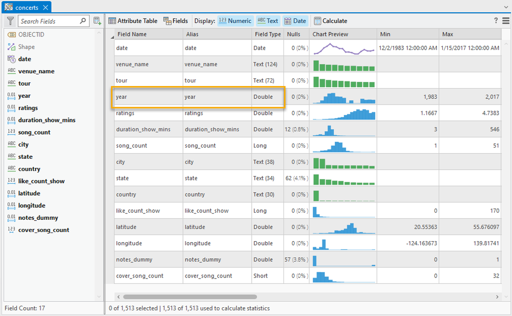
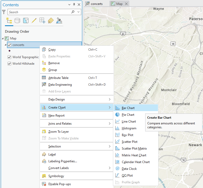
Since bar charts cannot be created on Double fields, the Bar Chart option is not shown when I right-click this field in the Data Engineering view. Instead, I’ll need to create a bar chart using the Create Chart menu option when you right-click the layer in the table of contents:
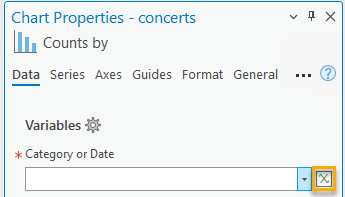
Now you should see a blank chart and the Chart Properties pane should open. Because the “year” field type is Double, it will not appear in the Category or Date dropdown for this bar chart. Instead, I’ll click the Arcade expression button to open the expression window:
In the expression window I’ll simply pass the “year” field into the Round Arcade function in order to round the values to the nearest integer:
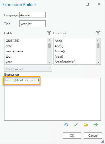
When I click “OK”, I now see a bar chart that shows the number of records for each rounded integer value:
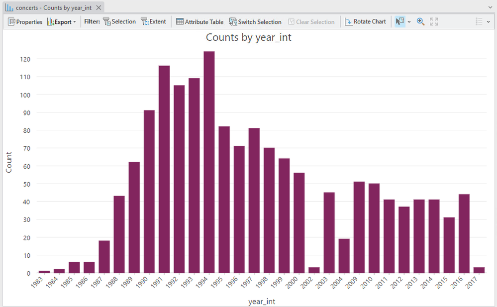
This approach obviously still requires some extra work but at least it saves you from needing to create and calculate new fields.
Take care,
Chris
@ChristopherAllenoooh, good to know! I'll keep this in mind once IT updates me from 3.0 this winter.
Awesome, that sounds great @wayfaringrob
Would you mind if I changed the title of this Pro Idea to reflect your request to have charts treat Double fields as categories (for instance, to create a bar chart)?
Updated the title to reflect the request to have Pro Charts treat double fields as integers so they can be used as categorical variables.
You must be a registered user to add a comment. If you've already registered, sign in. Otherwise, register and sign in.