- Home
- :
- All Communities
- :
- Products
- :
- ArcGIS Pro
- :
- ArcGIS Pro Ideas
- :
- ability to custom sort chart categories
- Subscribe to RSS Feed
- Mark as New
- Mark as Read
- Bookmark
- Follow this Idea
- Printer Friendly Page
ability to custom sort chart categories
- Mark as New
- Bookmark
- Subscribe
- Mute
- Subscribe to RSS Feed
- Permalink
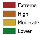
Chart categories can be sorted alphabetically, but sometimes that puts them in an illogical order. For example, here is how I have a map layer displayed in my legend:
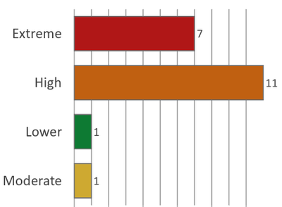
In the chart sorted alphabetically, however, Lower comes between High and Moderate.
Custom sorting of bar charts was implemented in ArcGIS Pro 2.6: https://pro.arcgis.com/en/pro-app/2.6/help/analysis/geoprocessing/charts/bar-chart.htm#ESRI_SECTION2...
What version of Pro are you using?
Thanks for the confirmation. Custom sort is available in 2.6 and above. The current version is 2.7.1.
Cheers
Thanks. We're supposed to get the latest version soon, so I will watch out for that!
You must be a registered user to add a comment. If you've already registered, sign in. Otherwise, register and sign in.

