I was wondering how the Map Viewer styles and design choices came about.
This is unselected but highlighted:

This is selected:

While making a lot of changes to various layers, as you do while laying out a map to be useable, I often find myself selecting a layer that is already selected.
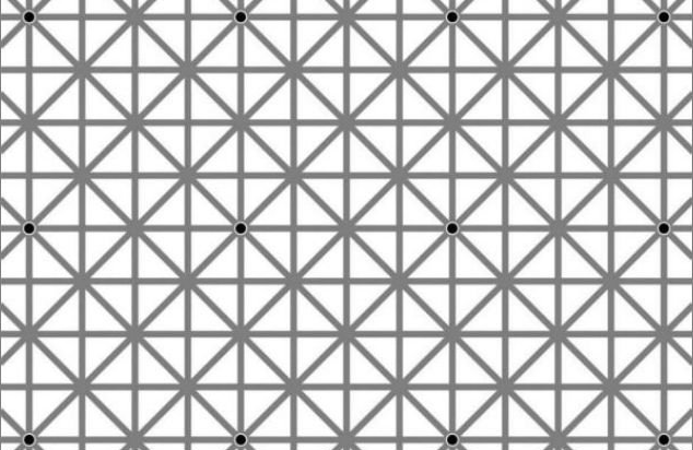
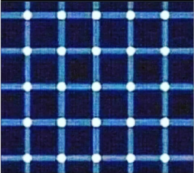
This is due to the same optical 'issues' humans have that make these type of illusions so fun when in a magazine.
How many black dots do you see?

Find the black dot:

The size/spacing of the objects in the Map Viewer contents area are 'just right' so that the 'selected' bar is invisible when you are focusing on other parts of the UI.
I would assume a proper company like Esri has designers that understand these concepts.
There are a few options at play:
- This issue was considered but .....?
- This issue was not considered. Remedy = don't give important jobs to the work experience student.
- Focus groups said it looked sick?
Therefore, and this is a serious question, why was the UI design made in this way?
Should we have to lodge Ideas that pertain to proper design?