Turn on suggestions
Auto-suggest helps you quickly narrow down your search results by suggesting possible matches as you type.
Cancel
- Home
- :
- All Communities
- :
- Products
- :
- ArcGIS Online
- :
- ArcGIS Online Questions
- :
- Is it possible to make a chart that consists of mu...
Options
- Subscribe to RSS Feed
- Mark Topic as New
- Mark Topic as Read
- Float this Topic for Current User
- Bookmark
- Subscribe
- Mute
- Printer Friendly Page
Is it possible to make a chart that consists of multiple lines in ArcGIS Insights?
Subscribe
1448
0
08-11-2021 06:53 PM
08-11-2021
06:53 PM
- Mark as New
- Bookmark
- Subscribe
- Mute
- Subscribe to RSS Feed
- Permalink
Hi,
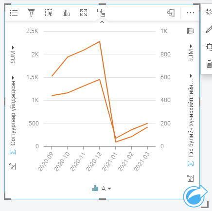
I saw from the documentation of ArcGIS Insights (ArcGIS Insights Documentation - time-series graphs) that one may make a time-series graph that consists of multiple lines, categorized by crime type (timeseries_graph.png).
In ArcGIS Insights, adding a field to an existing line chart makes it a combo chart, but it doesn't allow for more than 2 categories to be added to the graph (current_state.png). How do I create a chart that looks exactly like the image attached (timeseries_graph.png)?
0 Replies