Hi!
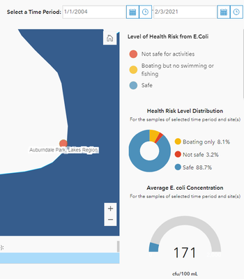
I am making a dashboard. I want to change a color of a point on the map according to the period I select on the dashboard's header. The point holds monthly records. I want the color changed according to the range of the average of the monthly records in the selected period. (blue: <235, yellow: 235~1260, red: >1260
)
I tried this:
a Web Map > "Contents" > the data layer > "Change Style" > "Choose an attribute to show" > "(Expression)" > clicked a pen icon > "Expression" > added "return mean($feature["Reporting_Result"]);"
It doesn't return the average of the single column ("Reporting_Result") in the specified period at the dashboard. I honestly do not know what it returns. The color changes oddly.
In short, the red circle on the map should be blue (avg. 171) but it's red:
