Turn on suggestions
Auto-suggest helps you quickly narrow down your search results by suggesting possible matches as you type.
Cancel
- Home
- :
- All Communities
- :
- Products
- :
- ArcGIS Online
- :
- ArcGIS Online Questions
- :
- Creating an Arcade pop-up bar chart in Map Viewer
Options
- Subscribe to RSS Feed
- Mark Topic as New
- Mark Topic as Read
- Float this Topic for Current User
- Bookmark
- Subscribe
- Mute
- Printer Friendly Page
Creating an Arcade pop-up bar chart in Map Viewer
Subscribe
1033
0
05-18-2023 09:11 AM
05-18-2023
09:11 AM
- Mark as New
- Bookmark
- Subscribe
- Mute
- Subscribe to RSS Feed
- Permalink
Hi, I'm wondering if any Arcade experts can help me please? Using the below expression, I am able to list out the average rainfall in mm prior to a defect report date.
var weather = FeatureSetByName($map, "Weather Stations", ["*"], false)

var station = $feature.Closest_WeatherStation
var defectdate = $feature.Reported_Date___Time
var startDate = DateAdd(defectdate, -30, "days");
var endDate = DateAdd(defectdate, -1, "days");
var query = "Station = @station AND Date_Field >= @startDate AND Date_Field <= @endDate "
var filtered_weather = Filter(weather, query)

var return_lines = [

Count(filtered_weather) + " days forecast",

]

for(var d in filtered_weather) {

Push(return_lines, "Total Rainfall " + d.Daily_Total_Rainfall__0900_0900 + " mm")
}
return Concatenate(return_lines, Textformatting.NewLine)
However, rather than a list, I would like to display my results in a bar chart, displaying the date on the x axis and the total rainfall in mm on the y axis. Is anyone able to help with this please?
I have tried this following the page Part 2: Introducing Arcade Pop-up Content Elements (esri.com):
var chartValues = {}
var chartNames = []
for (var f in return_lines) {
        chartValues[f.Date_Field] = f.Daily_Total_Rainfall__0900_0900
        Push(chartNames, f.Date_Field)
    }

return {
    type: 'media',
    title : 'Rainfall by Date',
    description : 'Chart showing total rainfall 30 days prior to defect report date',
    attributes : chartValues,  // replace this dictionary with your own key-value pairs,
    mediaInfos: [{
        type : 'columnchart', //linechart | barchart | piechart | columnchart
        //title : '',
        //caption : '',
        altText : 'bar chart showing crime counts by category', //altText will be read by screen readers
        value : {
          fields: chartNames,  // choose what attributes to use in the chart
          //normalizeField : '',  // the name of the attribute to normalize by or value
        }
      }]
  }
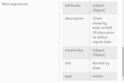
But i'm only getting this output
0 Replies

