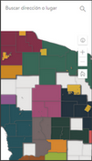
Could anyone help me figure out how to configure Navigation Boundary in an app to work for both desktop and mobile? It looks like it's actually zooming in more on mobile, which is the opposite of what I need. Is it possible to preserve extent instead of scale? If not, is it possible to get something between these two scales?
| Perfect on desktop but cut off on mobile | Too small on desktop and small-ish on mobile |

| 
|

| 
|
These are the settings for the first view:

Appreciate any advice!