- Home
- :
- All Communities
- :
- Products
- :
- ArcGIS Online
- :
- ArcGIS Online Questions
- :
- Best practices for text in custom thumbnails
- Subscribe to RSS Feed
- Mark Topic as New
- Mark Topic as Read
- Float this Topic for Current User
- Bookmark
- Subscribe
- Mute
- Printer Friendly Page
- Mark as New
- Bookmark
- Subscribe
- Mute
- Subscribe to RSS Feed
- Permalink
Hello,
I am working on creating thumbnail templates for my organization to use in ArcGIS Online. However, I am having trouble getting the text in the thumbnail to appear nice and crisp. I've tried many different export settings and file types, but none seem to make much of a difference.
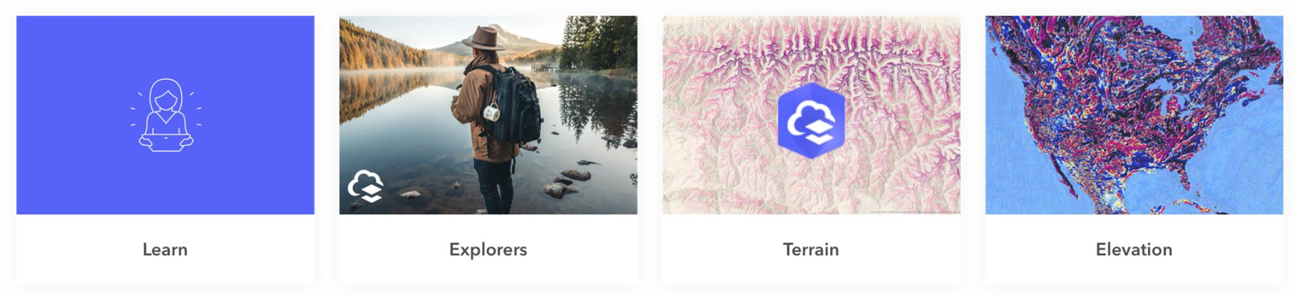
Here is an example of some custom thumbnails from an image taken from the recent "What's New in ArcGIS Online" post:

And here is an example of my template - pretty standard design and format. This particular one was made with an ArcGIS Pro layout template, so that whoever makes the thumbnail can easily use the Map Frame element to get the exact capture of the map that they want.
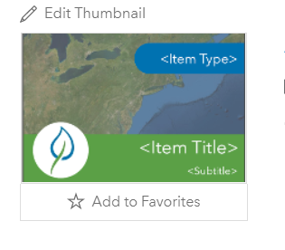
Is there a different setting or "best practice" I can implement to help make my thumbnail a bit sharper?
Katie
If this post helped you, please consider giving a kudos and/or marking as the accepted solution. Thanks!
Solved! Go to Solution.
Accepted Solutions
- Mark as New
- Bookmark
- Subscribe
- Mute
- Subscribe to RSS Feed
- Permalink
These recommendations are provided by our usability and accessibility team.
Do:
- Utilize branded icons with sufficient contrast.
- Brand images with logo in corner.
- Use logos with imagery or solid brand color background.
- Use a map or terrain background.
Avoid:
- Adding any text over the thumbnail. This is especially problematic when it is small or low contrast.
- Repeating text on the thumbnail that's already part of the title or summary.
- Placing all text on the thumbnail and not showing the title or summary.
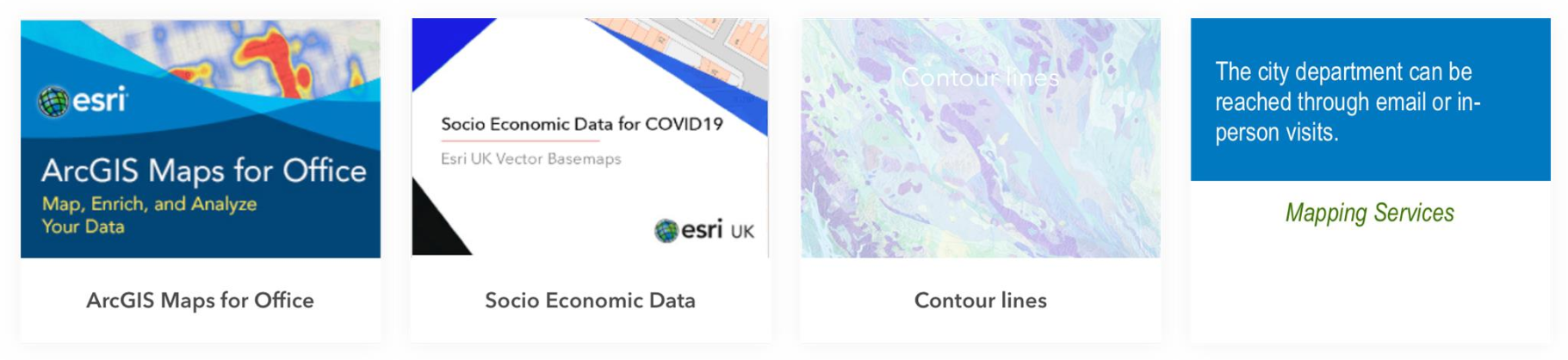
Some room for improvement for us here at Esri too!
Thanks,
Mike
- Mark as New
- Bookmark
- Subscribe
- Mute
- Subscribe to RSS Feed
- Permalink
These recommendations are provided by our usability and accessibility team.
Do:
- Utilize branded icons with sufficient contrast.
- Brand images with logo in corner.
- Use logos with imagery or solid brand color background.
- Use a map or terrain background.
Avoid:
- Adding any text over the thumbnail. This is especially problematic when it is small or low contrast.
- Repeating text on the thumbnail that's already part of the title or summary.
- Placing all text on the thumbnail and not showing the title or summary.
Some room for improvement for us here at Esri too!
Thanks,
Mike
- Mark as New
- Bookmark
- Subscribe
- Mute
- Subscribe to RSS Feed
- Permalink
Ok, not exactly the answer I wanted to hear I guess, since I see custom thumbnail examples with text all the time, but I guess that's just how it is. I do appreciate the thorough response! Thanks
Katie
If this post helped you, please consider giving a kudos and/or marking as the accepted solution. Thanks!