- Home
- :
- All Communities
- :
- Products
- :
- ArcGIS Online
- :
- ArcGIS Online Questions
- :
- Re: Arcade Symbology
- Subscribe to RSS Feed
- Mark Topic as New
- Mark Topic as Read
- Float this Topic for Current User
- Bookmark
- Subscribe
- Mute
- Printer Friendly Page
- Mark as New
- Bookmark
- Subscribe
- Mute
- Subscribe to RSS Feed
- Permalink
I am trying to display pavement condition inventory scores as groups, for instance 60-75 is okay, 76-89 is good, and 90-99 is excellent. I can do that in Map, but not Online. There is no grouping setting I can find. You can use Counts and Amounts and set the manual breaks, but you can't change individual colors in the ramp. I am not good with Arcade, but I found something that partially works. The problem is it only returns 3 categories. That may be all it is designed to do. Does anyone have any suggestions? Thanks!
if($feature.PCI >=90){
return "Great"
}
if (75<= $feature.PCI <90){
return "Better"
}
if (60<= $feature.PCI <75){
return "Okay"
}
if(40<= $feature.PCI <60){
return "Bad"
}
if($feature.PCI <40){
return "Awful"
}

Solved! Go to Solution.
- Mark as New
- Bookmark
- Subscribe
- Mute
- Subscribe to RSS Feed
- Permalink
Hi Nathan Bush ,
You example refers to Alligator Weed, which is a plan species, so I guess that you are working with 100+ different type of species. Is that correct? Do these 100+ layers that you are working with only differ on the attribute used for creating the legend, or are the differences bigger?
If they are bigger, some handwork will be involved to create the correct legends. If they are simular, you could probably use ArcGIS Pro (if you have access to it) and create a layer file that you apply after editing the arcade symbology expression.
- Mark as New
- Bookmark
- Subscribe
- Mute
- Subscribe to RSS Feed
- Permalink
Hi Xander Bakker,
So each species is an individual field with a domain (0-5, 99, 100) referring to the different categories (had to set up the attribute table wide version for field data collection purposes). For display purposes in a webapp, I'm simply copying the feature service, and symbolizing by each species and by the category. Hopefully this is making sense, below is a screenshot of part of the attribute table:


Again, the legend is NOT in the order I want, and the colors need specific ramping to show densities (zero to >60%)
- Mark as New
- Bookmark
- Subscribe
- Mute
- Subscribe to RSS Feed
- Permalink
In the scenario that you are using, you copy the layer in the web map, edit the expression (pointing to the correct attribute) and "ready". So, really that is only the beginning since as you probably have noticed, every time you edit the expression, the legend is regenerated and you would have to change colors and the order. The current order is first characters, than numbers and than special signs. If you could change the description in such a way that you don't have to change the order, that would help a little bit.
I am curious though... are you planning to have 100+ layers in a single map? What will the end user experience look like?
- Mark as New
- Bookmark
- Subscribe
- Mute
- Subscribe to RSS Feed
- Permalink
The ordering now makes sense, thank you.
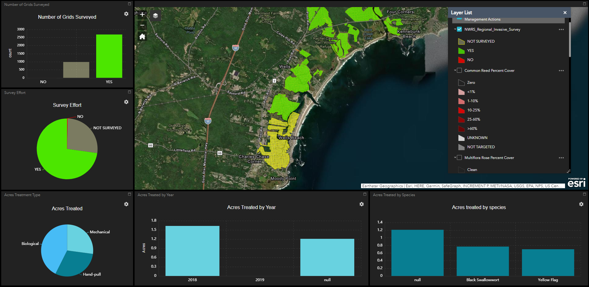
Below is a screenshot of user experience. This is "live" data being collected via Collector. Field teams are collecting species percent cover within each grid (attribute table in previous response). When finished, the team marks the grid as 'YES" for complete and the grid turns from clear to green - calling this "survey effort". The layer list displays one example of a species' labeling and color ramping I wish to code out in ARCADE since there may be over a 100. As of now, the user must open the layer list and check on the species they are interested in viewing. It's a bit clunky and I'd love to have a custom widget...something like an ordered list, or scroll..
There is other data in this app (bottom 3 panels) that can be disregarded in this conversation.
- Mark as New
- Bookmark
- Subscribe
- Mute
- Subscribe to RSS Feed
- Permalink
Hi Nathan Bush ,
Thanks for the additional explanation and sharing the screen shot. This helps a lot. Using a dashboard to monitor the data collection process is a great resource. I can also imagine that you want to be able to symbolize the specie distribution since this may aid to recognize patterns of specie distribution.
I do wonder if having a TOC with over 100 layers (one for each specie) is something that is "friendly" for the end user and I assume that this is something why you would like to have a custom widget that could enable a more user friendly way to navigate through the long list of species. Would it be possible to group the species at a higher level? Would this be acceptable for the end user?
You can also use Arcade to determine the most predominant species in a grid and present this and other information in the pop-up.
- Mark as New
- Bookmark
- Subscribe
- Mute
- Subscribe to RSS Feed
- Permalink
Xander Bakker you're absolutely right about the user experience - not so friendly right now.
Unfortunately, grouping species won't be very helpful since these data will be used to guide management decisions at the species-level (different actions for different species).
Your second suggestion about the predominant species within each grid might be a cool way to quickly see where higher densities exist without having to create copies for each species. Do you have a code snippet I could fiddle with?
btw...thanks for all the help!
- Mark as New
- Bookmark
- Subscribe
- Mute
- Subscribe to RSS Feed
- Permalink
Hi Nathan Bush ,
Sure, I can provide an example of how you can do this. However, it will be a long script in case you have to evaluate 100+ fields.
Have a look at the expression below.
- The function "CorrectVal" is to correct the high values 99 and 100 to 0 to force them to the end of the list
- The function "compareVal" is a helper function to sort the values
- The function "TranslateVal" will translate the values 0 a 5 to the corresponding percentages
- Lines 33 to 40 is where the values of the attributes are read and written to an array containing objects with properties "FieldName" and "FieldVal". See note on line 1 on reading the attribute value. For testing I am using fixed values, and they should be corrected using the function "CorrectVal".
- The code will take the array of field names and field values and sort it in descending order using the value. Note that you will have to correct the values and replace texts by a value (for instance values 99 and 100 should be '1 to force them to the end of the list)
- The "maxrank" variable will define how many species should be returned in the ranking
// Function to correct values higher than 5 to 0
Function CorrectVal(val) {
if (val > 5) {
return 0;
} else {
return val;
}
}
// Function to sort values from high to low
Function compareVal(a,b){
if (a["FieldVal"]<b["FieldVal"])
return 1;
if (a["FieldVal"]<b["FieldVal"])
return -1;
return 0;
}
// Translate values
Function TranslateVal(val) {
var dct = {"1": "<1%", "2": "1-10%", "3": "10-25%",
"4": "25-60%", "5": ">60%"};
val = Text(val);
if (HasKey(dct, val)) {
return dct[val];
} else {
return "Zero/NOT TARGETED/UNKNOWN";
}
}
// define the array of values to sort (with 100+ attributes, this list will be long!)
var fldsArray = [{"FieldName":"Alligator_Weed", "FieldVal": CorrectVal(1)}, // 10 should be replaced by $feature["Alligator_Weed"]
{"FieldName":"American_Lotis", "FieldVal": CorrectVal(5)},
{"FieldName":"Amur_Honeysuc", "FieldVal": CorrectVal(4)},
{"FieldName":"Asiatic_Tearthumb", "FieldVal": CorrectVal(2)},
{"FieldName":"Autumn_Olive", "FieldVal": CorrectVal(4)},
{"FieldName":"Barberry", "FieldVal": CorrectVal(3)},
{"FieldName":"Another_specie1", "FieldVal": CorrectVal(100)},
{"FieldName":"Another_specie2", "FieldVal": CorrectVal(99)}];
// sort the array
var test = Sort(fldsArray, compareVal);
// some initial settings
var maxrank = 5; // specify until which rank to show results
var rank = 0;
var cnt = 0;
var prevval = Null;
var result = "Ranking:";
// loop through sorted array
for (var i in test) {
cnt += 1;
var specie = Replace(test[i]["FieldName"], "_", " ");
var val = test[i]["FieldVal"];
if (val != prevval) {
rank = cnt;
}
if (rank <= maxrank) {
result += TextFormatting.NewLine + " - " + rank + ": " + specie + " (" + TranslateVal(val) + ")";
} else {
// exit loop
return result;
}
prevval = val;
}
return result;The result of this test expression is:
Ranking:
- 1: American Lotis (>60%)
- 2: Amur Honeysuc (25-60%)
- 2: Autumn Olive (25-60%)
- 4: Barberry (10-25%)
- 5: Asiatic Tearthumb (1-10%)I hope this helps and if you need a hand you could share the data in a group and invite me ("xbakker.spx") to it to help create the expression.
- Mark as New
- Bookmark
- Subscribe
- Mute
- Subscribe to RSS Feed
- Permalink
Excellent!
I'll give it shot!
- Mark as New
- Bookmark
- Subscribe
- Mute
- Subscribe to RSS Feed
- Permalink
Hi Xander,
I've been reading all these posts and I am looking for a similar solution, to display a number of parameters (maybe 40 parameters) with their own range of values.
For now, I am displaying all parameters using a general range.
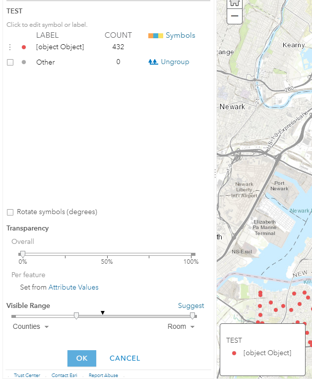
see image:

but I need 40 of each like in this example.

How can I do that - and yes I don't want to have individual layers for each.
maybe when zooming in I can see the range of each parameter.
Thank you,
Lacri Ursu ([email protected])
- Mark as New
- Bookmark
- Subscribe
- Mute
- Subscribe to RSS Feed
- Permalink
Hello
I am trying to group one field base on color. I created dictionary but I can't create group:
var OSB_1 =
{'Bollard': 'Red','Residential Mailbox': 'Red',
'USPS Mailbox': 'Red','Sidewalk Shed': 'Red',
'Sign': 'Red','Transit Elevated Structure': 'Red',
'Building Vault':'Blue','Catch Basin':'Blue',
'Survey Monuments':'Blue','Utility Access':'Blue',
'Transit Subway Vent':'Blue',
'Pedestrian Walkway':'Purple','Steps':'Purple',
'Trees':'Purple','Wall':'Purple',
'Fence':'Purple','Landscape':'Purple','Other':'Purple',
'No obstacle in travel path':'Green'}
return OSB_1
But this return below
Basically, I want to make 4 categories base of color of these values in Arcade on Arcgis online
Does anyone have any suggestions? Thanks!